 |
 |
 |
 |
 |
 |
|
||||||||||||||||||||||||||||||||||||||||||||||||||||||||||||||||||||||||||||||||||||||||||||||||||||||||||||||||||||||||||||||||||||||||||||||||||||||||||||||||||||||||||||||||||||||||||||||||||||||||||||||||||||||||||||||||||||||||||||||||||||||||||||||||||||||||||||||||||||||||||||||||||||||||||||||||||||||||||||||||||||||||||||||||||||||||||||||||||||||||||||||||||||||||||||||||||||||||||||||||||||||||||||||||||||||||||||||||||||||||||||||||||||||
OLDER POSTS
18 May 2013 Paintings on view in New York: Pour, baby, pour! NEW YORK - Barnett Newman once observed: “We are creating images whose reality is self-evident...” Uh-huh. Pollock dripped. Newman famously “zipped” (his narrow, vertical stripes, or “zips,” helped energize the pictorial space of his vast color-field paintings, he theorized). De Kooning pushed paint around and scraped it back off again. Fontana painted a canvas a solid color and then, daringly (?), slashed its surface. Countless other abstract-expressionists, as modern art’s canonical story tells us, flung paint at their canvases and found diverse ways to explore its communicative potential in fits of soul-stirring, existential Sturm und Drang that forever changed our understanding of what paintings could be and how they could appear. Indeed, many an abstract painter’s efforts called as much attention to a painting’s nature as a physical object as they did to the method by which it was produced or to its real or imagined meanings.
And then there were the paint pourers. Think Helen Frankenthaler, Paul Jenkins, Morris Louis... Theirs was a different kind of very fluid, accident-accepting, sometimes-controlled, sometimes-not-so-controlled, splishy-splashy way of creating paintings. Now, simultaneously, two New York galleries are presenting “Pour,” an exhibition that examines the work of a group of contemporary artists who make paintings on canvas and other support surfaces using a variety of pouring techniques. Co-curated by the artists Elisabeth Condon and Carol Prusa, one part of “Pour” is on view at Asya Geisberg Gallery in Manhattan’s Chelsea district through June 1 (537B West 23rd Street, telephone 212-675-7525). Part two is on view at Lesley Heller Workspace, on Manhattan’s Lower East Side, through May 24 (54 Orchard Street, telephone 212-410-6120). Artists whose work are featured in the two-part presentation include Ingrid Calame, Kris Chatterson, Roland Flexner, Angelina Gualdoni, Carrie Moyer, Carolanna Parlato, David Reed, Jackie Saccoccio and Carrie Yamaoka. During my recent visit to the Asya Geisberg Gallery’s portion of the exhibition, where I met up with Condon, the artist noted that the diverse selection of works on view at the show’s two venues “examines the techniques of post-World War II abstraction from the vantage of today’s digital culture.” In her own work, Condon incorporates various modes of paint-pouring, experiments with reflective materials and allusions to ancient Chinese painting’s push-me-pull-you perspectives. Like several of the works on view in “Pour,” Condon’s paintings are marked by energetic compositions that play with a viewer’s perception of pictorial space.
In their written notes about the exhibition, Condon and Prusa point out that, by “[f]loating, pouring and sweeping liquid pigment on canvas and panel, alone or in combination with ‘dry’ applications, such as drawing and collage,” the artists whose works are on view “redefine form and space in terms of speed, texture and depth.” Works on view in “Pour” include Roland Flexner’s small (each about the size of about three playing cards), black-and-white abstractions on paper made with liquid graphite, which the artist pushes around his surface by blowing on it through a drinking straw. The resulting compositions resemble surreal landscapes or frothy cascades, and their rich tones are as vivid as the sharp gradations of grays and blacks in fine photographic prints. In works like Jolly Rancher (2012), made with acrylic and graphite on canvas, Carrie Moyer offers big, bright bon-bons marked by dynamic plays of overlapping layers of color and of shape-defining, drawn lines against the hard edges of solid, colored forms. Using oil paint and mica on linen, Jackie Saccoccio creates surfaces with a luxurious sheen; her compositions feature blob-like forms that seem to break up into nets of interwoven lines of drippy color or, conversely, thickets of drippy filaments that gather and congeal into formless forms that float on or near the top layer of a multilayered pictorial space. An enthusiastic colorist, Carolanna Parlato uses acrylic on linen or canvas—assorted pinks, lemon and pastel yellows, fiery orange, acid greens and more—in some of the exhibition’s most vivid examples of the paint-pouring method. Elegant and ecstatic, her paintings seem to revel in their exploration of a very liquid paint’s shiny, viscous goo. By inevitably calling attention to how real, live human art-makers create their works (as opposed to computers or nameless fabricators to whom an art-product marketer merely sends his designs to be manufactured), “Pour” may be seen in part as a reaction against the hands-off aesthetic that asserts that eliminating any visible evidence of the touch of the artist’s hand in a finished piece is a most desirable goal. Whatever the theoretical, compositional or thematic concerns of the artists whose works are on display, “Pour” also offers a powerful reminder of a remark Joan Mitchell once made in response to a French critic who got lost in his own over-intellectualization of her art-making motivations and methods. Taking aim at his obfuscation, the great abstract-expressionist artist retorted: “You don’t get it, do you? It’s about paint!” Posted by E.M.G.
28 February 2013 In New York, the Guggenheim Museum Goes Gutai My article about the Solomon R. Guggenheim Museum’s new exhibition, “Gutai: Splendid Playground,” has just appeared in the Japan Times, the independent, national, English-language newspaper that is published in Japan. Read it on the newspaper’s website here. See a PDF that shows the print edition’s page layout by clicking here. Go Gutai!
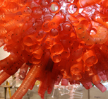
20 November 2012 Aurora Robson: Transforming “materials from the waste stream” to create bold, beautiful sculptures NEW YORK - To look at the Canadian artist Aurora Robson’s colorful, richly textured creations is to stop and ask, dumbfounded: “What are they made of - paper, fabric, expertly crafted glass or maybe clouds of magically colored air?”
In fact, Robson, who also makes paintings and collages, and is a licensed welder, constructs her sculptures using cast-off plastic bottles, a practice, she notes, that allows her to transform “materials from the waste stream” that would otherwise become trash into objects of beauty and wonder. Technically speaking, by using polyethylene terephthalate (commonly known as “PET”) bottles that are destined for the garbage bin after they have been used to hold water or soft drinks, Robson does not use recycled materials; instead, what she does is rescue materials before they can become waste.
I’ve written a brief essay for the publication that accompanies Robson’s current exhibition at the Franklin Park Conservatory and Botanical Gardens. You can see it here in the form of a PDF. About her art and sources of inspiration, Robson told me: “There are certain problems I’m interested in helping to solve through my work. One is the plastic debris problem, which is a symptom of a much bigger problem in terms of our collective consciousness as human beings. I hope other artists, designers and architects will [also] recognize the potential of all of the cast-off plastic that is accumulating around us [and] is a big problem in our environment.” She pointed out that plastic trash does not biodegrade; instead, it can take thousands of years for plastic to photodegrade, that is, to decompose with exposure to light. Robson said: “Every piece of plastic that has ever been produced still exists. This fact has influenced my desire to interrupt the waste stream with my work.” Sculptures on view in the conservatory exhibition include Kamilo, which was made from plastic trash that washed ashore on the southern point of Hawaii, and Be Like Water, a cascade of shimmering forms made from 9000 clear-plastic bottles and 80,000 bottle caps. Robson has observed: “I am interested in provoking reflection on consumption without making people feel guilty.” Instead, she has said, she is interested in “motivating them in a positive way.” An earlier interview of mine with Aurora Robson was published in the October 2009 issue of Art in America. Click here to see that article in PDF form.Posted by E.M.G.
28 October 2012 Modern art’s history, retold: Making room for artists from Japan NEW YORK - In recent years, in the art world in the West, more and more curators, dealers, teachers, critics, collectors and artists themselves have been paying closer attention to and seeking information about the activities of art-makers in and from other parts of the world—Asia, Africa and South America, for example—that traditionally have not been extensively documented in the history of modern art. To be fair, that’s probably because the main currents of modernism (a multifaceted aesthetic outlook that had broader social, cultural and even political implications) developed in Europe and North America before spreading and finding practitioner-proponents elsewhere.
After emerging in the mid-19th century from more than 200 years of self-imposed isolation from the West, Japan began the insatiable assimilation and processing of ideas, styles and technology from abroad that has characterized its modern history, including—and often most interestingly—in the visual and design arts. Now, a wave of exhibitions in the U.S.A. and Europe focusing on Japan’s modern-art history is offering some superb opportunities to get to know how Japanese artists and thinkers absorbed incoming aesthetic ideas from the West and also how they formulated their own fresh approaches to art-making and contributed in their own distinctive ways to the global development of modern art. Today, with this back-and-forth idea exchange in mind, some art historians are taking a so-called transnational approach to examining the role of Japanese artists and those from other parts of the world in modern art’s broader evolution.
My article about this recent wave of Japanese modern-art exhibitions has just been published in the November 2012 issue of Art & Antiques (U.S.A.). Click here to see the article as it appears in print. A PDF will open in a separate window. Two of the most significant exhibitions in this field will soon open in New York. On Nov. 18, the Museum of Modern Art will unveil “Tokyo 1955-1970: A New Avant-garde,” an exhibition examining one of the most energetic art-making periods in post-World War II Japan (on view through Feb. 25, 2013). On Feb. 15, 2013, the Solomon R. Guggenheim Museum will open “Gutai: Splendid Playground.” This survey of the ideas and creations of one of the most influential post-WWII Japanese modern-art movements will run through May 8, 2013. For more about this recent wave of curating and research concerning Japanese modern art, in particular, see my article, “Whose Modernism Is It Anyway?” in the Brooklyn Rail, July-Aug. 2011. Posted by E.M.G.
14 October 2012 What to do with all that stuff? Storage, mon amour. NORTH CAROLINA, U.S.A. - I’m at an undisclosed location in the heart of the Bible-thumpin’, flag-wavin’, “sweet tea”-drinkin’ Deep South taking in the scenery of seven-lane highways slicing through residential neighborhoods (say “political boondoggles” with a thick Southern accent) and endless strip malls and churches with signboards that declare: “God loves our troops.”
Just before I headed this way, a friend sent me a photo he had shot with his mobile phone of a sign for one of those along-the-highway storage facilities way out in Nowheresville, the kind at which you rent a lockable unit, small or large, stash your belongings in it and pay by the month for the luxury of having less clutter at home. I’m intrigued by everything about these places—their physical design and appearance, the ethos or culture (are those the right words to use in this context?) of storage centers and the customers who use them, and the relationship between human beings and their possessions this particular kind of commerce calls to mind. I visited one storage facility here and managed to snap a few photos, even though doing so probably was very verboten. Omnipresent security cameras in these places monitor a visitor’s every move. Posted by E.M.G.
18 September 2012 A fresh look at Brody-Lederman’s mysterious works on paper TOKYO - In the U.S.A., my new article about the most recent works on paper created by the New York-based painter Stephanie Brody-Lederman has been published in the September 2012 issue of Art & Antiques. Here is a link to the article as it appears in the print edition of the magazine. The artist has posted it on her website. I’ve written about this artist’s psychologically charged, emotionally ambiguous, not-quite-abstract work before; with its unabashed lack of guile or self-conscious irony, it turns a lot of tired postmodernist posing on its head or maybe it shows it a clear path to the door.
Brody-Lederman’s paintings, mixed-media works on paper and sculptural objects reflect an array of fleeting feelings, observations and impressions gathered from everyday life. Her art routinely mixes snippets of overheard conversation with vivid colors and simple depictions of an endless stream of lanterns, chairs, trees, dogs, boats, cars, food, jewelry and other objects or subjects that cross the artist’s path or roam from the periphery of her vision into a vast “To Keep” file that resides somewhere in her busy mind. Designs on candy wrappers, colors of paper scraps on the sidewalk, unusual words in newspaper headlines, the shapes of shadows, the sounds of feet crushing along gravel paths, the stiffness of the fabric in a pleated lampshade—such details are the raw materials of Brody-Lederman’s art. Her pictures, with their hints of anxiety, romance, trepidation or longing, are more impressionistic portraits of uncertain psychic atmospheres than realistic depictions of places or events. Appearing in her works in various media, her simple, poetic-declarative word fragments (“Spoonfuls of the old country” or “Fireflies and candlelit dinners” or “You’re winging it/From shore to forest”) can sound as goofy as they can disjointed. Nowadays there’s something refreshing in the spontaneity—or the daring?—of an artist who takes a scrap of raw feeling or a full-bodied, multifaceted emotional response to anything and makes it the subject of her work, as opposed to making one-trick-pony works that merely serve to illustrate points of a critique and that end up designing their compositions to death at the same time. There’s something inescapably life-affirming and humanistic at the heart of Brody-Lederman’s art, no matter how unsettling some of the emotional-psychological buttons it pushes might be. In a culture that obsessively celebrates death even as it superficially worships youth, to honor life and the enduring human spirit in all its confounding complexity is a big—and remarkable—task for any artist to take on. Posted by E.M.G.
8 September 2012 Just my type: On the trail of old Japanese letter forms ZUSHI, JAPAN - A few days ago I picked up a new book that has just been published in Japan. It is Taipo Sanpo (Tokyo: 誠文堂新光社/Seibundō Shinkōsha), by Kentarō Fujimoto, a graphic designer who hails from Hokkaido and is based there now. As an art director and designer, Fujimoto has done it all—he has created logotypes, online publications, packaging, books and more. The Japanese title of his book can be translated as “Type Walk” or “Type Stroll.” It refers to the content of Fujimoto’s book and how he found it.
Taipo Sanpo is a collection of photos of store or company signs, printed announcements or product packages in which old, now rarely found examples of Japanese typography appear. Often the type specimens Fujimoto captures in his photos and describes in his accompanying texts are one-of-a-kind; obviously each one was created especially for a particular shop or product brand. The author gathered the examples of old type forms that appear in the book during his strolls through Tokyo and other places in Japan. He writes passionately and with humor about such details as the thickness or narrowness of a single stroke of a character or the overall personality of a written name or word. (In Japanese, the borrowed Chinese characters with which, in part, Japan’s national language are written are called “kanji.”)
Fujimoto’s book appears at a time when various compilations of advertisements and other forms of popular “material culture” (as historians now refer to printed matter, furniture, jewelry, clothes and hand-made or industrially manufactured stuff of all kinds) from Japan’s 20th-century past are turning up in bookstores in this country. Right now in Japan, in certain quarters there seems to be a sense of nostalgia for the early and the latter parts of the Shōwa era (1926-1989), or the reign period of the late Emperor Hirohito (1901-1989). Those were the times before World War II, when Japan was absorbing and processing a diverse range of artistic and intellectual ideas from overseas, and also democratizing, and the period after the devastating years of militaristic, fascist rule and war-making, when the Japanese rebuilt their country in an “economic miracle” that culminated in the boom years of the 1980s. Compared to today, when Japan and many other countries are facing huge economic uncertainties, political paralysis and wrenching social changes, those “better” days were marked by a sense of prosperity and of optimism about the future.
Can such sentiments be conveyed by typography? Certainly in the sense of playfulness, exuberance, drama and even confidence that some of the type specimens Fujimoto captures and describes in his new book, they can. Right now, Taipo Sanpo is only available in its original, Japanese-language edition. In the spirit of Fujimoto’s search for interesting examples of type design in Japan’s visual environment, I shot the photos that appear here, above. If you like typography and graphic design, then, wherever you are, grab a camera and go out and preserve some similar, special specimens of visual culture before they’re all overtaken—everywhere—by McDonald’s and Starbucks logos.Posted by E.M.G.
1 September 2012 Memo to pencil: Look sharp!
Years ago, when I first lived in Japan, I owned a pencil sharpener of this same design. It’s a hand-crank model with an ingenious, pull-out clip apparatus (not visible here) that holds the pencil steady while it’s being sharpened. The gizmo can also be clamped to a tabletop for extra stability. If you like to write with plain pencils or to draw with colored pencils, this sharpener delivers the perfect point; it also allows you to control the sharpness you’re aiming for, which is especially important when you’re using certain kinds of colored pencils. If I were selecting a group of representative objects of/from/about humankind to send to the first planet out there on which some form of life is discovered, in order to, you know, show the new folks what life’s all about down here on this weary rock, in addition to breath mints, roller skates, an iPod, an iPad, a copy of Everything You’ve Always Wanted to Know About Sex (But Were Afraid to Ask), a package of Velveeta, a jar of Marmite, a pair of garters and a copy of Yoko Ono’s first record album (Yoko Ono/Plastic Ono Band, 1970), I would include one of these Japanese-designed pencil sharpeners. It is the Sistine Chapel, the Golden Gate Bridge, the Boeing 747, Brunelleschi’s dome and CERN’s Large Hadron Collider all rolled into one, in miniature, on my desktop. Sharing this souvenir from my little corner of this land of ancient spirits and modern desires... Posted by E.M.G. 5 August 2012 Goo, goo, g’joob, it’s hot in Japan. Gu-Gu-Gutai: Gutai’s hot now, too. TOKYO - One of the most inventive art movements to have emerged in Japan in the early, post-World War II era, Gutai has become known for its wide range of prototypical performance art/event art experiments, which included presenting exhibitions in unusual settings (a pine-filled public park, the sky above an Osaka department store), and for many of its members’ strong, stylistically varied statements in the field of abstract painting. The movement took its name from that of the Gutai Art Society, which was founded in August 1954 by Jirō Yoshihara (1905-1972) and 16 younger artists from the Osaka-Kobe area; their first headquarters was in Nishinomiya, near Osaka. Well-educated and affluent, Jirō was the scion of a family that owned a cooking oil company. Through imported Western art publications, he learned about developments in abstract art and eventually stopped painting in a quasi-surrealist mode in order to explore abstraction’s liberating, expressive language for himself. In Ashiya, near Osaka, Jirō had been teaching European-style oil painting techniques to a handful of younger artists. It was with some of these young charges that he established the Gutai group. (It was a time in which Japanese art-makers in various fields—calligraphy, traditional painting, and so on—often gathered and presented their work under the auspices of named associations whose members shared certain fundamental aesthetic principles; such clubs or societies still exist in Japan today, representing both amateur and more skilled levels of talent.)
As Gutai’s leader, Jirō urged his confrères to break radically with the past and create art forms that had never been created before. In the group’s original manifesto, he wrote that Gutai art did not “falsify” the materials with which it was made. Dismissing the art of the past that filled “altars…palaces…salons…and antique shops,” he commanded: “Lock these corpses in their tombs.” “Gutai” can be translated as “concrete,” “material” or even “embodiment.” Among the Gutai artists’ experiments: Shozo Shimamoto made sculptures to be walked on; Atsuko Tanaka fashioned an “electric dress” made up of colored light bulbs; and Kazuo Shiraga created abstract oil paintings with his feet, his body swinging from a rope suspended above canvases that lay flat on his studio floor. Now on view at the National Art Center, Tokyo, through September 10, 2012, “Gutai: The Spirit of an Era” chronicles the activities and achievements of the movement’s participants from its founding until its dissolution in 1972, following Jirō’s death. Since that time, interest in Gutai has increased steadily both in Japan’s art world and overseas. Another big Gutai exhibition will open next February at the Guggenheim Museum in New York. Coming soon to Hauser & Wirth, a gallery in New York that has branches in London and Zürich: “A Visual Essay on Gutai” (September 12-October 27, 2012). This gallery show will feature representative works of various artists who took part in Gutai at different stages of its evolution.
The excellent catalog of the National Art Center, Tokyo’s exhibition has been published in a bilingual, Japanese-and-English edition. In the U.S., the Walker Art Center in Minneapolis has a good selection of Gutai works in its permanent collection. In New York, McCaffrey Fine Art has shown the work of Kazuo Shiraga (1924-2008) and Sadamasa Motonaga (1922-2011), and Paula Cooper Gallery has shown the work of Atsuko Tanaka (1932-2005). In Japan, the Ashiya City Museum of Art and History has significant Gutai holdings and has pursued extensive research in the field. In Kobe, the Hyogo Prefectural Museum of Art also has a large, definitive collection of Gutai works. Go, go Gutai! Posted by E.M.G.
27 July 2012 In the good ol’ summertime, Tokyo-inferno style: It’s global warming, baby!
Right now in style-conscious Tokyo, everybody is walking around in shorts and T-shirts. In the throng at Shibuya Station, one leggy, blonde, foreign woman glided past me not in a thong but in little more than some kind of purple panties and a hippie-fringe blouse that resembled a big, puffy, shredded Kleenex. As I walked through the streets of one of Tokyo’s busiest business districts—like a fool, in a suit!—I spotted this little, wooden, traditional-style structure, which was tucked away on a narrow side street among the skyscrapers. It’s small architectural gems like this one, along with the overall coziness and labrynthine character of so much of Japan’s urban space, that never fail to seize my attention and my imagination here. To see some of the ingenious dwellings some Japanese contemporary architects have created in recent years on unfathomably tiny plots of land in Tokyo and other cities in Japan, do a Google search using these words: “Tokyo small houses.” Also check out this photo-filled group of articles on this subject in the online architecture magazine Dezeen. Posted by E.M.G.
1 July 2012 As abstract as they wanted to be… NEW YORK - The Guggenheim Museum’s current exhibition, “Art of Another Kind: International Abstraction and the Guggenheim, 1949-1960,” showcases a wide range of works (mostly paintings) in different paint-scraping, paint-splashing, canvas-manipulating modes. They were created both by artists whose names are very familiar from the heyday of one of modernism’s best-known eras—Jackson Pollock, Mark Rothko, Sam Francis, Robert Rauschenberg—and also, refreshingly, by numerous, less well-known but no less inventive elaborators of abstraction’s powerfully expressive language of vibrant color and ambiguous form. Often, it seems, they all took great joy in experimenting with their materials and reveled in creamy oil paint’s exhilarating, sensuous goo.
The works on view have been culled from the museum’s collection; seen together, they give a vivid sense of the creative energy that fueled still-fresh, still-evolving varieties of abstract painting in the period leading up to the opening of the Guggenheim’s Frank Lloyd Wright-designed building on Fifth Avenue in 1959. In the early ’50s, the museum’s director, James Johnson Sweeney, organized two movement-recognizing exhibitions of works by younger painters from Europe and from the United States (or by those who were based in the U.S.), and the museum acquired many works from those two presentations. Among them were paintings by Karel Appel, Alberto Burri, Georges Mathieu and Kenzo Okada. Taking its title from that of a 1952 book, Un art autre, by the French critic Michel Tapiè, “Art of Another Kind” examines such abstract-art movements of the past century as COBRA, art informel, kineticism, Spanish informalism and Italy’s Forma 1 and Gruppo Origine. In the exhibition, Burri’s tableaux with burned-wood or patched-and-painted burlap surfaces; Asger Jorn’s “A Soul for Sale” (1958-1959), whose oil-and-sand mixture on canvas collapses foreground and background in its pictorial space; James Brooks’s boldly calligraphic “Dolamen” (1958), which also features sand mixed with oil paint; and Jean Dubuffet’s “The Substance of Stars” (1959), with its shimmering crust of metal foil on Masonite, are some of works that caught my eye. So did Alfred Manessier’s “Variation of Games in the Snow” (oil on canvas, 1951), with its black grille of abstracted forms—are they cars, trains, women in silhouette?—against a foggy ground, and Kumi Sugaï’s “Shiro” (oil on canvas, 1957), whose broad, splotchy, austere strokes against a murky white ground recall those of Sino-Japanese written characters. Tancredi Parmeggiani’s “Composition” (oil and tempera on canvas, 1955), seems to channel the sense of energetic movement in two dimensions the Futurists had earlier savored, while the Chinese-born Zao Wou-Ki’s “Mistral” (oil on canvas, 1957) is a beguiling exercise in mysterious light and atmosphere conjured up with little more than a few overlapping strokes of black and white and two small patches of red. This exhibition’s inclusion of works by artists like Zao, who has long been based in Paris, demonstrates how timely (or overdue) it is for major museums to make room in modernism’s canon for those non-mainstream innovators who made significant contributions to how abstract art could look and what it could say. “Art of Another Kind: International Abstraction and the Guggenheim, 1949-1960” remains on view at the Guggenheim Museum in New York through September 12, 2012. (The screen shot from the museum’s website shows a detail from artist Conrad Marca-Relli’s “Warrior” (oil and canvas collage on canvas, 1956)). Posted by E.M.G.
15 June 2012 Off-Broadway: Make-up meets mortality in Chris Tanner’s extravaganza, “The Etiquette of Death” NEW YORK - Check out my new blog—click on the BLOG button here, to the left—for a brief review, with photos, of the just-opened music-and-dancing revue, “The Etiquette of Death,” which is running through July 1, 2012, at La Mama E.T.C.’s Ellen Stewart Theater in downtown Manhattan. Below: Some photos from the production, which is full of big ideas, big laughs and some very big hair...
Posted by E.M.G.
1 June 2012 With concern and compassion, artists respond to last year’s Japan disasters NEW YORK - More than a year has passed since Mother Nature’s double-whammy, earthquake-and-tsunami strike against the Tōhoku region of northeastern Japan and a series of explosions at the Fukushima Daiichi nuclear-power plant on the coast of Fukushima Prefecture, which resulted in dangerous radiation leakage over a wide area. Today, thousands of Tōhoku residents remain homeless, temporarily housed in evacuation shelters. As recently as May 26, referring to a reservoir at the severely damaged nuclear-power plant, in which used fuel rods are kept, the New York Times reported: “The public’s fears about the pool have grown in recent months as some scientists have warned that it has the most potential for setting off a new catastrophe, now that the three nuclear reactors that suffered meltdowns are in a more stable state, and as frequent quakes continue to rattle the region.” My feature article “Visualizing Disaster,” about ways in which three artists who work in different media and in three distictive styles have used their art to respond to last year’s disasters, has just been published in the June 2012 issue of the American magazine Art & Antiques. Click here to open a PDF, which shows the entire article as it appears in the print edition of the magazine. Please give it a few seconds to download.
“Visualizing Disaster” looks at an ambitious series of paintings in oil on sheets of copper or aluminum by the New York-based, Bosnian-born artist Amer Kobaslija, whose wife is Japanese and who has made numerous trips to the eartquake-and-tsunami-affected region. Kobaslija has been documenting the destruction in large and small paintings whose vigorous passages of what seem like abstract brushwork actually add up to vivid depictions of collapsed buildings and unbelievable, landscape-filling expanses of debris. With a nod to the Japanese print-maker Hokusai, who created “One Hundred Views of Mt. Fuji,” one of the 19th century’s most iconic series of images of Japan, Kobaslija has titled his still-evolving series of paintings “One Hundred Views of Kesennuma.” It focuses on Kesennuma, a small town in the distasters-ravaged zone. My article also examines a series of 1000 portraits of people from the Tōhoku region who lost their homes; made with felt-tip pens on paper by the New York-based, Japanese-born artist Naoto Nakagawa, they literally document the human face—or faces—of the disasters. (Scroll down to the bottom of this page and click on “Older Posts.” On the page that opens, scroll down to an item dated 10 July 2011, which describes Nakagawa’s “1000 Portraits of Hope” series in more detail. He began making the pictures last year.) “Visualizing Disaster” also describes the Tokyo-based artist Hiroyuki Doi’s large abstract drawing, “Hope for the Earth,” whose sprawling composition, he says, symbolizes a mother’s enclosing womb, the forces of the universe protecting the Earth and even a nuclear reactor. “This work is my way of expressing my condolences to all of the people who lost their lives in the disasters,” Doi says. “It commemorates all of their souls.” Posted by E.M.G.
15 May 2012 Lumps, legs and impressions of another kind of LA-LA Land in Mexico City
During this stay in the Mexican capital, I’m thinking of my late mother and of how dramatically Mexico City changed over the period of several decades after she left its colorful markets, traffic-choked avenues and cozy side streets for a globe-trotting life that included long periods of residency in such countries as Morocco, Switzerland, Germany, Italy, Japan and, of course, the U.S.A. She left her native land when she was in her twenties. Back in the early decades of the long-ago 20th century, when numerous surrealist artists visited Mexico and, before after World War II, emigrated from their homelands and settled in Mexico City, among other welcoming retreats, they used to remark that Mexico was a place that was surrealist avant la lettre; as they saw and felt it, it had offered an authentic surrealist atmosphere long before surrealism had found a name. In Mexico City, I enjoy snapping photos as I walk around from neighborhood to neighborhood. Here is a portfolio of images of one of my latest obsessions—large, myserious packages that are called “bultos” (“lumps”) in Mexican Spanish. They’re everywhere. Also some photos from the area around the Mercado San Cosme in the Santa María la Ribera district, which is full of elegant, old houses whose charm still shines through the layers of dust and age that mark their façades, and some photos of part of the sign of my hotel, shot through my room’s big window. I like sleeping with the curtains open, allowing the glow of two of the sign’s letters—a big L and a big A—to glow and create shadows in my room, like a set in some unknown director’s Latin-American film noir, in which I am the rum-sipping, inquisitive, restless protagonist, searching for clues—about love, life and those big, bulky packages?—in rollicking taxis and smoky cafés. Click on the image above to open the photo portfolio. Posted by E.M.G.
1 May 2012 Alchemy and strange allure: Suzan Frecon’s essays in space, color and form NEW YORK- The first works of the New York-based artist Suzan Frecon’s that I ever encountered were several of her saturated-color paintings made with watercolor on old ledger paper from India. They are related to but still very different from her small, medium-size and sometimes very large oil paintings on canvas, which typically feature only a few very simple shapes set against solid backgrounds in compositions that are shot through with a discernible tension. That visual-perceptual vibe is generated by the carefully considered proportions of the curved, round or oblong forms that appear in each work’s pictorial space and by the relationships of those forms to each other.
When it comes to color, Frecon is a tireless explorer and a perfectionist; to arrive at the variations of the earthy reds, rich blues and other hues and shades that are hallmarks of her palette, she experiments exhaustively with paints whose oil-and-pigment combinations she mixes herself. “I like that you can feel as though you’re stepping right into the space of the painting with a canvas this large,” Frecon told me during an interview at her studio a few weeks ago as we examined a nine-foot-tall picture-in-progress. About her creative approach, which she referred to as “building” a painting, she said: “I look for my structure to hold my art.” She noted that “the ground, the format, the size [and] the relationship between the forms within it that are generated by the outside form” are the elements of each painting-edifice she develops, to use her construction metaphor. “Stepping Into Space,” my feature article about Frecon’s work and her background as an artist, has been published in the May 2012 issue of Art & Antiques. In this article, I note of Frecon’s paintings: “Light reflects off their surfaces, with their varied sheens, even as it seems to emanate from deep within them. Frecon’s slow, deliberate art-making processes have produced paintings whose solidity belies their evanescent air. Look closely at them, and become lost in the depths of their saturated colors. Look again, and be transported as those same planes of color seem to gently lift away from their moorings.” Click here to read my article as it appears online. Or click here to open a PDF, which shows this article as it appears in the print edition of the magazine. Above: Here are some photos that I shot of the artist in her Manhattan studio with some finished works and some paintings-in-progress. Posted by E.M.G.
17 April 2012 Gillian Jagger: To find out what makes an artist tick, take a good look at her bulletin board
Scroll down on this page to find my news item, dated September 23, 2011, about her last solo exhibition, which took place at John Davis Gallery in Hudson, New York, last autumn. A few weeks ago, I visited Jagger in the Hudson Valley, where she keeps several studios in former barn buildings; she needs the ample space for her large-scale, mixed-media works, which often incorporate sections of dead or uprooted tree trunks. She finds them on her rural property. In her drawing studio, I shot this photo of Jagger’s bulletin board, on which she had pinned up a selection of photos documenting in a random, non-chronological order the history of her art-making career to date. “Many artists like to keep favorite works of theirs or works they consider to be especially signifiant nearby in their studios; often they serve as valuable points of reference,” Jagger observed. She added: “In my case, though, since many of my works have been so large, I count on photos to help jog my memory.” For me, in my research work as a critic and art historian, encountering a visual storehouse like Jagger’s bulletin board is like stumbling upon a treasure trove of intriguing artifacts and information nuggets. I also very much enjoy looking at the board and appreciating it as a medium of visual communication and as an engaging object in its own right. To see a higher-resolution (300 dpi) version of the above digital photo, click here. A photo will open in a separate window. Poke around an artist’s studio long enough and, even without asking too many questions, you just might find some clues to help explain what’s on her mind, and what makes her tick. Posted by E.M.G.
10 April 2012 The irrepressible artist Yayoi Kusama, in her own words
My article about these two new books has been published in the April 2012 issue of the Brooklyn Rail. Click here to open a PDF containing the complete article. In this piece, I note about Kusama’s distinctive creations: “If the real-imaginary world to which she has given oddly alluring form looks and feels hallucinatory, it is because, as [she] explains in these books, her art has always flowed from and, for Kusama, has always served as a potent antidote to the neuroses that have long haunted her.” Viewers who are familiar with Kusama’s art will recognize the polka dot as one of her signature motifs. In these books, she explains that endlessly reproducing those bountiful dots on just about everything has provided a “self-obliterating,” soothing response to her ills. In the early period of her New York sojourn, Kusama writes in Infinity Net, her outlook could be summed up like this: “Bring on Picasso, bring on Matisse, bring on anybody! I would stand up to them all with a single polka dot....I was betting everything on this and raising my revolutionary banner against all of history.” Both of these books remind us that Kusama’s abiding, driving energy, which has found compelling expression in her work’s love-sexy titillations, despite—or because of—her magnificent obsessions, is and has been the real, central subject of her art. Unlike so many self-consciously detached, irony-filled art exercises, it is, unabashedly, a strange but irresistible affirmation of life. Posted by E.M.G.
5 April 2012 Japan disasters, one year later: Still thinking about, helping and honoring the suffering Tōhoku people NEW YORK - Yesterday evening at Teachers College, Columbia University, on Manhattan’s Upper West Side, members and supporters of the Consortium for Japan Relief (CJR) hosted a symposium titled “The State of Mental Health in Tōhoku, Japan.” The CJR is an organization whose members include students and faculty members from throughout the Columbia University community, most of whom are Japanese. In addition to numerous guest speakers, the symposium showcased the efforts of another student-created group, United Students for Disaster Relief/Recovery, whose members come from countries—Haiti, Thailand, Indonesia, Japan—that in recent years have all experienced devastating natural disasters. Based on lessons learned in the recent past through responding to crises in their native countries, the members of United Students for Disaster Relief/recovery have created a Wiki website that functions as a clearing-house for information about how, in response to future calamities, individuals and groups can most effectively offer assistance to victims, evacuees and other affected people when such events occur around the world. Featuring specialists in psychiatry and mental-health services, an expert in radiation studies and a veteran international-affairs expert with a focus on Japan, yesterday’s symposium examined the emotional, psychological and even spiritual conditions of the many residents of Japan’s northeastern Tōhoku region who were displaced or left homeless by the earthquake, tsunami and subsequent nuclear-power plant accidents that occurred in March of last year. Consortium for Japan Relief member Daiyu Suzuki, a Teachers College student and current Fulbright Fellow who is pursuing a doctoral degree, offered opening remarks at yesterday evening’s gathering. Later, he told me: “Tonight’s event focused on mental-health issues, which are often overlooked in the broader, mainstream media coverage of disasters. In the case of Japan, the trauma associated with last year’s events was so big that we are still learning just how much of an impact it had on the people who were hurt or who lost their homes.”
The data from last year’s big blow to the northeastern coast of Japan, in which tsunami waves reached heights of up to 20 meters (about 65 feet), are staggering. (The earthquake’s magnitude measured 9.0 on the Richter scale.) As Dr. Mitsuru Suzuki, a mental-health consultant to the Japanese government’s foreign-affairs ministry and professor in the neuropsychiatry department of Iwate Medical University pointed out in his talk yesterday evening, since the earthquake and tsunami of March 11, 2011, 343,935 people had been evacuated from their damaged or destroyed homes, and 116,787 Tōhoku residents were still being sheltered in temporary housing facilities. To date, 15,854 people from the affected region have been declared dead, and 3155 are considered to be missing. Columbia political science professor and longtime East Asia expert Gerald L. Curtis noted that, “in the disaster-hit region, for the people who are still living in temporary shelters, there are no facilities for getting together and socializing; older people, in particular, feel forgotten and alone, since many young people have fled the region in search of jobs in the cities.” Greenwich, Connecticut-based school psychologist Shizuko “Kame” Barnes has made trips to Tōhoku, where, she noted, more than 7000 schools were damaged or destroyed, to work with teachers who are wrestling with severe stress (their students’ and their own) in a culture that prizes unsinkable perseverance and frowns upon those who display weakness. Columbia radiation biophysics professor David Brenner noted in his talk that people from the area surrounding the damaged Fukushima Daiichi nuclear-power plant on the coast of Fukushima Prefecture face the added hardship of “radiation stigmatization.” Brenner said, “People are afraid of identifying themselves as coming from the affected region. It becomes a mark of disgrace.” Dr. Katherine Shear, a Columbia professor of psychiatry, told the symposium audience that, remarkably, over time, trauma is something most human beings are able to overcome, but that those who have a harder time coping with its effects should be treated with compassion and special care, for, as she noted, “For everyone who experiences trauma, it’s something that requires release and resolution.” She noted that, in Japan’s perseverance-demanding culture, “symptoms of grief or of post-traumatic stress disorder are often considered shameful, so sufferers become hidden and feel alone.” As much as some sufferers might need extra attention, Shear said, “The culture must learn to adapt” so that it can address their needs. Posted by E.M.G.
5 March 2012 Jane Wilson: Profile of a painter’s painter and her life-long exploration of color and light NEW YORK - For many years, I’ve followed the work of the New York-based, American artist Jane Wilson, who has shown her paintings regularly at D.C. Moore (535 West 22nd Street in Manhattan; telephone: 212-247-2111). Wilson’s most recent solo exhibition was presented at this gallery late last year, and it was, typically, a stunner. Wilson was born in Iowa in 1924 and moved to New York in 1949. She is now a grande dame d’un certain age and member of the American Academy of Arts and Letters who is much admired by her peers for the enduring freshness of her creative vision and her technical aplomb. This latest gallery presentation of Wilson’s gave me an opportunity I had been looking for to write about her work. The result is my feature article about the development of her art and ideas, which has been published in the March 2012 issue of Art & Antiques. To read this article as it appeared in print, click here. A PDF will take a few seconds to download. From this new article: “What is it about the ineffable, elusive essence of any color—what...Wilson has called ‘the color within a color’—that compels so many artists to want to figure it out and guard that precious knowledge, and to infuse each new work with a visible expression of that understanding? That quest, at once deliberate and unpredictable, scientific and, for some artists, even spiritual, lies at the heart of Wilson’s most recent paintings of big skies hovering above blurry-elastic horizon lines. Some mark off the borders of stretches of bare or verdant earth. Others hint at out-of-sight, beyond-the-frame expanses of restless, unknowable seas....”
Wilson’s paintings have “seamlessly blended the techniques of gestural abstract painting with unabashed, unmistakable references to the real, perceived world—to some of the most elemental aspects of nature....Looking at her newest canvases, with their thickets of long, stringy brushstrokes here or their passages of broader, undulating strokes there, which shift through Wilson’s broad expanses of sky in translucent layers, with rhythmic movements, it is easy to believe the artist is painting with little more than colored air....[H]er decision to concentrate on landscapes set her apart from those abstractionists who looked inward to the subconscious or who mined the emotional stirrings of their own souls as starting points for their actions on canvas. Wilson recalled: ‘I had one of those devastating conversations you have with yourself; I said: Let’s look at this’—meaning her own work—‘and see what it’s trying to say. I found it was dominantly horizontal and about light and gesture and I found a great deal of emotion in the gesture, as long as it was not extravagant. I just wanted my own little corner in which to paint what I wanted to paint.’”... “For years, the artist has brought [a] Buddhist-like awareness of nature’s changing conditions, especially as they are reflected in the pageantry of ever-permutating cloud formations and the drama of the skies, to her art-making. Indeed, in her newest paintings, like Cold Moon (2010, oil on canvas), Getting Colder (2011, oil on canvas) or Looking Up (2011, oil on canvas), Wilson’s brushstrokes themselves seem to emulate the random-pattern behavior of clouds as they swell, gather or fall away to reveal patches of vibrant color—sometimes only wisps of vibrant blue or pink, recalling the expertly placed highlights on a Rubens angel—that turn out to be the very lifeblood of a composition....It’s with a sensitive, revealing language of rich color and light that, over the course of a lifetime, this keen observer of nature’s rhythms has painted the soul of the sky.” Posted by E.M.G.
27 February 2012 Music, art, innovation, peace: Yoko Ono presents 2012 Courage Awards for the Arts NEW YORK - At a private dinner gathering yesterday evening at The Modern, a restaurant on the ground floor of the Museum of Modern Art (MoMA) building on West 53rd Street in Manhattan, multimedia artist Yoko Ono Lennon presented her 2012 Courage Awards for the Arts to the Nazareth-based violinist and music teacher Nabeel Abboud-Ashkar, a co-founder of the Polyphony Foundation, a music-education organization whose mission statement notes that it “believes in the power of music to spark conversations and bridge the divide between Arab and Jewish communities in Israel.” Ono also honored the artist, human-rights activist and author Kate Millet, whose ground-breaking book, Sexual Politics (1970), offered a probing critique of patriarchy in Western society and culture; the feminist performance artist Carolee Schneemann, who famously used her own body as the subject and raw material of her work; the performance artist and founder of New York’s Franklin Furnace Archive, Martha Wilson; and the museum curators Sabine Breitwieser and Jenny Schlenzka. Breitwieser is currently the chief curator of media and performance art at MoMA. Schlenzka is an associate curator at MoMA P.S. 1, the branch of the museum in Queens that focuses on contemporary-art programming.
Breitwieser and Schlenzka had organized a public reading at MoMA last November of a portion of the transcript of the U.S. military tribunals that took place during the latter part of the Bush-Cheney administration at the American naval base in Guantánamo, Cuba. On Ono’s website, Imagine Peace, Breitwieser recalls that, after arriving at MoMA last fall, she had “wanted to emphasize performance as a collective and participatory project.” With that goal in mind, she “thought it would be interesting to examine if a public action or performance [could] create a ‘collective experience’ and a ‘collective memory’ among the performer(s), the audience, the space and the organizing institution.” Breitwieser notes that, in fact, the written record of the tribunal proceedings did seem to take on a new character when it was publicly “performed.” The reader-paticipants in last November’s event told her and Schlenzka, who had worked as a curator in the field of performance art before at MoMA, that, as Breitwieser puts it, “while reading the text[,] something happened with it[;] it turned into something else.”
Ono has explained that she created her annual awards as a way to “recognize artists, musicians, collectors, curators, writers—those who sought the truth in their work and had the courage to stick to it, no matter what. And with this courage, I see an avenue to peace. Each year, I choose several recipients to honor their work as an expression of my vision of courage.” In accepting her award, Schneemann noted that, because Ono’s prize comes from one artist to another, for her it seems to honor “the grandeur of intimacy” that artists share and cherish among themselves in a community in which new ideas are always percolating. “Just keep doing it!” Ono replied, referring to Schneemann’s often controversial art-making, in which the frequently naked female body has played a symbolic role as both a laboratory in or a battleground on which ideas about artistic creativity and various notions of power have been played out. Wilson, who founded the Franklin Furnace Archive in downtown Manhattan in 1976 as an alternative kind of museum and venue for performance art and other new, ephemeral art forms, with which mainstream institutions could not or would not keep up, recalled hearing Ono’s screaming against pounding rock rhythms and experimental vocalizations in moody sound collages on her 1970 record album, Yoko Ono/Plastic Ono Band. “I was a young woman from a conservative, Quaker family in Pennsylvania,” Wilson remembered. She added, with a mixture of seriousness and irony, “I heard you scream, and that scream expressed all the frustration I had long felt for having been born female—and inspired me to overcome it and not be afraid to pursue my own life as an artist.” Later during the evening, Ono told me: “These awards are very meaningful to me. I’m deeply inspired by all the honorees—by their courage, their determination, their spirit. In their own ways, they’re all working for peace.” Posted by E.M.G.
1 February 2012 [Flower-covered] hats off to Hans Krüsi!
Now my latest article about Krüsi, based in part on that recent research work in Switzerland, has been published in the February 2012 issue of the American magazine Art & Antiques. (Click here to see the article online. Click here to open a PDF of the published article.) Something that really interests me when it comes to Krüsi, a humble man who was poor until his art-making activity was discovered, which led to some financial success in the local art market, is the ways in which he created and projected an artist’s persona. To be sure, Krüsi was a genuine artist. He was the real deal. But he also enjoyed publicly playing the role of the eccentric artist, and his thousands of photographs—of himself in flower-decorated hats and vests; of his home (which was also his art-filled studio); of his beloved animals, including cats, rabbits, cows and birds; and of his exhibitions—offer a vivid record of this self-taught artist’s fascinating process of self-invention. It might seem to have been a quintessentially postmodernist performance art exercise avant la lettre. It certainly was sophisticated and consistent, and it reminds me of the non-stop photographing and audio-recording of just about everything, even his most routine, banal telephone chats with his friends, that Andy Warhol made throughout his art-making career. From my new Art & Antiques article: “[O]ne of the most remarkable aspects of Krüsi’s multifaceted oeuvre is the fact that, in it, viewers can find plenty of evidence showing that the energetic autodidact regarded himself as both a genuine artist and also as someone who was self-consciously playing the public role of an artist from almost as soon as he started making little pictures to sell along with his flowers....Using a reel-to-reel recorder and, later, a cassette recorder, Krüsi also made hundreds of audio recordings of ambient sounds, including church bells ringing, cows mooing and birds chirping. All of these items are now stored at the [Kunstmuseum des Kantons Thurgau]; with them, Krüsi captured and preserved not only some of the sources of his artistic inspiration but also some of the defining aspects of his self-conscious Swiss identity.” Posted by E.M.G.
1 January 2012 A new year’s wish...
NEW YORK - I saw this rainbow shimmering over a small bay on the north coast of Jamaica when I was visiting that sunny island a few weeks ago. See a rainbow, make a wish, right? Looking at this photo now, I wish that a big, global epidemic of PEACE, LOVE and UNDERSTANDING might break out everywhere in 2012. You never know. The unexpected does sometimes occur on this weary, ailing planet. Happy New Year to everyone! Posted by E.M.G.
8 December 2011 Welcome to the world of vernacular photography...
10 November 2011 Artist/arts activist Martha Wilson in the Brooklyn Rail NEW YORK - My article about Martha Wilson, the New York-based artist, arts activist, educator and founding director of the Franklin Furnace Archive, has been published in the November 2011 issue of the Brooklyn Rail. In it, several well-known feminist artists, including Suzanne Lacy and Lynn Hershman Leeson (whose docu-film about the feminist art movement, !Women, Art, Revolution, came out earlier this year), and the art historian/critic Lucy R. Lippard share their observations about the lasting place Wilson’s work as an artist and institution-builder has earned in the history of feminist art and, more generally, in the history of conceptual art. Wilson’s most recent solo exhibition was presented at P.P.O.W. in New York from Septemer 9 through October 8; please scroll down on this page to read my item about it, dated September 10. Meanwhile, the New York-based organization Independent Curators International has published The Martha Wilson Sourcebook: 40 Years of Reconsidering Performance, Feminism, Alternative Spaces. The book is a compendium of essays, book excerpts, and magazine and newspaper articles chosen by Wilson herself, an assortment of texts that played a big role in the past in shaping her thinking about art, politics, and the status of women and the role of the artist in society. It also includes some of Wilson’s own writings. The book is available from ICI, through its website. To read my article in the Brooklyn Rail, please click here. (Photo at right, courtesy of P.P.O.W.: Martha Wilson, Invisible, 2011, color photograph, text; 26.5 inches x 37 inches.) Posted by E.M.G.
2 November 2011 Kusama looks back at her formative heyday: New York in the 1960s TOKYO, JAPAN - With her colorful wigs, wide-eyed gaze and paintings, sculptures and clothes covered with all-over swarms of her signature polka dots or “infinity net” patterns or thick, phallic, sausage-like stuffed protrusions, Yayoi Kusama (born 1929) has become one of the most visible figures on today’s international art scene. Her look, as much as her art’s distinctive motifs, which have been reproduced in a multitude of what the Japanese call “goods”—postcards, tote bags, key chains, coffee mugs—have become indelible emblems of the globally recognizable Kusama brand.
It’s Kusama’s world. Grab some polka-dot stickers, plaster them all over your body and dare to enter it. There was a time when the inquisitive and the adventurous who did cross over into that trippy-playful headspace to join Kusama in her inhibitions-smashing performance-art events (many of which had to do with shedding all their clothes) would eagerly strip down and allow the artist to paint or plaster the blank canvases of their bodies with polka dots or polka dot stickers. In interviews, Kusama used to say that she took an obsessive approach to making her art. “Kusama’s Body Festival in ’60s,” an exhibition that is now on view (through November 27) at Watari-um, a small museum in Tokyo, looks back at the formative heyday of Kusama’s art-making in the 1960s, when she lived in New York and developed many of the themes and techniques that would become the hallmarks of her multifaceted oeuvre. Among them: her Infinity Net paintings, her soft sculptures and her painting-meets-sculpture-meets-performance art events (like her “Body Festival” in New York’s Washington Square Park, 1967) and all of those endless torrents of dots. In the press release the artist prepared for her 1968 “Alice in Wonderland” happening, which took place in Central Park, she wrote: “Featuring me, KUSAMA, mad as a hatter, and my troupe of nude dancers.” In Japan, a new book by Kusama, たたかう (“Tatakau,” which means “to fight,” “to battle” or “to struggle against”), has just been published. It complements the Watari-um exhibition and covers the same thematic territory. The book is full of photos and reproductions of posters and announcement cards for Kusama’s New York-era exhibitions and events. It includes photos of many of her performance-oriented works and such gems as a reproduction of a December 1955 letter Kusama received from Georgia O’Keeffe after the young Japanese artist had boldly contacted the legendary American modernist to ask her for advice and assistance regarding the art world. For photos of Kusama and news about her activtities, see the artist’s own website. Posted by E.M.G.
24 October 2011 In stunning, never-before-seen landscapes, a totally rad Ramírez TOKYO, JAPAN - Currently I’m working in this fast-paced, sprawling city that is home to a national government in paralysis that is wrestling with some very serious economic challenges (sound familiar?), along with some of the world’s most dazzling-wacky architecture and an endless supply of all things cute: stuffed-animal toys, pastries, mobile phones, bicycles—and people, like the androgynous youth in hot pants, a blue-sequin tank top and a bowler hat who handed me a flyer advertising a restaurant at which cute foods—a pork cutlet on a bed of rice shaped like a teddy bear, sundaes with balls of ice cream shaped like bunnies’ heads—are served by young women dressed as “fantasy maids.”
Just before I left New York, I had an opportunity to see the remarkable group of never-before-shown, mixed-media drawings by the Mexican-born, self-taught artist Martín Ramírez that are now on view at Ricco/Maresca, a gallery in Manhattan’s Chelsea district (529 West 29th Street; telephone: 212-627-4819). Ramírez (1895-1963), whose work first came to the art world’s attention in the early 1970s, and who spent the latter part of his life in a psychiatric hospital in northern California, has earned a place as a genre-defining giant in the canon of outsider art’s still-evolving history. The works on display in the current gallery show, “Martín Ramírez: Landscapes,” which is on view through November 12, are revelatory. They will certainly change the way viewers who are familiar with Ramírez’s work and life story think about and comprehend the breadth and depth of his artistic vision. Both within the context of Ramírez’s own body of work, with its distinctive draftsmanship and signature, sensuous forms, and also, more broadly speaking, within the field of 20th-century drawing, these works expand and deepen the meaning of what landscape images can be. My article about this exhibition has just been published in the New York Observer. I invite you to read it here. Posted by E.M.G.
23 September 2011 La Wilson: Thinking outside the box (inside the box, that is)
A selection of Wilson’s newest mixed-media works from the past several years is now on view at the John Davis Gallery in Hudson, New York, the mid-Hudson Valley, riverside town that lies about two hours by automobile or train north of Manhattan. (See above item about Gillian Jagger’s exhibition, which is also now on view at this same gallery.) Dealer John Davis first showed the artist’s work in 1983, in an earlier incarnation of his gallery in Akron, Ohio. In her assemblage pieces, which exude an air of mystery and of playfulness at the same time, Wilson takes such humble items as wooden spools, pencils, dominoes, flat-head nails, colored embroidery thread, dice, hair clips, typewriter keys, small hand tools and light-switch plates, and through simple gestures like slicing them in half or placing them in unusual positions, completely transforms their character and meaning. In Wilson’s hands, a clothespin can become as elegant as a diamond brooch or as sinister as a dagger. She uses antique metal type or letter-press type forms, too, often stuffing sections of a box’s space full of texture-yielding objects, such as bullet casings, beads or carpenters’ folding yardsticks. The old wooden boxes she uses to hold her assemblages become integral elements of each one and often set the overall tone of a work, from funky to eloquent. Étude (2010), one of the most ephemeral-feeling creations in her current exhibition, consists of a group of felt hammer tips from the innards of a piano placed inside a small, shallow box like the delicate, color-streaked shoots of an exotic tropical plant.
For many years, Wilson has studied and followed the tenets of Buddhist thought. She used to keep a beloved pet rabbit, too, but it achieved satori and died several years ago; it had been one of her favorite companions here in this material world. In the Midwest, Wilson has enjoyed an enthusiastic cult following. Nationally, she is admired by fellow artists who work in and appreciate collage and assemblage modes of art-making. In the essay for the catalog of a retrospective exhibition of Wilson’s work that was presented at the Philip and Muriel Berman Museum of Art at Ursinus College, in Pennsylvania, in 2004 (“La Wilson: Altered Objects”), I wrote: “Wilson does not make art about art, per se, as much as she makes art about the making of art.” (So check your winking, postmodernist sense of irony about the appropriated and recontextualized at the door; Wilson’s creations are surreal, abstract or pomo by accident or by unintentional affinity, not by design.) About the odds and ends that are the raw material of her art, the artist once told me: “I just try to find a home for them....The thing is to go in and find relationships [between them] that I never imagined or heard of or thought about. I just love that feeling of them coming together.” La Wilson’s works are on view at John Davis Gallery (362 ½ Warren Street, Hudson NY 12534; telephone: 518-828-5907) through October 9. Posted by E.M.G.
16 September 2011 In mysterious, dreamy images, photographer Emi Anrakuji uncannily captures Japan’s current, anxious mood NEW YORK - Works of art that feel or appear mysterious because that’s the kind of effect their makers aim for and hope they will have can certainly attract attention. Even more compelling are those works of art in whatever form—pictures, objects, songs or instrumental music, films, dances, stories or poems—that, somehow, unwittingly and with a sense of timeliness and relevance that seems uncanny, capture the mood of the moment right now with an air of mystery and an uncertain but just-right emotional pitch. In this way, the images the young, Tokyo-based photographer Emi Anrakuji is showing in her just-opened solo exhibition, “A Decent Life,” at Miyako Yoshinaga Gallery (at 547 West 27th Street, in Chelsea), seem to perfectly reflect the mood in Japan today.
As her homeland wrestles with an ongoing economic recession, a sclerotic national government, the challenges of a fast-aging population, the daunting task of rebuilding the north-central region of the country that was devastated by the earthquake and tsunami of March 2011, and the fear and panic that have followed leaked-radiation reports associated with a nuclear-power plant that was damaged in those disasters, among many Japanese, the mood today is one of high-anxiety uncertainty. “Actually, I started making the images in this series several months before the earthquake and tsunami struck Japan earlier this year,” Anrakuji told me at her exhibition’s opening reception yesterday evening. “But I do recognize that their eerie quality catches today’s mood.” In her photos, the photographer appears as a kind of untethered, roaming Everyman in a plain, light-colored frock, who floats through the streets of Tokyo like a spirit in a dream. In almost all of her photos, Arankuji’s face is not clearly visible. In them, she turns up in pedestrian tunnels, concrete passageways, in the back seat of a bus or in the urban underbrush, sometimes exposing part of her body and sometimes sipping at a little bottle of an energy drink, one of many bottles of that kind of popular potion that she can be seen lugging around in a clear-plastic bag. (If ever many Japanese people felt they needed a shot of stamina, mixed with confidence and optimism, that moment might be right now.)
(Emi Anrakuji’s exhibition, “A Decent Life,” is on view through October 8, 2011.) Posted by E.M.G.
10 September 2011 Artist Martha Wilson at P.P.O.W., New York: Aging gracefully, with political consciousness, “beauty” and sass NEW YORK - The artist, cultural activist, freedom-of-expression advocate and educator Martha Wilson is well-known as the founder of an important contemporary-art institution. In 1976, in New York, Wilson established the Franklin Furnace Archive, an alternative-space museum, whose purpose, its mission statement explained, was “to champion ephemeral forms neglected by mainstream arts institutions” and, in particular, with regard to the still-new genre of artists’ books that was emerging at the time, “to serve artists who [chose] publishing as a democratic artistic medium and who were not being supported by existing artistic organizations.”
By the time it closed its doors at 112 Franklin Street, in downtown Manhattan’s TriBeCa district, in late 1996, Franklin Furnace had presented many memorable exhibitions and a wide-ranging program of performance art events. It also had built up a renowned and definitive collection of artists’ books and ephemeral material that was often related to performance art, including photographs, videotapes, posters, pamphlets, collage works and limited-edition printed material of all kinds. In 1993, the Museum of Modern Art in New York acquired that collection. In 1997, after closing its physical space, Franklin Furnace launched its website, which has served as a platform for webcasts of performance and other Internet-based works of art. Under Wilson’s direction, the organization has continued its grant-making program in support of artists from around the world and has won major grants in support of its ambitious, ongoing project, the Franklin Furnace Database, which contains information about every performance art work, temporary installation, exhibition or benefit presented by the institution; it also offers images of events presented during Franklin Furnace’s first ten years. Now, in a solo gallery exhibition (“I Have Become My Own Worst Fear,” on view through October 8) that opened yesterday at P.P.O.W., in Chelsea, Wilson’s own new, performance-and-photography-based works are being showcased; with their interweaving of candor, humor, psychological analysis and subtle, social-political critique, they revisit themes she first began examining in the early 1970s as a younger, unabashedly feminist artist. Among them: the ways in which clothes and make-up shape a woman’s perceived identity in the world (and of herself); how our Western, developed societies “allow” or perhaps expect women to age; and how, in contexts that are sometimes beyond her control, given a society’s definition of what feminine “beauty” can or should be, a woman’s body may serve as a powerful platform for self-expression—or a battleground for a contest between a woman’s courageous sense of herself and the forces of Mother Nature (whose own feminist credentials sometimes seem dubious at best; what’s with all the macho-aggressive earthquake- and hurricane-making lately?). “I’ve always mixed humor with politics and the analysis or critique of social norms, values and trends,” Wilson told me at the opening of her P.P.O.W. exhibition yesterday evening. Standing next to a photo of herself dressed as an elegant, older matron (with great gams) in a red skirt suit, on which was printed the title “The Legs Are the Last to Go,” the artist added: “A sense of humor is especially worthwhile when self-identity and aging—your own inevitable process of getting older, that is—are your subjects.”
As much as I admire and respect Wilson for her accomplishments as an institution-builder and, most significantly, as a champion of free expression for artists and all supporters of democratic values in these chilling, paranoia-loving times, I also regard her as a remarkable locus of many of the intellectual, cultural and aesthetic currents that have evolved around her over the years and, in one way or another, have crossed the paths of the places, events or creative, collaborative efforts with which she has been associated. Examples: Wilson’s presence as a teacher at the Nova Scotia College of Art and Design in Halifax in the early 1970s, when numerous, prototypical conceptualist artists were passing through to lecture and create event-based works, and her in-the-eye-of-the-storm advocacy for free speech, a civil right protected by the U.S. Constitution (remember that old thing?), during the “culture wars” of the 1990s. In 1998, following the U.S. Supreme Court’s decision upholding the so-called decency test for awarding federal arts grants, which the conservative Republican Senator Jesse Helms had demanded, Wilson wrote: “I believe the net effect of this law will be that artists will continue to take sexuality as their subject (as they have been doing for 30,000 years), but many presenting organizations will become frightened off by controversial content. Sigh.” Alas, maybe Martha Wilson is something of a venerable institution herself. Posted by E.M.G.
1 September 2011 With the passing of Leonora Carrington in Mexico, a revived interest in female surrealist artists NEW YORK - Born into an affluent family in northern England in 1917—her father was a texile magnate, her mother a devout Catholic from Ireland—Leonora Carrington was known from an early age as strong-minded, inquisitive and rebellious. As a young woman, she made her debut in high society at an elegant ball and was even presented at court to King George V. (Years later, she would mock that encounter in a story she would pen about a hyena who meets the monarch.) In her twenties, after studying painting with Amédée Ozenfant and discovering surrealist art in London in 1936, she met the German surrealist artist Max Ernst. With him (he was married, had a son and was more than twice her age), Carrington began a romantic affair that become a mentor-student relationship, too. They headed to Paris, where they hobnobbed with such modern artists as André Breton, Pablo Picasso, Marcel Duchamp and Joan Miró. Once, in Paris, Miró handed Carrington some coins and told her to go fetch him some cigarettes. In 2006, recalling that moment in an interview with a British journalist, she said that she gave the artist his money back and advised him that, “if he wanted cigarettes, he could bloody well get them himself.”
Carrington and Ernst separated after the Germans invaded France, and conditions in Europe worsened. Carrington experienced—or endured—a traumatic-dramatic adventure that led to her escape from Europe after a nervous breakdown and a stint in a mental asylum in Spain. She also fled from the clutches of her father’s pals, who would have packed her off to a psychiatric hospital in South Africa. From Portugal, she headed to the U.S., then to Mexico, where she settled and spent the next seven decades of her life. She died in Mexico City on May 25 of this year. In Mexico, Carrington married a Hungarian-immigrant photographer and befriended other artists and intellectuals from Europe who had sought refuge there from the war. She became a close friend of the Hungarian-born photographer Kati Horna (1912-2000) and the Spanish-born painter Remedios Varo (1908-1963). Varo, who also painted in a surrealist mode, became one of Carrington’s closest friends and artistic peers. The two artists shared deep interests in alchemy, the occult, shamanism, the superstitious and magical aspects of Mexican culture, and the imagery of dreams. I was one of the last journalists to interview Carrington at her home in Mexico City. Toward the end of her life, she became very reclusive. She adamantly refused to speak about her personal life or the themes and content of her art. She declined to interpret or analyze her work. Admired for her vivid imagination and the fine craftsmanship that was always evident in her paintings, prints and sculptures, Carrington earned a lasting place in Mexico’s own modern-art history. A naturalized Mexican citizen, her coffin was draped with a small Mexican flag during a private burial service that took place at Mexico City’s British Cemetery soon after she died. My feature article about Carrington’s life, work and legacy has just been published in the September 2011 issue of Art & Antiques. (Click here to open a PDF.) A big exhibition focusing on the art and ideas of female surrealist artists who lived and worked in North America and South America will open at the Los Angeles County Museum of Art late next January. With the passing of Carrington, a giant in this sub-category of the larger, diverse surrealism field, expect art historians, curators and collectors who specialize in both modern Latin-American art and modern art in general to start poking around for available works by this most individualistic maker of strange, magical, indelible images. Posted by E.M.G.
9-13 August 2011 In Hans Krüsi, Switzerland found an unlikely, anti-folk, folkloric-expressionist artist WARTH, SWITZERLAND - The self-taught artist Hans Krüsi (1920-1995) was born in eastern Switzerland, where his mother gave him up for adoption when he was an infant. Brought up by foster parents on a farm full of cows and other animals, which he loved, and, later, in an orphanage, Krüsi dreamed of studying to become a gardener. Although he never received the formal training he desired, he did become a gardener on his own and eventually a flower-seller on the Bahnhofstrasse in Zürich, one of Europe’s most chic shopping streets in one of its most expensive cities. When he was in his mid-fifties, Krüsi started making postcard-size drawings on scraps of paper and selling them for a few francs alongside bouquets of flowers. Soon his impulsive, expressionistic images of cows, cats, birds, flowers and alpine houses began to sell briskly. At the beginning of the 1980s, an art dealer from St. Gallen discovered Krüsi and presented an exhibition of his mixed-media paintings and drawings in his gallery. Admirers found in the self-taught artist’s work a sincerity and a sense of pure, urgent, unfettered creative energy.
Krüsi was technically inventive. He used real ferns and his own stencils, with spray paint, to create rich visual textures in his pictures, and like a surrealist artist enamored of “automatic writing,” without planning he would lay down washes and splotches of paint on paper or cardboard, let them dry, then go back and, with a felt-tip marker, pick out shapes in his spontaneous compositions that became rabbits, cats or human figures. Krüsi also made hundreds of audio recordings of ambient sounds, including the ringing of church bells, the mooing of cows and the chirping of birds (sometimes he lived with pigeons and caged birds in run-down buildings). Krüsi became well-known and something of an unexpected art star during the last 15 years of his life, with numerous articles about his humble existence and his work appearing in the Swiss press. After his death, the Kunstmuseum des Kantons Thurgau, in northern Switzerland, received as a bequest the holdings of Krüsi’s modest estate—artworks, papers, mixed-media sculptures and thousands of Polaroid and other photos that he shot (of himself, animals, mountains, flowers and other subjects). The museum, in the village of Warth, is housed in a section of the Kartause Ittingen, a former Cathusian monastery, which was founded in the late 12th century. Right now I’m doing research in the museum’s Krüsi archives. I’ve written about this artist’s work before, for the New York Times and Raw Vision. I also wrote a small monographic book about Krüsi’s art, which was published in France in 2006. I’m gathering material for a new essay, which will look at some of Krüsi’s imaginative art-making techniques, the graphic-design aspects of his work and the rather sophisticated, knowing ways in which he used photos, language, costume and his physical presentation in society to construct and project his very personal version of an artist’s identity. Many of Krüsi’s “strategies,” to use a bit of jargon from the postmodernist critical kit, will seem very familiar to pomo devotees. Posted by E.M.G.
10 July 2011 Naoto Nakagawa’s “1000 Portraits”: Art to honor humanity, a gesture to rise above grief NEW YORK - The Japanese-born painter Naoto Nakagawa has lived and worked in New York for more than four decades and is deeply devoted to his adopted home. Still, like Japanese immigrants throughout the United States and Japanese people who were living or traveling outside their homeland at the time, Nakagawa was deeply alarmed when he saw the television news of the earthquake and tsunami that hit Japan in early March of this year, followed by the radioactive-leak scare associated with damaged nuclear-power plants in the disasters-devastated region. Recently, at his studio in downtown Manhattan, Nakagawa told me: “Like many people, I contributed to Japan-relief funds but I still felt powerless about helping the disaster victims. I wanted to do something more direct, more personal.” In May, the artist traveled with his teenage son to Japan, where he visited the disasters-affected Tōhoku region in the northeastern part of Honshu, the largest island in the Japanese archipelago.
There, at an evacuation center in the town of Ōtsuchi, in Iwate Prefecture, one of the hardest-hit areas in the earthquake-tsunami zone, Nakagawa sat down and started to draw portraits of the men, women and children in the shelter who had been made homeless by the disasters. The artist invited his sitters to pose for him while he drew their images quickly using only broad-nibbed, felt-top markers on thick sheets of white paper. He promised to give each of his sitters his or her respective portrait in the near future. First, though, Nakagawa has been showing his initial batch of images in what he is calling his “1000 Portraits” series to well-known figures in business, politics and the arts in the U.S. and Japan, and inviting them to also sit for portraits. Eventually, those pictures of individuals with some measure of celebrity will be auctioned off to raise money to help fund ongoing relief efforts in the disasters-affected zone. Nakagawa says: “I would especially like to see whatever funds this project might be able to raise go toward the construction of recreational and entertainment facilities for the people who lost everything. I’m talking about soccer fields, sports clubs, cultural and community centers, movie theaters. Many of the homeless are going to have to spend many months in evacuation centers, living in anxiety, scared and depressed, and completely uncertain about what the future may hold.” Nakagawa would also like to present an exhibition of all 1000 of his projected portraits in a museum in Japan before they are dispersed, some going to market to be sold to raise relief funds, and the rest going to the many people who will have become the artist’s portrait subjects.
Nakagawa is in Japan now, again in the north, making more drawings. He will return to New York soon, then travel back to Japan in September for another period of portrait-making at relief centers in Tōhoku. I have followed the evolution of Nakagawa’s art career for many years. Decades ago, he was best-known for his precisely rendered pictures of elaborate still lifes, which he always painted from real-life set-ups, never from photographs. (He was never a photorealist, per se, although his earlier paintings were sometimes placed in the “hyperrealism” category.) In recent years, he has produced some vivid paintings of trees and forest underbrush in electric-psychedelic colors. His latest exhibition, “Earth Wave Paintings,” was shown from April 13 through May 15 at Feature, Inc., a gallery in downtown Manhattan. (Read an interview with the artist about these large-scale images of flowers here.) I find Nakagawa’s deeply personal, artistic response to the natural disasters that struck Japan this year to be one of the most original and thoughtful of the relief efforts that have emerged so far. Never one to send designs for his artworks out to workshops to be fabricated for him or to employ a legion of assistants to manufacture his paintings in assembly-line fashion, Nakagawa always takes a very hands-on, meticulous approach to producing his art. Now, with little more than paper and markers, he is calling attention to the pain and suffering of countless people whom he does not know and honoring their humanity. I’m deeply moved by the sincerity of Nakagawa’s “1000 Portraits” project and by this artist’s imaginative way of expressing his concern for a hurting, grieving part of the human family. Posted by E.M.G.
24 June 2011 From Geneva, the abstract-insouciant art of painter Gene Mann NEW YORK - One of the artists who work primarily in an abstract mode, whom I’ve been following closely in recent years, is the French-born, Swiss painter-sculptor Gene Mann. Today, she lives and work in Carouge, a small town immediately to the south of the lakeside city of Geneva, in southwestern Switzerland. In an earlier post (please scroll down to 26 January 2011), I mentioned that Mann had been picked up for representation by Galerie Krugier & Cie in Geneva, one of the best-known galleries in Europe. I attended the opening of her debut solo exhibition at this gallery in April; it ran through late May. Now, my feature article about Mann and her work, and the life experiences and various artistic sources that have influeneced it, has just been published in the July-August issue of the American magazine Art & Antiques. Here is a link to the article, in PDF form.
Mann makes exuberant abstract paintings on canvas, paper and small pieces of cardboard, which she calls “petits carrés” (“little squares”). Often she presents batches of these small works together in grid-format compositions under the series title “Mythologies quotidiennes” (“Everyday Mythologies”). She also makes large-format, mixed-media paintings on paper or canvas. One of these large-scale works, “Tendres humains” (“Tender Humans,” 2010-1011, 122 cm x 312 cm, or approximately 4 feet x 10.25 feet) commanded an entire wall of one room of the gallery in Mann’s exhibition, which served as a mini-retrospective of her work of the past several years. “I like working on this scale, but it’s daunting,” the artist told me. She added: “I tend to approach a large composition in sections, developing each one in relation to the others. Maybe this comes from having worked for a long time on the more spontaneous compositions of the little squares.”
From my Art & Antiques article: “Jan Krugier had once observed: ‘A drawing is the first cry of humanity....It goes back to something deep and primitive.’ Mann’s art is rooted in drawing or, even more basically, in a rudimentary, conscientious sense of mark-making. Many of her works, with their inky splotches, patches of impasto, and curlicue, zigzag strokes, appear to share affinities with ancient writing systems or with the gestural bravura of classic, abstract-expressionism. They reflect the pure creative impulse, which is not affected by critical theory or a self-conscious sense of art history, that is found in the work of art brut artists. (‘Art brut,’ or ‘raw art,’ is the French term that has been used in Europe since the mid-1940s to refer to the creations of non-academically trained artists who work outside the social-cultural mainstream. In English, they are known as ‘outsider’ or more broadly as ‘self-taught’ artists.) Mann admires outsider art but does not try to imitate its looks in her own work, which is equally direct and impulsive in spirit.” Posted by E.M.G.
1 May 2011 Valton Tyler’s bizarre and alluring world in paint on canvas: Resist it if you can NEW YORK - Fast on the heels of the publication of my critical essay in April’s issue of the Brooklyn Rail (see box and link above, or click here) about the life and work of the Texas-based, self-taught artist Valton Tyler, who for many years has created some of the strangest, most compelling images to be found anywhere on the international, contemporary-art scene, the American magazine Art & Antiques has just published my longer, well-illustrated feature article about Tyler in its May 2011 issue (click here for the online version, with complete text and photos). You can see the actual, published article here in this PDF. It might take a few seconds to download. I last visited Tyler at his modest home and studio in Dallas last November. At that time, the artist was still recovering from a partial hip-replacement surgery that he had undergone several months earlier; even now, he reported in a recent telephone call, he is in considerable pain as a result of that surgery, which was performed after he suffered a fall in his studio. At the age of 67, Tyler has other health problems, and it saddens me to see so buoyant a person, who genuinely loves life and literally lives to be able to paint and make his art, have to suffer. At the same time, Tyler’s determination to keep moving forward, greeting each new day with gusto and courting his muses with affection and verve, is nothing less than inspiring.
A few observations about his unusual images, which you’ll also find, elaborated in more detail, in both my Brooklyn Rail essay and my Art & Antiques article: First, there was the big, historic milestone in Tyler’s early life of the Texas City Disaster of 1943, which left indelible marks on and in his imagination. In that incident, a fire that broke out on a cargo ship in the Texas port city, on the Gulf of Mexico coast, in which Tyler grew up, led to a massive explosion in a nearby oil refinery. It was a horrific, end-of-the-world event that terrified the infant Tyler; he says he can still remember it vividly today. It’s hard not to imagine that the otherworldly, futuristic, part-organic, part-architectural structures Tyler sets against vibrantly colored landscapes in his paintings are not somehow inspired by his memories of the Texas City explosion and fires. A second interesting point: The artist says that his unusual subjects, which he calls “my shapes,” are somehow emotionally alive and full of a life force. In 2000, on the occasion of a retrospective of his work at The MAC, a contemporary-art center in Dallas, Tyler told the now-retired dealer Phyllis Kind, who later showed his paintings at her New York gallery, that his shapes “communicate with one another.” He said: “They are having fun together, and I feel free and happy when I am making them but I have to leave them and let them go their way.” Tyler has often said that, in his imagination, he sees whole compositions that he feels compelled to immediately set out to paint.
A final, very interesting point about this singular artist’s work, which has sometimes been labeled that of an outsider, because Tyler makes his art primarily for himself, without conscious reference to canonical art history or to the art-establishment or socio-cultural mainstream: What really distinguishes his work, even—or perhaps especially—in the outsider-art camp, is that it is made using some rather sophisticated techniques, including glazing (the building up of numerous layers of transparent washes to create luminous, vividly modeled forms) and the mixing of straight-out-of-the-tube oils right on the canvas while he is painting. Historically, a method like glazing is normally associated with Renaissance painters, especially those of the Netherlandish school of the 15th century. It does not typically characterize the work of Tyler’s self-taught peers in and from the American South, whose materials are often cheap house paint or mud applied to any available scrap of board. I invite you to read my latest articles about this fascinating artist’s hardscrabble life and enigmatic paintings. Right now I’m in discussions with the artist and the director of a New York venue about the possibility of organizing an exhibition of his work for that space. If a proposed exhibition does materialize, I will announce it here. Posted by E.M.G.
1 April 2011 Valton Tyler’s otherworldly landscapes and magical “shapes”
Click here to read the essay on the website of the Brooklyn Rail.
14 March 2011 NEW YORK - As someone who has enjoyed a long, deep and close association with Japan and its society and cultural institutions for many years, and who has many friends who live and work in Japan, it saddens me profoundly to know that so many people in the parts of the country that were affected by last week’s earthquake and tsunami are suffering. The still-unfolding story of the spreading radiation from the damaged nuclear-power plant in the northern part of Japan’s main island is also very alarming. I have managed to reach certain friends and professional colleagues in Japan to express my concern about their well-being and my solidarity with them. Never has the common Japanese phrase, “Ganbatte kudasai,” which often is used to mean something like “Good luck!” but which literally means “Please persevere” or “Please keep at it” meant so much or sounded so resonant.
My thoughts are with the suffering Japanese who were walloped by last week’s natural disasters, with those who were injured or who lost their homes, friends and family members. News reports indicate that more than 300,000 people have been left homeless. Please join me in making a financial contribution that will help the relief organizations that are providing urgently needed supplies and rescue services in the disaster zone in Japan. In New York, Japan Society, a non-profit, non-governmental, independent cultural and educational institution, is coordinating an effort to collect contributions to the relief-support effort. Click here to go to Japan Society’s website page with information about making a contribution. Posted by E.M.G.
28 February 2011 NEW YORK - Yesterday evening, at a private dinner at the Modern, a restaurant on the ground floor of the Museum of Modern Art, artist Yoko Ono Lennon presented her 2011 Courage Awards for the Arts to four recipients. In this third annual offering of these awards, which Ono created to recognize the determination, integrity, innovative ideas and perseverance in the face of sometimes formidable challenges of deserving fellow artists, arts patrons and cultural institutions, the Japanese-born, New York-based multi-media artist honored dancer-choreographer Simone Forti; dancer-choreographer-filmmaker Yvonne Rainer; the French poet, publisher, political activist and happenings artist Jean-Jacques Lebel; and the composer, singer, filmmaker, choreographer and director Meredith Monk. Each honoree received a citation signed by Ono and an honorarium of $25,000.00. Guests at the awards dinner included, among others, artist Jeff Koons, filmmaker and Anthology Film Archives president Jonas Mekas, Franklin Furnace Archive founding director Martha Wilson and Museum of Modern Art associate curator of media and performance art Barbara London. Also in attendance: the New York-based musicians and composers La Monte Young and Marian Zazeela, who together received Ono’s Courage Award in 2009, its inaugural year.
Alluding to the struggles many artists face as they pursue their creative careers, from basic pay-the-rent worries to pressures from society to conform to its rules and expectations instead of seeking new ways to live and think, Ono told her guests: “I want people to know that there are such animals as artists with courage.” Without courage, she added, artists “cannot survive.” Ono recalled the many different kinds of now-legendary, experimental performances, which brought together art, music and dance, that a range of avant-garde artists staged at the loft in which she lived and worked at 112 Chambers Street, in downtown Manhattan, in the early 1960s. Of the Forti performances that took place there, Ono observed that, instead of conventional dance movement, the dancer-choreographer had offered her audience something different, “a flow of beautiful vibration of spirit.” Forti, who was born in Italy in 1935 and moved with her family to the United States as a child, acknowledged how valuable Ono’s Chambers Street loft venue had been to many avant-garde artists, allowing them to present their work to an interested but at the time still marginalized audience. Forti, who has long based her improvisational choreography on everyday movement and gestures, said: “I’m at an age now at which I have two main tasks—to make sure my work is still available and to keep up my goofy explorations. This award will help me in those tasks.”
Rainer, now a distinguished professor on the faculty of the University of California, Irvine, also remembered the early years of New York’s avant-garde art community, which found a gathering place at Ono’s loft. “I want to acknowledge Yoko’s generosity in giving these awards and also what she spearheaded back in 1961,” Rainer said. Recalling performances at the Chambers Street loft by such artists and musicians as David Tudor, Henry Flynt and others, Rainer added: “It’s a year that I shall never forget and I’ll forever be grateful to Yoko for the role she played in it.” Meredith Monk, who could not attend last night’s dinner because she was performing out of town, was represented by her niece, Corinna Durland, of the New York gallery Gavin Brown’s Enterprise. Durland, who accepted Ono’s honor on behalf of her aunt, noted that Monk shared the artistic risk-taking spirit the award celebrated, and for which Ono herself is well-known. In her closing remarks, Ono, who turned 78 on February 18, referred to her recent birthday and noted: “Now, I see things very differently.” With each passing year, she said, “It’s a privilege and a joy to know that another year has been added....It gets better and better. You accumulate experience and you learn how to use it well.” In that same philosophical vein, Ono referred to the collective value of the accomplishments of this year’s Courage Awards honorees. She said proudly, acknowledging their perseverance and pluck: “They’re survivors. They’re here.” Posted by E.M.G.
11 February 2011 NEW YORK - The 19th annual Outsider Art Fair, which opens to the public today and will run through this coming Sunday, February 13, has a brighter, more spirited vibe than last year’s edition of this high-profile event that is one of the most important gatherings of dealers, collectors and aficionados in the specialized sector of the art market that focuses on works made by self-taught or outsider artists. Those labels refer to art-makers who create paintings, sculptures, drawings and all sorts of mixed-media works primarily outside the cultural and institutional mainstream. The obvious irony, of course, is that, over the past four decades or so, a fully evolved market and institutional support system of commercal galleries, museums, exhibitions and publications has grown up around this kind of art, whose creators tend to make it for themselves rather than for presentation to the public. The spirit of this kind of art is deeply personal. Often it seems to convey a sense of raw creative energy, and for many collectors and admirers, that quality is a large part of its appeal.
At this year’s fair, I especially liked the abstract forms in porcelain made by the self-taught Japanese ceramics artist Hiroshi Konuma (a newcomer to the fair) and the exuberant abstract drawings in colored pencil on paper by Yuichi Saito that dealer Yukiko Koide brought from her gallery in Tokyo. Koide, who runs Yukiko Koide Presents in the Japanese capital, is currently the only dealer in Japan who specializes in the work of self-taught artists. Fluent in English and a former, longtime resident of Chicago, Koide has translated the writings of the legendary American outsider Henry Darger into Japanese. In Japan, she has published magazine articles and curated numerous exhibitions in the outsider-art field. An exhibition of Darger’s mixed-media drawing-collages that she has organzied will open at Laforet Museum in Tokyo on April 22. At the fair, the Iowa-based dealer Sherry Pardee (The Sherry Pardee Collection, Iowa City) is showing some new finds from Morocco, including paintings on board by Akjait Abdlmalk, a self-taught Berber artist whose swirling compositions remind me of those of the late Jamaican outsider Leonard Daley, who was known in his homeland as a key member of a group of artists who were popularly called the “Jamaican Intuitives.” From Paris, dealer Christian Berst has brought drawings on paper by the Italian artist Giovanni Bosco (1948-2009), whose strong graphic-design character brings to mind some of the classic posters of the European-modernism era. Bosco’s first paintings were murals that he executed in Castellamare del Golfo, a town on the island of Sicily. His work will be the subject of an exhibition that will open next year at the Collection de l’Art Brut in Lausanne, Switzerland. In Paris, Galerie Christian Berst recently moved to a new, larger space near the Centre Pompidou.
From Berkeley, California, dealer Bonnie Grossman of the Ames Gallery is presenting a variety of self-taught artists’ works and American-vernacular items, including a set of six large poster-drawings full of quirky charm that date from the late 1800s or the early 1900s. The pictures show the effects of increasing quantities of booze on the appearance of a respectable gentleman and, literally, on his interal organs. The images were used by lecturers who once tried to convince the public to refrain from consuming Demon Alcohol. From Summerland, California, the directors of Just Folk have brought tiny, upholstered chairs made by an unknown artist, each of which is hand-crafted from a metal soft-drink can. These small creations offer a vivid reminder of the inventive sense of design that can be found throughout the world of outsider art, many of whose biggest talents have been poor, uneducated or under-educated men and women. Their humble circumstances have often forced them to find imaginative solutions to obtaining materials to work with and to developing techniques to give visible, physical form to the ideas and messages they have wanted to express. The 2011 Outsider Art Fair is taking place at 7 West 34th Street, just east of Fifth Avenue. Hours: Friday, February 11 and Saturday, February 12, from 11:00 a.m. to 8:00 p.m.; Sunday, February 13, from 11:00 a.m. to 6:00 p.m.
My new article about a trend that is percolating in and on the edges of the outsider-art field has just been published in the February 2011 issue of Art & Antiques. This article looks at the question of whether or not this art-market category should still be regarded as separate and distinct from the broader contemporary-art category. As more and more contemporary-art collectors dip into this field, is the tradtionally strict art-market divide between self-taught artists’ work and that of academically trained, “professional” artists starting to blur? In my article, various dealers, collectors and other experts in the outsider/self-taught field share their thoughts and observations about this subject, which has become something of a debate. Posted by E.M.G.
1 February 2011
Click here to read the essay on the website of the Brooklyn Rail.
27 January 2011 NEW YORK - If you’re in New York tonight - yesterday night’s snow is melting, Mother Natures assures me! - please come to Andrew Edlin Gallery, at 134 Tenth Avenue in Chelsea, where I’ll present a reading of my new essay about the work of the American painter Stephanie Brody-Lederman. The essay will be available at tonight’s event in the form of a limited-edition chapbook. This essay, which was recently published in a shorter, excerpted version in The Brooklyn Rail’s December 2010/January 2011 double issue, will be one of the pieces in a new collection of art-themed essays that I’m working on now and that I’m aiming to publish in book form in the not-too-distant future. In the meantime, the first four to six of the approximately twelve essays that will make up the new book will each be presented in a public reading event in New York and/or in other cities. Each of these essays will be published in limited-edition chapbook form. [Update, spring 2011: Please see the box in the upper-right, top corner of this home page for information about how to order a copy of this chapbook.] Below is the invitation to tonight’s reading that has been sent out via e-mail. To place your name on the guest list for future readings, please send an e-mail message to this special address that is being used for all communications related to these events: edwardmgomezreading@gmail.com
By the way, I’m delighted to be able to report that the Brooklyn Rail will publish a shorter version of my forthcoming essay about the British-born sculptor Gillian Jagger, who lives and keeps a studio in the mid-Hudson Valley, north of Manhattan. That shorter version of another longer essay that will also become part of my new book is scheduled to be published in the February 2011 issue of the Brooklyn Rail. In New York, this publication, a tabloid-format magazine of critical writing about art, culture and politics, is available free of charge at various outlets in Manhattan and Brooklyn, including Printed Matter (Chelsea, Manhattan) and Spoonbill & Sugartown, Booksellers (Williamsburg, Brooklyn). To see my description of Stephanie Brody-Lederman’s last solo exhibition in New York, which took place at O.K. Harris Fine Art (December 2009-January 2010), please scroll down on this page to the entry dated January 4, 2010. Posted by E.M.G.
26 January 2011 GENEVA AND CAROUGE, SWITZERLAND - I’ve been on the road and in the air for many months, heading out to many different destinations, which explains the tardiness with which I’ve tended to the maintenance of my website. If I could just enlist my cats to help me, maybe I could keep up. Then again, eight paws and a computer is not a recipe for high-tech achievement of any kind. I’ve just returned to New York after back-to-back research trips to Mexico and to Switzerland. I spent my childhood in that latter, small country of snow-topped mountains, cows, chocolate, clever bankers and hard-working, creative people, and I always enjoy going back. Although I grew up in Bern, Switzerland’s capital, I’m also very familiar with and fond of such Swiss cities as Basel, Zürich, Fribourg, Genève (Geneva) and Montreux.
In Geneva and the neighboring small town of Carouge, I spent time with the French-born Swiss artist Gene Mann, who is known for her exuberant abstract paintings on canvas, paper and small pieces of cardboard (which she calls “petits carrés,” or “little squares”). Lately she has been making sculptures using papier mâché. I’m very interested in the continuing appeal to some - many? - painters of the language of gestural abstract-expressionism and I’m planning to write an essay on this subject for the new book of art-themed essays that I’m working on now. With this in mind, I was interested in speaking with Mann, who has shown her work at various galleries in Switzerland and at Galerie Miyawaki in Kyoto, Japan, where she is a regular. Soon she will have her first-ever solo exhibition at Galerie Krugier & Cie in Geneva, one of the best-known galleries in Europe. It will open on April 12 and run through May 27, 2011. (Krugier recently closed its New York branch after many years.) Here are some photos of Mann in her studio and of some details of her works. I’ll have more to report about what she’s up to soon.
Posted by E.M.G.
7-13 July 2010 KINGSTON, JAMAICA - From her home base in the hills of north-central Jamaica, where she keeps several studio buildings on her family’s farm, the artist Laura Facey has long been inspired by some of the lushest landscape anywhere in the Caribbean, or anywhere on our ever-warmer planet. There, big skies host the spectacles of ravishing sunsets and dramatic storms that make any excuse for staying inside to watch imported American pap via satellite or cable TV simply unacceptable. “To raas, man,” with that idea, as some Jamaicans would say.
Facey is known for creating works using various indigenous Jamaican woods, such as lignum vitae. Her large, two-panel pieces on thick slabs of cedar (a series collectively known as “Everything Doors”) feature incised patterns and painted motifs based on such subjects as palm leaves or breadfruit plants. Her “doors” were first displayed in Jamaica in 2006 as part of a multi-element, mixed-media installation, “Their Spirits Gone Before Them,” which evoked the painful history of the colonial era’s slave trade and honored the African ancestors of many contemporary Jamaicans, who were forced to work in sugar-cane fields and at other grueling forms of labor, often to the point of death. At Roktowa, a non-profit, independent art center that has sprung up in a former beer-factory building in downtown Kingston, Jamaica’s capital, on the south coast of the island, Facey is now showing new sculptures and colorful woodcuts, printed on paper and based on her “Everything Doors” motifs. The exhibition, titled “Propel,” will remain on view through late July.
Posted by E.M.G.
10 June 2010 NEW YORK - In New York, the veteran art dealer Luise Ross is known for presenting an unpredictable program of exhibitions that reflects her interest in both unusual, contemporary-art forms and in the work of very individualistic, self-taught visionaries. Over the years, she has become especially noted for having discovered some remarkable outsider or self-taught artists, including, for example, Thomas Burleson (1914-1997), a Texas-born maker of psychologically intense drawings with psychedelic vibes, and the paintings of Finland’s Tyyne Esko, whose folkloric looks belie the trenchant nature of their social and political commentary. (See my May 26, 2002 New York Times article about Tyyne Esko’s art here.) The Luise Ross Gallery is now showing the work of two Icelandic artists, Guðrún Kristjánsdóttir and Guðjón Ketilsson. In such works as paintings, sculptures, prints and videos, Guðrún Kristjánsdóttir focuses on the appearances and textures of snow-covered surfaces in nature. Enlarging images of such surfaces in, for example, her paintings and prints, the artist creates physically and thematically expansive abstractions whose overall character is gentle and muted to the point of being almost ephemeral. By contrast, Guðjón Ketilsson’s works have, in various senses, considerably more heft than Guðrún Kristjánsdóttir’s delicate concoctions. Primarily made of wood, which he hand-crafts with skill and inventiveness, Guðjón’s creations are marked by a sense of humor that is both subtle and sly; the many strange “tools” he has fashioned out of wood and mostly displays here as wall-mounted pieces often have no practical functions at all, even if they do appear to do - or maybe to want to do - something meaningful and effective. They certainly call attention to the meaning of work and of handiwork, in particular, and in their exquisite uselessness lies a certain goofiness and charm. Guðjón’s “ETCETERA,” for example, is a carving of its title word into a wooden wheel that is mounted on a stick. Pressed into and rolled across a long patch of sand on the floor, as it has been in Ross’s gallery, this “tool” merely knocks out an endless strip of impressions of the same mindless word.
In the 2004 catalog of an exhibition of Guðjón’s work in Reykjavík, the Icelandic critic Jón Proppé wrote: “Tools increase our power and allow us to bend the world to our purpose but at the same time tools direct our actions. The tool itself teaches us to use it and to use it correctly but at the same time it is useless for anything else....[T]he tools that we have handy determine what sort[s] of problems we can solve and they also direct our decisions as to which problems we will attempt to solve.”
“I suppose that, by calling attention to what tools can do for us, or to what we do with tools, I’m also calling attention to what it is that human beings do at all - with their hands, certainly, but also to what they might aspire to make or to do in more general terms,” Guðjón told me at the opening of the current exhibition. Guðrún Kristjánsdóttir and Guðjón Ketilsson’s works will remain on view at Luise Ross Gallery, at 511 West 25th Street (Suite 307), in Manhattan’s Chelsea district, through July 30, 2010. Posted by E.M.G.
5 May 2010 NEW YORK - My article about the Japanese modern artist Takesada Matsutani, pegged to his recent museum exhibition in Kamakura, Japan, has been published in the May 2010 issue of Art in America. (See my 7 February 2010 “Journal” item, below, for background information about this artist and his recent exhibitions in Japan.) Matsutani, who has been based in Paris since the late 1960s, was a member of the so-called second generation of the post-World War II Gutai group of prototypical performance and abstract-expressionist artists in Japan. Lately, both in Japan and in Europe and the United States, there has been increasing interest among modern-art historians and curators in the Gutai period and its artists’ varied accomplishments. I summarize this trend in my Art in America article. Click here to open a PDF containing the complete text of this article, with photos, as it appears in the print edition of the magazine. Click here to see the article on the magazine's website. Posted by E.M.G.
30 April 2010 NEW YORK - It’s run, don’t walk time. Time to run over to P.P.O.W., the gallery at 511 West 25th Street in New York’s Chelsea gallery district, to see the just-opened exhibition of the American artist Julie Heffernan’s newest paintings (on view through June 5, 2010). In this collection of other-worldly pictures in oil on canvas, titled “Boy, Oh, Boy,” Heffernan pushes forward her signature, neo-baroque style of rendering eerie-romantic, dream-fantasy images, this time with some powerful thematic twists. That’s because, for the first time ever in her art, in place of a female-nude, alter-ego character who often appeared in fanciful, imaginary garments, including, in one painting, a broad hoop skirt made of flowers and dead animals, Heffernan has now made a lithe, red-haired youth the central subject or focal point of several of her big, new pictures. At the same time, “Boy, Oh, Boy” also features many other new images whose subjects are hard to pin down.
In fact, all of these new paintings depict some very complex worlds within worlds—the whole surface of the Earth on a gigantic, rolled-up carpet; a topiary-encrusted globe installed inside an elegant garden, its surface and exposed innards teeming with life and movement; or a coffin-like tree house filled with small boxes. In turn, these cubbyholes are variously filled with toppling furniture, figures on seesaws or vignettes marked by mirth, girth (one shows a woman with the mother of all bosoms) or erotic antics. A whiff of passing time as something embodied in both the landscape and the human-built environment, and of history as something malleable, wafts through these effusively elaborated compositions, with their visions of weirdly idyllic alternative worlds and odd ecosystems. Heffernan fills every available corner of her images’ pictorial space with precisely rendered figures, objects and activities. If these new paintings feel hallucinatory, they’re also irresistibly compelling as they pull a viewer’s gaze deeper and deeper into their Bruegelesque panoramas of unnatural nature and multifaceted human drama. One can imagine Heffernan’s new paintings giving visual expression to what those heavy thinkers back during the Age of Enlightenment might have found floating through their wildest dreams when they allowed themselves a moment in which to kick back, remove their wigs, let their real hair down and just dream—in a world long before LSD. Posted by E.M.G.
29 March 2010 NEW YORK - At a private dinner gathering here yesterday evening at the Modern, a restaurant on the ground floor of the Museum of Modern Art, Yoko Ono Lennon handed out her 2010 Courage Awards for the Arts. The prizes, consisting of printed and framed citations signed by Ono, along with monetary contributions to the honorees, went to Guerrilla Girls, the feminist organization of artist-activists that emerged in 1985 and since then has produced posters and live events to raise awareness about sexism in the art world; and to the group’s more recently formed off-shoots, Guerrilla Girls BroadBand (a website) and Guerrilla Girls on Tour, an association of more than two dozen women theater artists who have taken the Guerrilla Girls’ messages to schools and other venues around the world in the form of activist plays, performance-art works and street theater.
This year, Ono also honored Printed Matter, Inc., the New York bookstore that specializes in limited-edition, artist-produced and art-related publications, and the French naturalist writer Émile Zola (1840-1902). Zola’s posthumous award was accepted on behalf of PEN American Center’s Freedom to Write Program by the Polish-born American author and former lawyer Louis Begley. Begley is also a former president of PEN American Center, the U.S. branch of the international organization that works on behalf of freedom of expression in the literary arts. In accepting Zola’s award, Begley reminded the gathering of some 80 guests, including Museum of Modern Art associate director Kathy Halbreich and associate curator of media and performance art Barbara London, and New York art dealer Jeffrey Deitch, among others, that Zola had “risked his life when he stood up for Alfred Dreyfus, a captain in the French army who had been unjustly accused of treason.” Begley noted that Zola’s famous newspaper article, which was published in January 1898 and headlined “J’Accuse,” (“I Accuse”), had “dared to condemn the army’s command for its anti-Semitism and for unjustly sentencing Dreyfus to life imprisonment for alleged treason.” In accepting Ono’s award for Guerilla Girls on Tour, artist-activists “Aphra Behn” and “Julia Child” pointed out that young women at many of the venues at which their troupe has staged theatrical performances or talks to address sexism in the arts have later written to their organization to thank them for visiting their towns. “Behn” and “Child” pointed out that, in such locales, which often are located far away from urban centers, for many female students, even expressing interest in studying or discussing certain modern or contemporary works of art may be strongly discouraged, if not prohibited. (Guerrilla Girls members use the names of deceased female artists and cultural figures instead of their real names and wear gorilla masks in an effort to keep the focus on their messages and not on their individual personalities.) Last year’s first-ever Courage Awards for the Arts were presented, on February 1, 2009, to the New York-based musicians and composers La Monte Young and Marian Zazeela, and to the Detroit-based collectors of Fluxus art Gil and Lila Silverman, who subsequently donated their extensive collection to the Museum of Modern Art. (Last year’s honoree couples each received citations signed by Ono and honorarium payments of $25,000.00.) As she chatted with her guests at last night’s dinner event, Ono noted that, often, “it takes courage to be an artist or to support the arts,” and that the very personal award program she has created to recognize the achievements of fellow artists and arts supporters in various fields is especially meaningful to her at this stage of her own long and accomplished career. Ono told her guests: “I am very honored to be giving the Courage Awards for the Arts for 2010 to such a deserving group of artists. With your courage, our world is getting brighter every day.” Posted by E.M.G.
7 February 2010 KAMAKURA, JAPAN - The Japanese artist Takesada Matsutani’s exhibition “Stream,” which offers an overview of his production from 1984 to the present, opened yesterday at the Kamakura branch of the Museum of Modern Art, Kamakura and Hayama. It will remain on view through March 28. Meanwhile, in Tokyo, Kaneko Art Tokyo will present a two-part retrospective survey of Matsutani’s work. The first presentation will run from February 15 through March 6. The second part will open March 15 and run through April 3. Also in Tokyo, Tsubaki Modern Art Gallery will present a separate Matsutani show, titled “The 1960s and Now,” from April 12 through April 24.
In Japan right now, it’s Matsutani’s moment. The Osaka-born artist, who is now 73 years old, represents the so-called second generation of the Gutai Art Association, as the group that was formed by artists from his hometown and its vicinity in 1954 was formally known. The Gutai Art Association was founded by Jiro Yoshihara, the scion of a cooking-oil wholesale company, and 17 young artists who looked to him as their leader. (In Japanese, the word “gutai” means “concrete.”) Yoshihara had made paintings in a surrealist mode but later became interested in abstract art. He commanded his youthful charges: “Don’t copy anyone! Do something no one’s ever done before!” Published in 1956, the Gutai group’s manifesto declared: “Gutai art does not change the material but [rather] brings it to life. Gutai art does not falsify the material. In Gutai art, the human spirit and the material reach out their hands to each other....” Matsutani joined Gutai almost a decade after it was established. By that time, the local media had published breathless reports about such provocative and emblematic Gutai works as Shozo Shimamoto’s painting made by shooting paint from a cannon at a large sheet of fabric (1956); Sadamasa Motonaga’s “Work (Water)” (1956), with its puddles of colored water resting in wide ribbons of fabric stretched like hammocks between trees; and Atsuko Tanaka’s “Electric Dress” (1956), a stage costume consisting of a thicket of color-painted, round and tube-shaped light bulbs. In Kamakura today, Matsutani recalled his early years as an artist. He told me: “I had read about the Gutai artists’ activities in Japanese magazines and newspapers, which described them as ‘scandalous.’ But I liked the energy in their works. It seemed to come from their hearts.” Matsutani developed bubble-like forms from blobs of vinyl glue that he deposited on the surfaces of canvases. With a straw, he would pierce a drying glue bubble and blow air into it, making bulbous forms that popped and collapsed. Once dry, these forms resembled the curves of the human body. Matsutani said: “Working with glue, I discovered its sensual quality and from then on I would always strive for a certain sensuality in my work.” Along with vinyl glue, Matsutani, who has lived and worked in Paris since the late 1960s, has also used pencils or graphite sticks to cover large sections of big sheets of paper with black, abstract forms. He has also mixed graphite powder with his glue to give his three-dimensional abstract shapes some subtle, lustrous color.
In Kamakura, Matsutani is showing Relation, a work that consists of a cloth-covered plastic bag filled with black ink that is suspended about two meters above a flat sheet of white canvas stretched on a rectangular stretcher that also hangs from the ceiling. Beneath it lies a shallow, water-filled metal pan. To start the piece, the artist pricks holes in the ink-filled bag, allowing black ink to drip from it onto the porous, stretched canvas. As the fabric becomes saturated with ink, the excess black liquid drips through it down into the pan, darkening the water below. Nearby, hung vertically from a wooden bar, one of Matsutani’s 10-meter-long graphite drawings cascades down to and sprawls along the floor, setting up a contrast—or “relation”—between its blackness and the manner by which it was achieved with those of the black-splattered painting-in-progress. With this sculpture that is also a painting, Matsutani has concocted a work of art that, in effect, creates itself. The artist told a group of visitors to the museum: “Even after all these years, I believe I’ve remained faithful to the spirit of Gutai.” Posted by E.M.G.
26 January 2010 NEW YORK - The legendary American art dealer Phyllis Kind first opened a gallery under her own name in Chicago in the late 1960s and went on to play a major role in the introduction to the market and to broader audiences of innovative art made by artists with unconventional ideas and art-making techniques. Over the years, Kind also did pioneering research in the field of outsider art and was largely responsible, along with a handful of other dealers in the United States and Europe, for creating an international market for the work of exceptional self-taught artists. Late this past summer, after a long, accomplished run, she closed the second gallery she had operated for many years in New York. My article looking back at Kind’s career and at her legacy has just been published in the winter 2009/2010 issue (no. 68) of Raw Vision, the U.K.-based, international magazine about outsider/self-taught artists and their work. To see this article in its entirety, click here; a PDF will open in a separate window. Or click on the “Articles, Essays, Books” link on the left of this page, which will take you to the 2010 page, where you’ll also find a link to this article. For more about the closing of Kind’s gallery and her contributions to art research, please scroll down on this same page and see my “Journal” item dated 28 August 2009. Posted by E.M.G.
4 January 2010 
NEW YORK - The American artist Stephanie Brody Lederman makes paintings on canvas and paper, and mixed-media objects that are potent cocktails of probing psychological, free-floating emotional and ambiguously poetic ingredients. Based in New York, in recent years she regularly has spent time residing and working in Paris, where she has become an enthusiastic flâneuse, meandering through that ancient city’s narrow streets, soaking up the atmosphere of neighborhoods in which dreamy surrealists once cavorted, and existentialism’s muses danced on the tables of smoke-filled, jazz-pumping boîtes de nuit. Or something like that. The point is that, as a researcher on the lookout for inspiration of her own, over the years Brody Lederman has shown herself to be an alert, sensitive and tireless hunter-gatherer of the kinds of stuff in the atmosphere - words and phrases from overheard conversations; the silhouette of a lantern at dusk; the decorative pattern printed on a candy wrapper; the shape and sound of a walking cane - that other faces in the crowd might overlook. Along with an enthusiastic embrace of the emotionally expressive power of color, she has made such elements the raw material of her art. Through January 9, 2010, the artist is presenting a selection of new works on canvas and on paper at O.K. Harris Works of Art in New York’s SoHo district (at 383 West Broadway). Posted by E.M.G.
2 December 2009
MEXICO CITY - Robert Waters is a 35-year-old Canadian artist who has been based here for the past three years. His exhibition, “Taparrabo” (meaning “loin cloth” or, literally, “cover your tail” in Spanish), is on view through January 10, 2010 at Ex Teresa Arte Actual, a former, colonial-era convent in Mexico City’s downtown historic district. In this exhibition, Waters is showing mixed-media pieces that address various Catholic Church themes. They do so provocatively but without the sensationalism that have characterized other art critiques of an ancient institution whose doctrines often have provided easy targets. In his series Christs (2007-2009), he offers portraits of various actors in the lead role of 12 different biographical movies about the biblical Jesus Christ; their images are painted with Sangre de Christo (Blood of Christ), a cheap, Mexican red wine. Dirty Priests (2008) is a cross made up of 17 communion wafers pinned to a wall with accompanying little paintings, made with pig’s blood on paper, of Catholic priests who were convicted in recent decades of sexual abuse or other crimes.
For more about Waters’ artworks, see my review of his Mexico City exhibition in the December 2009 issue of Art in America. Posted by E.M.G.
1 October 2009
BROOKLYN, NEW YORK - The Canadian-born artist Aurora Robson is an environmental activist who makes art or maybe an artist who is an environmental activist. Any way she cuts it (the plastic, that is, of the countless bottles she rescues from the trash and transforms into colorful sculptures), Robson’s art-making and activism are indelibly entwined. Lately, I’ve been speaking with Robson and keeping an eye on her still-evolving, newest projects. Here are some photos I shot last year of her monumental work, What Goes Around, Comes Around. Completed last winter, it was commissioned by Merrill Lynch and later installed in the atrium of a building at its corporate headquarters in New Jersey. (That financial-services company, after a merger, later became Bank of America Merrill Lynch.) Robson used thousands of plastic bottles “rescued from the waste stream,” as she puts it, to make this work of art. An interview I conducted with this very inventive artist has been published in the October 2009 issue of Art in America. You can read this article here. Please note: This is a large PDF, which shows the article exactly as it appeared in the print edition of the magazine. Posted by E.M.G.
28 September 2009
NEW YORK - As an observation about the changing face of retailing in New York and, implicitly, about its very soul, because this city has always been an anything-for-a-price, get-it-while-you-can bazaar, it has become a cliché to point out that the place has lost a lot of its once-unique character now that mom-and-pop shops and small specialty stores have disappeared by the score, only to be replaced by Starbucks, Gap, HSBC and Dunkin’ Donuts outlets on every corner. It’s still true, though. Does anybody remember that upstairs shop in the West 40s, between Fifth and Sixth Avenues, that used to sell thousands and thousands of mint-condition 45 rpm singles for a song? How about those now long-gone nightspots like Wonderbar, in the East Village, where an air of inviting insouciance, mixed with nocturnal mischief, offered an enticing cocktail for night owls in a New York state of mind? And let’s not even talk about CBGB, which has transmogrified into a sterile John Varvatos men’s-clothing boutique. Fuggedaboutit. The good news is that, in the face of this onslaught of cheerless corporatization at every turn, there are still a few outposts in Bloombergland where echt merchants with personality, a vision and a smile may be found purveying their wares. Take, for example, Grant Captanian’s Mystery Shop at 1672 First Avenue (on the east side of that thoroughfare, between 87th and 88th Streets, on Manhattan’s baby-stroller-filled Upper East Side; telephone: 212-423-9920).
Captanian’s shopkeeping routine is somewhat irregular. Call it the anti-corporate approach to modern retailing. His establishment tends to be open only if or when Captanian feels like doing some business. Since he is apparently a nocturnal creature, he often opens his shop’s door only after sunset, allowing a generous sampling of its offerings to spill out onto the sidewalk. That’s a good thing, too, since it is often impossible for any human being to step deeper than, say, two feet in any direction into the shop space itself. As treasure troves go, even Tutankhamun’s tomb didn’t hold as many or as diverse a selection of wonders. It was on these tempting but limited-access precincts that a recent, cursory rummage-cum-excavation turned up an assortment of wooden nutcrackers (Christmas is coming), a retired Barbie doll dressed in what appeared to be papal robes, a lamp whose base had been made from a metal ice skate, a miscellany of goblets (great for outfitting that what-to-do-with-it, medieval manse out in the Hamptons), a couple of John Gunther’s ancient Inside books (the Gunther of Inside Europe, Inside Asia fame), a pile of shoes, some suitcases, a metal egg cup, many thickets of beads, and the first volume of Sainte-Beuve’s Oeuvres in the 1956 Pléiade edition. I made off with the Sainte-Beuve for only two bucks. “Oh, that was in there?” Captanian asked with surprise when I showed him my find and paid up. Then he added: “Enjoy!” Rumor has it that someday the Mystery Shop’s owner might actually clear a path through to the back of the shop. Urban archaeologists and cultural anthropologists are salivating at that prospect. Posted by E.M.G.
14 September 2009
NEW YORK - For some riders of the shuttle train that rattled from Times Square to Grand Central Station on a routine round late this evening, the smiles of this summer night were provoked by the radioactive glow of a hard-to-miss pair of red, funky pumps worn by one female passenger who was also dressed in a modest combo of grey trousers and white T-shirt. As I discreetly tried to withdraw a small camera from my bag to snap some photos of this five-alarm-fire footwear, an older man standing a few feet away from me on the platform smiled lasciviously at me - or, more precisely, I supposed, at what he rightly perceived to be my desire to take some pictures and at his delighted (but mistaken) recognition of a fellow women’s-shoe fethishist. Creepy? Or just another night in the New York City subway? Anyway, who cares? Get a load of those shoes! Posted by E.M.G.
28 August 2009 NEW YORK - Those sounds that are breaking through the late-summer hush that prevails in many precincts of the still-away-on-vacation New York art world are those of a door closing and of a collective gasp of disbelief - of big surprise, that is, at the news that one of Manhattan’s legendary art dealers has shuttered her gallery after more than four decades in the art biz.
That veteran dealer is Phyllis Kind, a longtime champion of innovative contemporary art and a pioneering researcher, educator and promoter in the field of outsider art (works made by self-taught artists who generally live and work outside the social-cultural mainstream). The normally vivacious, seventy-something Kind, who danced in a gold-lamé minidress at her 70th birthday bash in 2003 and hosted a “Ship of Fools” costume party in 1982 from which some guests are still recovering (for the record, the hostess came dressed as the biblical Eve), suffered a mini-stroke late last year and has been convalescing since then. Realizing that she would not be able to return to work anytime soon, Kind reluctantly decided to close her gallery on West 26th Street. Before taking over that space in 2006, she had operated her gallery - and held court - for many years at 136 Greene Street, in Soho. A New York native, Kind earned university degrees in chemistry and in English literature. By the early 1960s, she and her then-husband moved to Chicago, where they opened a gallery that dealt in Old Master prints. The 1960s and 1970s were formative decades for Phyllis; it was in Chicago that she sharpened her focus and refined her aesthetic outlook. There, she eagerly took in exhibitions of contemporary art at venues like the Hyde Park Art Center in order to find out what local artists were thinking and creating. She met the artists who became known collectively as “Hairy Who?”; that group’s members included James Falconer, Art Green, Gladys Nilsson, Jim Nutt, Suellen Rocca and Karl Wirsum. She also met the painters Ed Paschke and Roger Brown, and enjoyed learning about their interests and influences. All of these artists became known, more broadly, as the “Chicago Imagists.”
From some of the artists she got to know well and with whom she worked in Chicago, Kind learned about such self-taught artists as Joseph Yoakum (1890-1972), whose drawings they collected. Yoakum, whose ancestry was both African-American and Native-American, began creating imaginary landscapes, in colored pencil and ink on paper, when he was 76. Recognizing in such works (which, later, she would collect and sell herself) the essential qualities she sought in all art, Kind began doing her own research about and presenting exhibitions of work made by self-taught artists. Along with a handful of dealers in the U.S.A. and Europe, she effectively helped create a market for this kind of art and became internationally renowned as a specialist in the outsider/self-taught field. Kind opened a gallery under her own name in Chicago in the late 1960s and, in 1979, a second one in New York’s SoHo district. She closed her Chicago branch in 1998. Kind was the first dealer to bring to market the unusual drawings of the Mexican-born outsider artist Martín Ramírez (1895-1963), who had spent the latter half of his life in residence at a psychiatric hospital in northern California. She also showed works by such definitive outsider artists as the Swiss draftsman-composer-storyteller Adolf Wölfli, the Italian Carlo Zinelli and the Chicago recluse Henry Darger. In addition to Nutt, Brown, Paschke and Jagger, Kind also represented such contemporary artists as Robert Colescott, William N. Copley (known as “CPLY”), Alison Saar and Domenico Zindato. In the 1980s era of perestroika, Kind traveled to the U.S.S.R. and hauled back works by Soviet artists who were unknown in the West and barely able to survive in their home country. Such travel was costly and risky. The New York-based film-maker and artist Scott Ogden (Make), who worked as an art handler in Kind’s gallery in the 1990s, told me: “One day, Phyllis saw that I was reading Lolita and told me that it was a good book, but that I really should read another one of Nabakov’s novels, Ada. Later that afternoon, she gave me an extremely old and tattered copy of Ada, which, she explained, she had read one time when she had been jailed in the Soviet Union after getting caught trying to transport art out of the country. The authorities had said she was smuggling. What was amazing to me was how un-out-of-the-ordinary her stay in a Soviet jail seemed to have been to her and the lengths to which she was willing to go to to bring her gallery and collectors extraordinary art.” Kind opened her first exhibition of contemporary art from the Soviet Union, “Direct from Moscow!”, in May 1987. Lisa Stone, curator of the Roger Brown Study Collection at the School of the Art Institute of Chicago, has known Kind and followed her career for many years. Recently, she told me: “By following her acute instincts, which led her into some uncharted territories, Phyllis made a deep impact on the art world; it will be a duller scene now without her intense curiosity, verve and discoveries.”
Jagger, who recently retired after teaching sculpture for many years at Pratt Institute, in Brooklyn, became one of Kind’s close friends. Jagger told me: “When I first heard about Phyllis years ago, I told a certain well-known critic that I had met her, and he said, ‘Phyllis Kind does what she believes in. She never can be bought, and people know that - and they trust her.’” Posted by E.M.G.
18 August 2009
NEW YORK - It’s the middle of August. In much of the northern hemisphere, and certainly in this muggy-sweaty, concrete jungle, probably thanks to the global-warming trend of recent years, it’s even hotter (and, this year, wetter) then normal, whatever “normal” is supposed to mean anymore. We’re also in that traditional, slow-news period at the near-end of the summer - a perfect time for Britain’s Ministry of Defense to make public a long-classified stash of documents describing hundreds of sightings over the United Kingdom of unidentified flying objects and just what Her Majesty’s minions in the defense sector had to say about them. The just-released eyewitness accounts from residents around the U.K. who claimed to have seen UFOs, government and defense officials’ responses to those sightings, and inquiries from assorted real or would-be authors of books and self-styled alien-spacecraft investigators fill 14 large files that are all available, free of charge, on a special Ministry of Defense website. The documents, totaling more than 4000 pages, cover the period from 1981 to 1996. They were made public this past Sunday, at midnight, U.K. time. I was intrigued when I read news reports yesterday and today announcing the release of these UFO files. Of special interest: the so-called Rendlesham Forest incident of December 1980, in which Unites States Air Force personnel stationed at a Royal Air Force base in Suffolk, near the southeastern coast of England, claimed to have seen mysterious lights in a nearby forest over a period of three successive nights. I was also curious about a sighting by two young men in west-central England, in 1995, of a UFO and a space alien with a “lemon-shaped head” who reportedly beckoned, “We want you; come with us.” In a video-clip introduction on the Ministry of Defense’s website, David Clarke, a professor of journalism at Sheffield Hallam University, in Sheffield, notes that more than 600 UFO sightings were reported in the U.K. in 1996 (compared with 117 a year earlier). He points out that the spike in reported sightings coincided with broadcasts of the American series The X Files on British television and the release in 1996 of the movie Independence Day. Clarke, who teaches media law and investigative techniques, has been serving as a consultant to the Ministry of Defense in its ongoing document-release program related to UFO sightings.
I admit it: Today I dipped into some of the just-released files. In the documents, many names are obscured by black rectangles marked only with an anonymous censoring office’s designation, “Section 40.” Among the papers that caught my attention was a 1984 note from an exasperated-sounding, defense-ministry official to an unidentified recipient to whom, apparently, he or she had responded many times before, explaining that the ministry did not consider certain UFO sightings to have been defense threats. The bureaucrat wrote: “I suggest that there is little point in continuing this correspondence.” A longer defense-ministry memo from 1985 to another recipient states: “We have to recognize that there are many strange things to be seen in the sky but we believe there are adequate explanations for them.” My favorite tidbit from the newly released UFO files (those from 1993-1994) concerns a woman who, driving through northwestern London at night, was wowed by what she thought was a glowing, alien spacecraft in the sky. (In fact, it turned out to be an airship that was advertising the launch of a new-model Ford automobile.) In a handwritten letter in the defense ministry’s files, the woman recalled her nocturnal vision. She wrote: “I felt so calm and lovely, I just wanted to follow it.” Posted by E.M.G.
13 August 2009
NEW YORK - A few days ago, I saw one of the most disturbing films I have ever seen. No, it wasn’t a biopic about Sarah Palin or even about George W. Bush (who?), or a dusted-off print of the 1973 horror movie, The Exorcist, in which the demon-possessed, pubescent actress Linda Blair’s head spins like an unstoppable top as she hurls firehose streams of pea-soup-colored vomit and some very naughty words, for a little girl, and exhorts J.C. to do the nasties with her... No, the film I saw at Film Forum, one of New York’s leading showcases for independently produced movies and revived oldies, was the new documentary Food, Inc. by producer-director Robert Kenner and co-producer Eric Schlosser (an investigative journalist who has become well-known for his revealing reports about where food comes from and how it is industrially processed). Food, Inc. examines the industrialized, food-production methods that are used by huge, multi-national agribusiness corporations and market-dominating meat-packing corporations in the U.S.A. These corporations are powerful because their senior managers, board members and well-paid lobbyists are all cozily in bed with the very politicians and government-agency executives who are supposed to be regulating their industries. However, as Food, Inc. shows, when a power player like Justice Clarence Thomas, who, before landing a seat on the United States Supreme Court had close ties to Monsanto, the world’s leading producer of seeds for farming, and who, as a Supreme, has made at least one big decision that was undeniably favorable to his old gang, well... Well, just look at what is - or isn’t - happening right now in the current, Democrat-controlled government’s attempt to reform the health-care industry, starting with health-care insurance practices, for evidence of how unjust and corrupt the too-close-for-comfort relationships typically are between lawmakers and their corporate bosses, those non-governmental honchos who always call the policy-making shots. Food, Inc. examines the fast-food industry; the growing organic-foods sector; the marketing and presentation of food products in advertising and in supermarkets; dietary trends (including the alarming fact that one out of three American youngsters is obese); the potentially and actually unsanitary conditions that exist in meat-packing factories; the abuse of workers by meat-packing companies; and the really evil abuse of animals by the meat-production industries. New strains of deadly bacteria in meat products; chickens, hogs and cows that are force-fed industrially manufactured feed, which is often derived from genetically modified corn, and that are forced to stand tightly pressed together, cheek to cheek, in their own excrement; farmers who are threatened by Monsanto for not using the company’s genetically modified seed... You don’t even want to go there, where any of these subjects leads, but Food, Inc. does, and its exposé is both lucid and urgent. In addition to Schlosser, the author of the book Fast Food Nation, Food, Inc. features interviews with Michael Pollan (the author of The Omnivore's Dilemma and In Defense of Food: An Eater's Manifesto), the socially conscious food entrepreneurs Gary Hirshberg (Stonyfield) and Joel Salatin (Polyface Farms), and, most movingly, the food-safety activist Barbara Kowalcyk, whose two-and-a-half-year-old son, Kevin, died in 2001 from E.coli poisoning after eating a hamburger. The illness that took his life was unstoppable. Since that time, Kowalcyk has urged lawmakers in Washington to pass legislation known as “Kevin’s Law,” which would give the U.S. Department of Agriculture the power to close down factories that produce contaminated meat. (Memo to Capitol Hill: Shouldn’t the USDA have such authority anyway?) Food, Inc.’s official website notes: “The Centers for Disease Control and Prevention estimates that 76 million Americans are sickened, 325,000 are hospitalized, and 5000 die each year from foodborne illnesses.” Right now, “Kevin’s Law” is not a pending piece of legislation on the agenda of the U.S. Congress. In 2006, Barbara Kowalcyk co-founded, along with Patricia Buck, the Pennsylvania-based Center for Foodborne Illness Research & Prevention (CFI). A recently posted article penned by Kowalcyk appears on the blog Take Part. In it, the food-safety activist summarizes CFI’s history, mission and activities. See Food, Inc. and, if you’re a meat-eater, you might become a strict vegetarian overnight. Then again, nowadays, some consumers may wonder if even supermarket-sold fruits and vegetables are safe. Maybe the glory days are coming for manufacturers of bleach. Posted by E.M.G.
12 July 2009
15 June 2009
LONDON - It was 40 years ago today that Yoko Ono taught her band to play. In December 1970, the album Yoko Ono/Plastic Ono Band was issued on Apple Records simultaneously with the London-based label’s release of John Lennon’s first, post-Beatles solo album, John Lennon/Plastic Ono Band. Some of the same musicians who played on Lennon’s record played on Ono’s. It was the era of the rock “supergroup,” whose members, typically, came from other accomplished ensembles and whose respective, musical styles and artistic attitudes combined to create bands with especially distinctive sounds. Think Led Zeppelin, Cream or Crosby, Stills, Nash & Young. By contrast, Lennon and Ono’s concept of what the Plastic Ono Band, as a music-making entity, could or would be, flew in the face of the supergroup model and instead was more related to jazz jamming ensembles or pick-up basketball games, whose participants moved more fluidly in and out of the action. So it was, then, that the Plastic Ono Band’s configuration, when it came to laying down the tracks that would become Ono’s album after the daily recording sessions in October 1970 that led to Lennon’s disc, included Ono (vocals), Lennon (guitar), Klaus Voorman (bass) and Ringo Starr (drums). Later line-ups of musicians in the Plastic Ono Band in live performance or in the recording studio backing Lennon and/or Ono varied considerably. (For a complete history of Ono’s musical career, see my essay on this subject in Yes: Yoko Ono (New York and London: Harry N. Abrams, 2000), edited by Alexandra Munroe and Jon Hendricks.) In recent days, Ono has been in the United Kingdom, fresh from a soujourn in Venice, Italy, where she received the Golden Lion Award for Lifetime Achievement on June 6 from the organizing committee of the 2009 Venice Biennale. In Venice, at the Palazzetto Tito of the Fondazione Bevilacqua La Masa, in an event that is taking place outside of but concurrent with the Biennale, Ono is presenting “Anton’s Memory,” an exhibition of old and new works. It will remain on view through September 20, 2009. In London, on June 11, Ono picked up another prize, this time a lifetime-achievement award bestowed by Mojo, the British music magazine. At an awards ceremony hosted by the magazine, its editor, Phil Alexander, said of the visual artist, composer, performer and peace activist whose label-defying first album was panned by the British press decades ago: “She may have been married to one of the most famous men in the world but she also helped change music as we know it in her own right. First, by introducing avant-garde sensibilities to her husband but, just as significantly, by continuing to push the boundaries of what was deemed the norm way after that.” (BBC) Yesterday, 40 years after the Plastic Ono Band, a “conceptual supergroup,” as it has sometimes been described, was formed, Yoko Ono fronted the ensemble’s latest configuration in a concert in the annual Meltdown music-and-film festival at London’s Southbank Centre - and at 76 years old, she tore the roof off the arts center’s Royal Festival Hall. This year’s Meltdown series of events has been curated by the legendary, American, avant-jazz pioneer, Ornette Coleman. With her son, Sean Lennon, a very capable and charismatic bandleader, on lead guitar, Ono kicked off her gig with a fierce version of “Why,” the rock-meets-avant-garde, primal-scream blow-out that opened side one of her 1970 debut record back in the Age of Vinyl. Just as John Lennon had played guitar on Yoko Ono/Plastic Ono Band (and, years later, on Ono’s single, “Walking on Thin Ice,” which was released in early 1981) with a take-no-prisoners gusto that was rarely heard in his Beatles recordings, Sean Lennon showed himself to be a practitioner of the slash-and-burn guitar style that serves his mother’s most vigorous compositions so well. Ono and her son worked as a tightly collaborative team as they led a polished group of musicians - including Cornelius, Yuko Honda (of Cibo Matto), Mark Ronson and, on “Toyboat” and a new song, “I’m Going Away Smiling,” guest singer Antony Hegarty - through a long set that included “Don’t Worry Kyoko (Mummy’s Only Looking for Her Hand in the Snow),” “Rising,” “Kurushii” and “Mindtrain” (with Coleman, a.k.a., in some quarters, “God,” on saxophone). Yoko Ono/Plastic Ono Band's new album, Between My Head and the Sky, will be released as a digital download on Sean Lennon’s new Chimera Music label on September 21, 2009. Posted by E.M.G.
8 June 2009
VENICE - The 2009 Venice Biennale, the 53rd edition of the world’s oldest and most venerable international exposition of contemporary art, opened to the public on June 7. It will remain on view through November 22, 2009. Bigger then ever this year, the Biennale’s official presentations, representing 77 different countries, institutions or organizations in their own pavilions or exhibition spaces, spill out of the Giardini park and the Arsenale, the former ship-building center of the now-faded Most Serene Republic of Venice, into numerous venues around the city. Among the new national participants this year: several Central Asian countries (Kazakhstan, Kyrgyzstan, Tajikistan, Uzbekistan) and the United Arab Emirates. The Swedish-born curator Daniel Birnbaum, the rector of the Staatliche Hochschule für Bildende Künste - Städelschule, in Frankfurt, Germany, is the director of this year’s Biennale. As the subject of the big event’s main exhibition, which is also its title, Birnbaum chose the open-ended theme “Making Worlds.” Quoting the director’s remarks, the Biennale’s official press materials note: “A work of art is more than an object, more than a commodity. It represents a vision of the world and, if taken seriously, must be seen as a way of ‘making a world.’ A few signs marked on paper, a barely touched canvas or a vast installation can amount to different ways of world-making.” And in these late-postmodernist times, nearly a century after Marcel Duchamp, presenting industrially produced objects as “ready-made” works of art, declared that they were works of art simply because he, the artist, could and did so designate them, in effect, anything, anywhere, anytime can be a work of art. So there! Go make a world with that notion. Predictably, many of the works on view at this year’s Venice Biennale offer emblematic examples of what one American critic several years ago dubbed “biennal art.” They are big, to take advantage of and fill the cavernous spaces of some of the Biennale’s most spectacular galleries, like those in the high-ceilinged Arsenale, and they are loud (visually, that is, or even aurally) and they can be bombastic. Subtlety is in short supply at many a biennial bash, where less sometimes masquerades as more, but where more often seems to want to be seen as better. Take, for example, the Round Wooden Rods made by the late Polish artist André Cadere (1934-1978). On view in the main portion of the “Making Worlds” presentation in the large, main-exhibition pavilion in the Giardini, Cadere’s simple creations, each about one meter long, are croquet-like sticks painted with colored stripes. They lean against the walls of various galleries inside the pavilion, where they are unobtrusively sprinkled throughout the exhibition. By contrast, Human Being, a mixed-media installation by the lawyer-turned-artist Pascale Marthine Tayou of Cameroon (who is based in Belgium), fills a large section of the Arsenale’s long, central passageway with the recreation of an African village, complete with wooden huts perched on stilt-like platforms, piles of wood chips, video projections and long poles leaning up against the building’s brick-covered pillars.
Big is also very poetic in the hands of the German artist Hans-Peter Feldmann. Shadow Play, his mixed-media installation on view in “Making Worlds” in the main-exhibition pavilion in the Giardini, consists of little more than several small, motorized, rotating platforms (without the motors, they’re known as “lazy Susans” in American English; those are round, rotating trays, placed in the center of dinner tables to hold condiments) loaded down with toys, tools and household objects, which have been set up on a long table, along with lamps that shine on them and project the shadows their objects create against a large wall in a darkened room. The shadows that hit the wall overlap and dance with each other in endless combinations of enchanting, multi-layered shapes and shifting, random patterns. The Argentine artist Tomas Saraceno, who lives and works in Frankfurt, also has created a large-scale work with humble materials. Using little more than thick, elasticized, black string, he has filled a large gallery in the main-exhibition pavilion in the Giardini with Galaxies Forming Along Filaments, Like Droplets Along the Strands of a Spider’s Web. Visitors can - and enthusiastically do - actually walk through Saraceno’s thicket of carefully handcrafted knots and webs. On June 6, the Japanese-born artist Yoko Ono, who has been based in New York for many decades, and the American artist John Baldessari, were awarded the Venice Biennale’s top prize, the Golden Lion Award for Lifetime Achievement. Among the newcomers to the Biennale this year, the United Arab Emirates has its own pavilion (actually, it’s a space inside the Arsenale). Abu Dhabi, the UAE’s capital, has its own separate presentation, too. Choosing not to ignore the wealth for which the UAE is famous, Tirdad Zolghadr, the curator of its exhibition, has organized a presentation of works by contemporary artists from the Emirates that includes a scale model of the ambitious, $27-billion Saadiyat Island development project in Abu Dhabi that is expected to be completed in 2018. It will feature luxury housing and hotels, and branches of the Louvre and Guggenheim museums. Frank Gehry, Jean Nouvel, Norman Foster, Tadao Ando and Zaha Hadid are among the superstar architects who are designing buildings for the project, whose creators hope it will instantly transform Abu Dhabi into an international cultural center. Is Zolghadr’s inclusion of the Saadiyat Island model in the UAE’s exhibition an ironic or an unironic gesture? In these late-postmodernist, economically hard times (for much of the rest of the world, that is, if not for the oil-rich UAE), who knows? Around this Biennale, a certain sense of pomo detachment and self-conscious cool provides a chill to make up for the air conditioning that is not to be found in some of the national pavilions and the centuries-old, elegant palazzi in central Venice, where other, related exhibitions are being presented. Abu Dhabi’s own exhibition isn’t really an exhibition at all, but rather something of a real-estate agent’s sales office, a large space lined with billboard-size photos of a smiling, UAE couple and their child loaded down with purchases from a shopping mall, where they’ve just scooped up armfuls of global luxury-brand goodies from high-priced shops. This presentation is lavishly produced and sponsored by the Abu Dhabi Authority for Culture and Heritage. Definitely unironic, as this year’s Biennale gets under way, are some of the biggest sculptures to be seen anywhere in Venice this summer. These are the yachts that belong to certain art-loving Russian and European millionaires or billionaires (depending on which currency they might be using to count their riches). They’re anchored near the entrance of the Grand Canal - just a euro’s, a dollar’s, a pound’s or a ruble’s throw from the Biennale’s main venues. Posted by E.M.G.
2 May 2009
NEW YORK - I first wrote about the American artist Donna Sharrett in 2000 in an article for the New York Times on the occasion of her solo exhibition at the Everson Museum of Art in Syracuse, New York. I was struck by Sharrett’s imaginative use of both common and unusual materials, and by her blending of traditional craft-making techniques and modernist aesthetics to create highly original works that were not exactly conventional collages or wall-mounted sculptures. Sharrett’s work consistently blurs the line between “craft” and “fine art,” at least as far as those rather limited - and limiting - category-defining terms usually have been used in the United States. Now, after a period of labor-intensive, all-by-hand production that lasted a few years, Sharrett has emerged from her studio in the lower Hudson Valley, just north of Manhattan, to present her newest group of mixed-media creations. They’re on view at Pavel Zoubok Gallery in New York through May 23 in an exhibition entitled “Reverb,” for which I wrote the following introductory text. (This brief note appears on the card that has been produced to document this exhibition.) Donna Sharrett: “Reverb” Echoes, repeating rhythms, reverberations of thoughts, emotions, sights and sounds - such are the movements in the heart and in the mind that have become both the fleeting subjects and, along with beads, dried rose petals, used clothing and even copper-penny coins, some of the raw materials of Donna Sharrett’s distinctive art. Her mixed-media creations are not quite sculptures and not quite paintings but certainly are the products of meticulous compositional calculations, impeccable craftsmanship and extensive background research. Now, in Sharrett’s new “Reverb” series, her thematic focus has shifted from an earlier interest in memorials to the ineffable nature of memory itself. For Sharrett, such memories usually are deeply personal. At the same time, her art feels quietly and invitingly therapeutic; for all its ornamental fineness, it is still abstract, and viewers may find in its conjoining of unlikely, jewel-like materials their own resonant meanings. To create these works, Sharrett used the bead-like, round, metal ends of her late, musician brother’s guitar strings and string ends from dozens of other musicians who donated them to her. Her new works also allude to music because they take their titles from actual songs. Admirers of Sharrett’s art gave her articles of clothing (denim jeans, men’s cravats) and antique-damask linens, which she incorporated into these new works. All of these elements, the artist notes, “actually contain memories,” for before she acquired them, they all really had been used by their former owners. Now they serve, like Proust’s pastry, as both “placeholders for memories,” as Sharrett says, and as talisman-souvenirs to provoke them. We all share, she observes, “a basic desire or need to remember.” With imagination and skill, in works whose richly elaborated, round-shaped compositions evoke the simple form of the ring, a symbol of the everlasting and of time as a cyclical whole made up of past, present and future, Sharrett continues to explore - and to honor - that unshakable impulse to look back that is an enduring mark of the human spirit. Posted by E.M.G.
21 Apr 2009
HAVANA - The 10th Havana Biennial opened on March 27, 2009 and is scheduled to remain on view through the end of April. Artists from more than 40 countries, especially those in the Latin-American and Caribbean regions, are taking part in this international, contemporary-art exposition, which serves a special purpose as a high-profile showcase for new creations by Cuban artists, many of whom have few or no contacts outside their island home to help them promote or sell their works. I traveled to Cuba a few weeks ago to interview artists associated with the Havana Biennial and to catch up with current art-making trends. I had made my last trip to Cuba in September of last year. That research trip resulted in the publication of my report about the activities of several Cuban contemporary artists in the December 2008 issue of Art & Antiques, a magazine based in the U.S.A. As with past editions of this event, this year, the Biennial's main venue is the Fortaleza de San Carlos de la Cabaña, a massive fort overlooking the entrance to Havana Bay, which was built during the Spanish-colonial era. Inside the fort, long, stone buildings house bunker-like spaces that serve as the exhibition galleries for works by individual artists or artists' collectives. Several other exhibitions that are officially associated with the 10th Havana Biennial are also on view at various venues in the Cuban capital, including the Centro de Arte Contemporáneo Wifredo Lam in the Habana Vieja (Old Havana) district. Overall, this year's Biennial offers fewer works of painting and sculpture than it does mixed-media works of a kind that could be described as "conceptualist" or perhaps "wannabe conceptualist." These days, around Latin America, especially in Mexico, a certain strain of what I call gimmick-driven, conceptualist or would-be conceptualist art-making is still very prevalent. Specifically, I'm referring to works whose one-trick plays on the meanings or values of certain appropriated objects or images - frying pans, baskets, cups and saucers, Q-tips, tortillas, supermarket shopping carts, newspaper photos, you name it - purport to provocatively subvert such meanings or values. Many such creations have little or no poetic or aesthetic resonance, however, and after a viewer "gets it" - the new meaning of a stack of dishes or an assemblage of dry tortillas or a familiar corporate or brand logo presented in an uncommon context - there is often little to go back and "get" again. Some exceptions to the banality that characterizes this kind of too-easy (or too self-consciously, too easily ironic), appropriationist art-making do turn up at the current Havana Biennial. Among them: Globalization Factory (2009), a mixed-media work by the Cuban artist Abel Barroso: Based in Havana, Barroso has been interested in what might be called his country's low technological literacy level. Mobile phones, computers and the wide range of everyday, electronic gadgets that consumers in many other parts of the world take for granted are still rare in Cuba, where Internet service is slow and cumbersome, and allowed by the government only in certain hotels, for use by foreign tourists. The government also grants artists, writers and academics who are members of a national, cultural-workers organization limited access to e-mail and the Internet. As Barroso sees it, Cuba is as isolated technologically as it is politically and economically from much of the rest of the world, and it has a lot of catching-up to do. The artist works in wood, carving detailed, oversized replicas of common electric or electronic devices, such as blenders, TV remote controls, mobile phones and laptop computers. Barroso's chunky, exaggeratedly large, wooden copies of these high-tech items call attention to the ways in which, for many Cubans, who can only dream of ever owning the real things, such sophisticated consumer products have become fetishized objects of desire. Prolongation (2007-2009), a mixed-media work by Colectivo Lalimpia: Consisting of a gas-station pump unit whose hose extends and unfurls endlessly, filling the exhibition space with a dense, impenetrable thicket of black-rubber tubing, this eloquently simple work by a five-person artists' collective from Ecudaor refers symbolically to the many, interconnected ways - economic, political, industrial - in which the oil industry and the use of petroleum-derived products effectively control the world - or at least the ways in which many people in it live, deeply dependent on such products.
20 Mar 2009
NEW YORK - On view at the Guggenheim Museum in New York, through April 19, 2009: “The Third Mind: American Artists Contemplate Asia, 1860–1989.” This large exhibition charts the flow, over more than century, of some rather influential philosophical and aesthetic ideas, and artistic traditions, from what used to be known as “The Orient” to the West. It examines numerous, overlapping currents of thought and art-making techniques - among them: Buddhist teachings about reality and death, East Asian calligraphy, meditation - that deeply affected the ways in which American and other modern artists who were based in the United States thought about and produced works of art from around the time feudal Japan was forcefully opened up to trade with the West in the 19th century through the end of the Cold War era in the late 1980s. Contact with Asia, either in person or through the exchange of books, artworks or travel notes and research, freed many U.S.A.-based artists’ ways of thinking about what art could and should be. Organized by Alexandra Munroe, the Guggenheim’s senior curator for Asian art, “The Third Mind” goes way beyond familiar, art-history course factoids about the excitement 19th-century European Impressionists felt upon discovering Japanese ukiyo-e (woodblock prints). It tracks the way traditional, 19th-century art objects literally gave up their physical forms as paintings, drawings or sculptures to become little more than ephemeral events (or, sometimes more precisely, the varied forms of documentation - photographs, videos, sound recordings - that record such events’ fleeting occurrences). Early-modern and abstract-expressionist paintings by such artists as Georgia O’Keeffe, Mark Tobey, Franz Kline and Jackson Pollock are on view. At the other extreme of the artistic evolution examined here, so are the photos and punch cards that document Tehching Hsieh’s performance work, Punching the Time Clock on the Hour, One-Year Performance (1980-1981), in which the New York-based artist clocked in almost every hour on the hour, every day, for one year. Still photos and a time-lapse film show Hsieh’s hair growth during the year-long period of the endurance effort he undertook for the sake of an artwork that was as intangible as its subject itself: the passing of time. If many or most of the Asian influences on American modern artists that come into focus in “The Third Mind” were associated with Japan, that may well be, Munroe notes, because, since the 19th century, economically, politically, culturally and even militarily, the United States’ closest and deepest relations in Asia - even when the two countries were at war - have been with Japan. “The Third Mind” is a big and complex exhibition whose theme of impactful cross-cultural exchange couldn’t be more relevant at a time of border-dissolving, globalized everything, from brand-name products and popular music to economic recession. (My article about “The Third Mind” has been published in the April 2009 issue of Art in America, the international art magazine that is based in the U.S.A.) Posted by E.M.G.
26 Feb 2009 NEW YORK - Jon Waldo is a New York-based painter whose personal background and research interests include traditional New England handicrafts and folk art; punk rock; graffiti; the 19th-century, American author Herman Melville’s classic novel, Moby Dick; and the paranoid-poetic pronouncements of that ubiquitous Beat rambler, William Burroughs. An exhibition of Waldo’s new paintings is on view through March 27, 2009 at Linda Warren Gallery in Chicago. In the early 1990s, Waldo made “word paintings” in which he painted (in plain block letters on what looked like fluttering yellow ribbons) snippets of conversations he had heard in the street, chatter he had heard on the radio or headlines he had spotted in newspapers. These bits of found speech included such inestimable nuggets of Americana as “Smokin’ and drinkin’ for two” (referring to a pregnant woman in Maine), “Nothing is telling me anything,” “It’s alright if you leave me alone” and “My poison.” (Huh?) Later, Waldo produced paintings whose images came from hand-cut stencils the artist made himself, based on his own line drawings of everyday objects, such as toys, cars, electric fans and furniture. In recent years, Waldo has refined his stencil-painting technique. Now he uses acrylic modeling paste and enamel paint with his stencils to create the thick, crusty outlines of his familiar-looking subjects. About his new works on view in Chicago, Waldo notes: “There is a simplicity about my subjects and the manner in which they are depicted.” With the current, worldwide economic recession in mind, Waldo adds: “As a native New Englander, I’ve long been interested in the outlook, partly influenced by Buddhism and Hinduism, of the19th-century Transcendentalist thinkers Ralph Waldo Emerson and Henry David Thoreau, who celebrated the extraordinary nature of the ordinary. I believe my new paintings express a sense of urgency about just how worthwhile - or necessary - it might be right now to pay attention to and recognize the value of everyday experiences and of the most familiar objects and events in our daily lives. With these new works, I feel excited about finding my own way of calling attention to the enduring charm and beauty of the ordinary.” Posted by E.M.G.
26 Feb 2009 NEW YORK - Forget the worldwide economic recession. Recently, in New York, grooviness could be seen breaking out all over the vast atrium of the Museum of Modern Art, where the Swiss video artist Pipilotti Rist had installed her mixed-media creation, Pour Your Body Out (7354 Cubic Meters). The installation consisted of far-out, mind-blowing, consciousness-raising, gigantic video projections on all the walls of the cavernous atrium space, visuals that featured such iconic, hippy-trippy fare as colorful flowers in bloom, close-ups of dreamy, human eyeballs and little girls playing with bugs. Visitors to Rist’s soul-soothing, psychedelic chamber were invited to take off their shoes, to sit or lie down on a thick-piled white carpet in the center of the room or, better yet, to lie down on a huge, doughnut-shaped sort of settee that had landed, like a flying saucer, on top of that big rug. Frenetic New York and many of its stressed-out, neurotic, overworked, recession-weary inhabitants could use a permanent, chill-out playpen of the kind Rist had concocted. It was open to MoMA visitors from November 19 of last year through February 2, 2009. Pity that it’s gone. Posted by E.M.G.
|
||||||||||||||||||||||||||||||||||||||||||||||||||||||||||||||||||||||||||||||||||||||||||||||||||||||||||||||||||||||||||||||||||||||||||||||||||||||||||||||||||||||||||||||||||||||||||||||||||||||||||||||||||||||||||||||||||||||||||||||||||||||||||||||||||||||||||||||||||||||||||||||||||||||||||||||||||||||||||||||||||||||||||||||||||||||||||||||||||||||||||||||||||||||||||||||||||||||||||||||||||||||||||||||||||||||||||||||||||||||||||||||||||||||


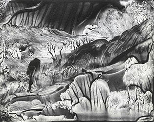
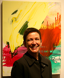
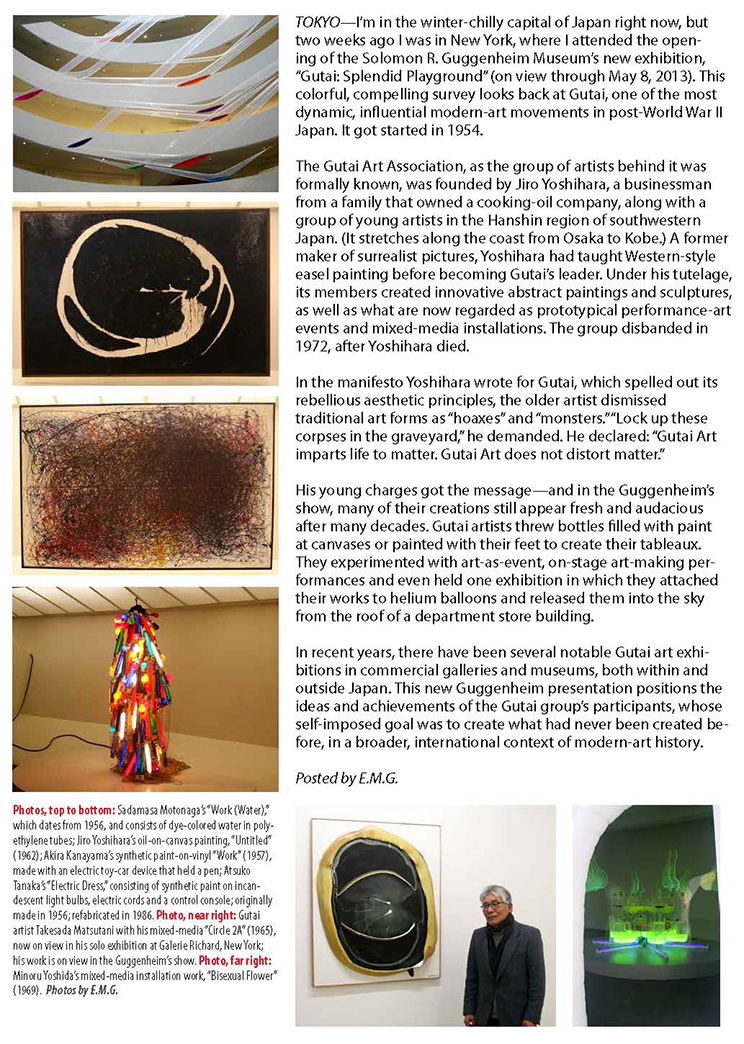
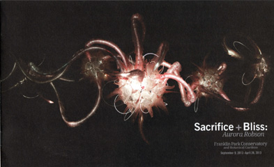
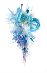
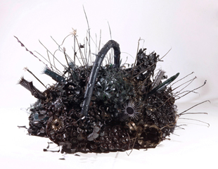
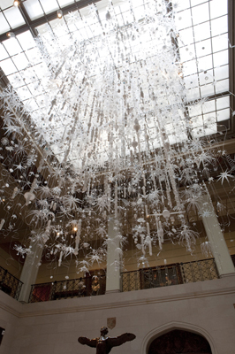
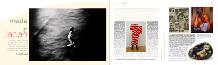
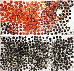
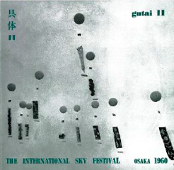

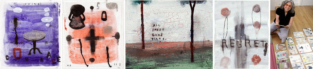
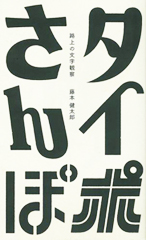
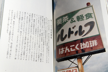
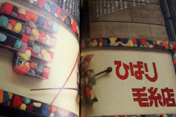
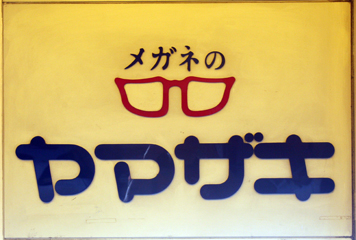
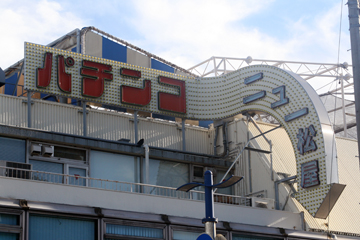
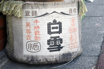
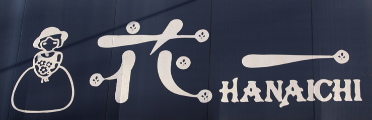
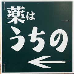
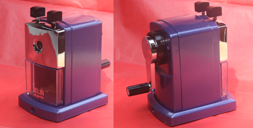 TOKYO - Among other urgent errands on my “To Do” list today, I picked up a pencil sharpener I had special-ordered from a stationery shop in a large department store. Here’s a photo of the little treasure.
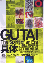
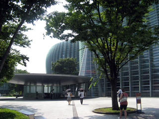
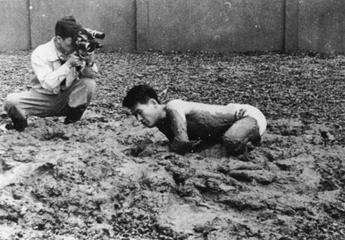
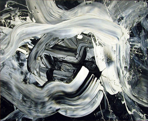 All of these exhibitions come at a time at which a growing number of art historians and curators in Japan and the West are becoming interested in Gutai’s “transnational” character—in how its artists used the mass media, constructed and projected their group’s identity and values, and unabashedly asserted the fullness and seriousness of purpose of their contributions to the dominant art currents of their time, despite their relative isolation and distance from the era’s leading creative and market centers, such as New York or London. (See my article about this tendency in the
 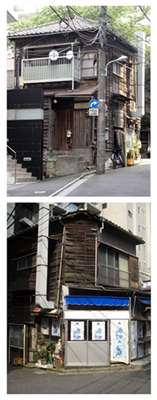 TOKYO - If Japan’s capital feels hotter than ever right now—certainly more swelteringly hot in the summer than I can remember it ever having been over many years’ time—then blame it on global warming, right? Is any other proof needed, along with all those sweating polar bears and melting icebergs, that, around the world, temperatures are rising, and familiar weather patterns are dramatically changing? Even springtime cherry-blossom season has been occurring earlier and earlier.
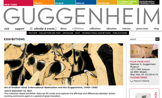
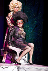
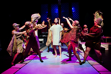
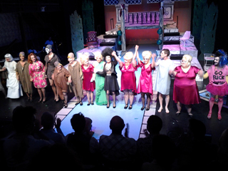
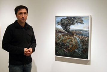
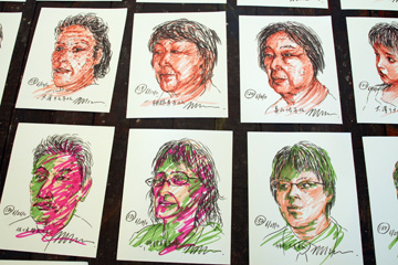
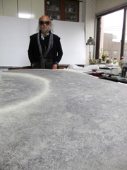
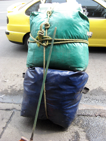
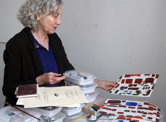
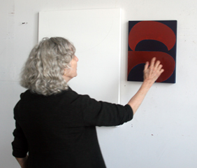
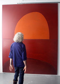
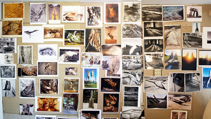 NEW YORK- In recent years, I’ve been following with interest the development of the British-born sculptor
 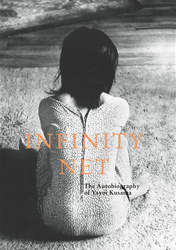 NEW YORK - Last month, the Japanese modern artist
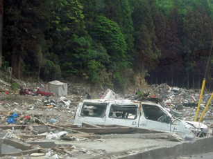
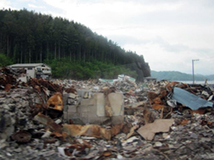
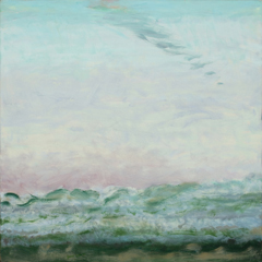
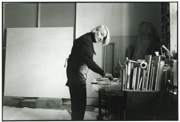
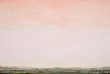
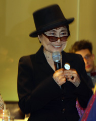
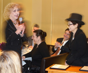
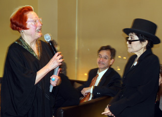

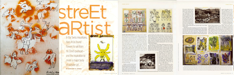
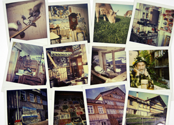 NEW YORK - Last summer, I had an opportunity to go back to Switzerland, the country where I spent the formative years of my childhood, to do research about the Swiss outsider artist Hans Krüsi (1920-1995) at the
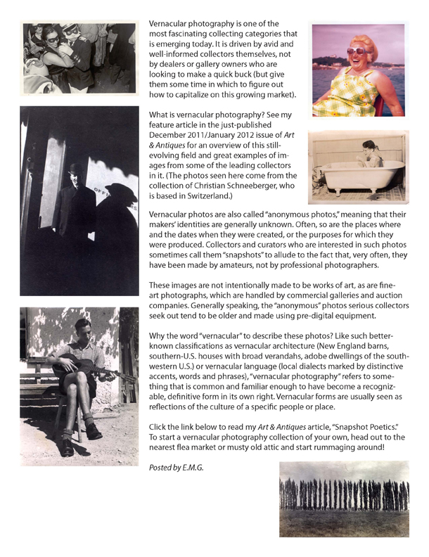
 To read this article online, click
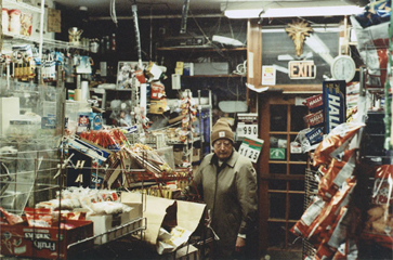
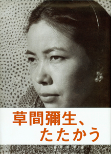
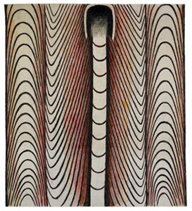
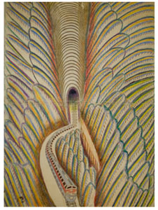
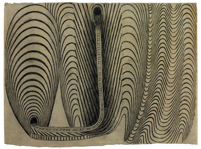
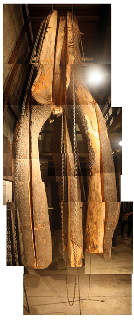
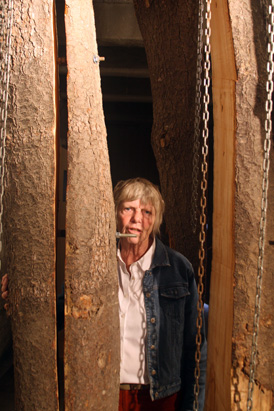
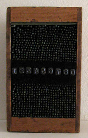 HUDSON, NEW YORK—
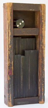
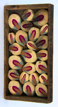
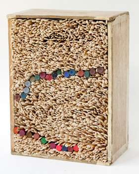
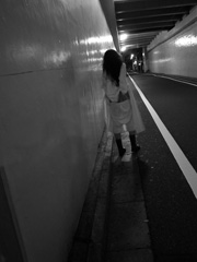
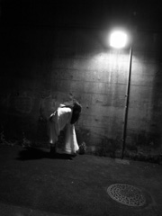
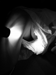
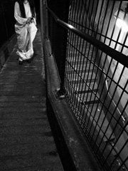
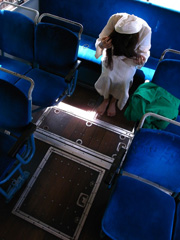
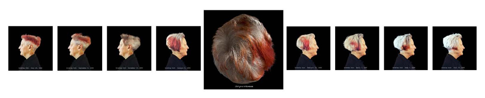
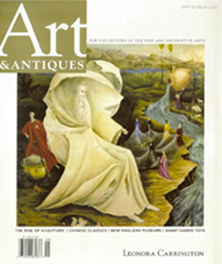
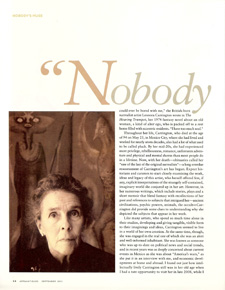
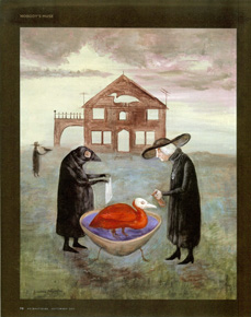
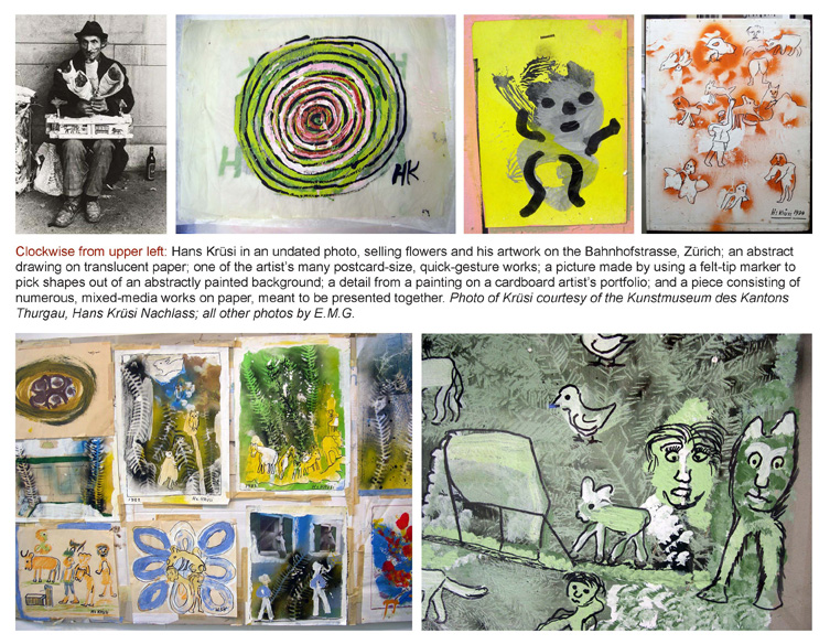
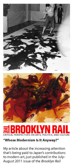

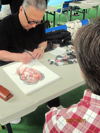
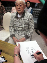
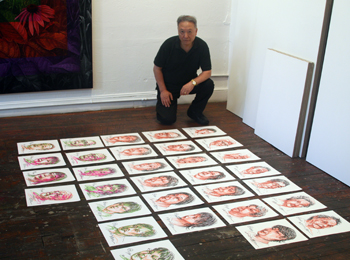

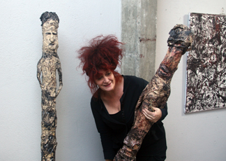
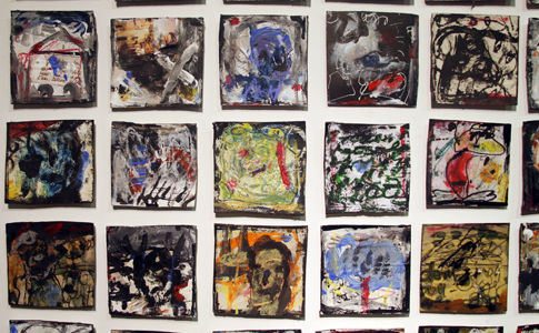 Galerie Krugier & Cie was founded in 1962 by Jan Krugier (1928-2008), a Polish-born survivor of Nazi concentration camps. A legendary, discerning aesthete, during his long career Krugier showed the work of some of modernism’s most venerated masters, including Picasso, Alberto Giacometti, Balthus, Giorgio Morandi and Alexander Calder. The gallery is now run by his daughter, Tzila Krugier. (Late last year, Krugier’s New York branch closed after a run of more than two decades.) Gene Mann is the first new artist Tzila Krugier has brought into the gallery’s fold since taking over its operation.
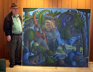
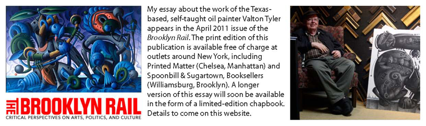


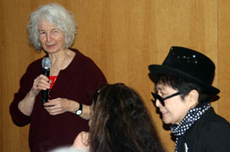
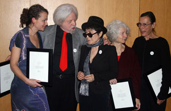
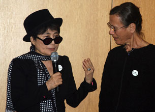 Jean-Jacques Lebel, who, like Ono, took part in the
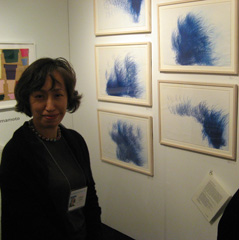
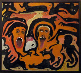
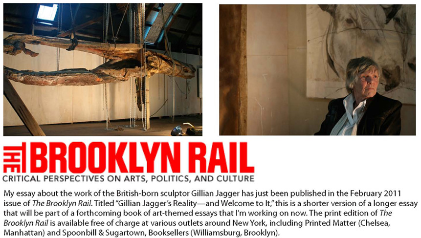
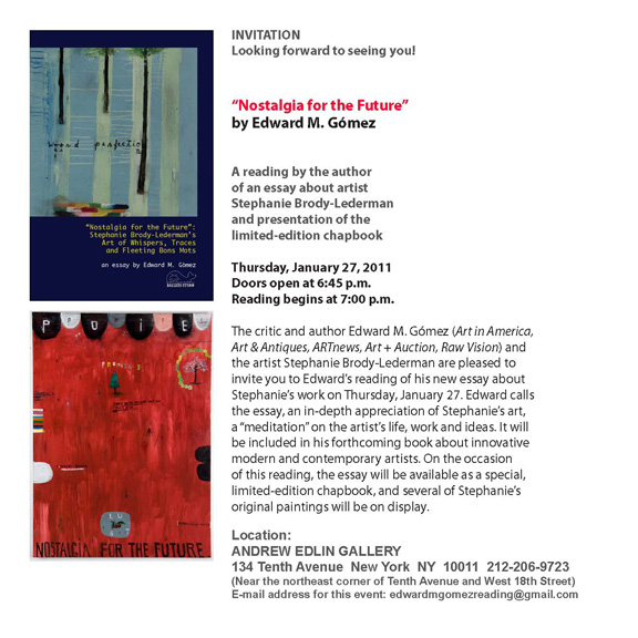
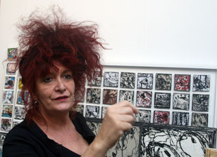
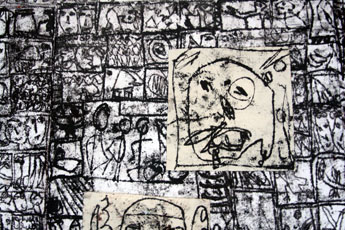
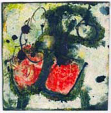
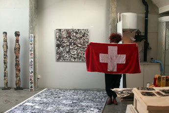
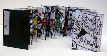
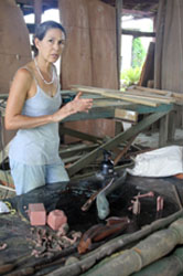
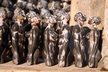
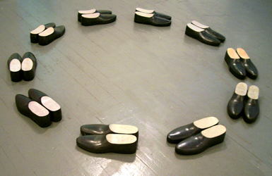
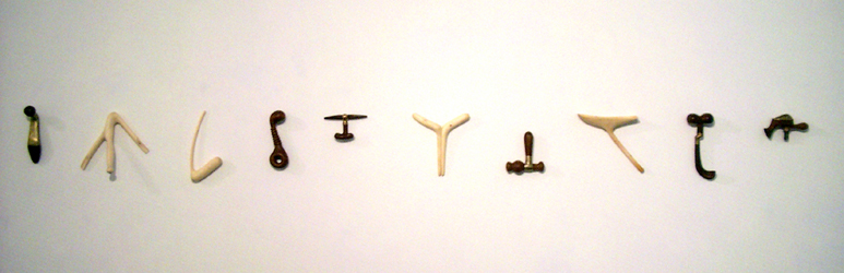
 Guðjón’s “tools,” with their organic, anthropomorphic and often ergonomic-looking shapes, at first glance resemble familiar graters, rollers, clamps, diggers or pincers but they are none of those helpful items. Not exactly.
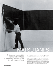
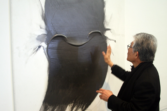
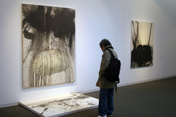

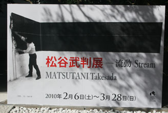
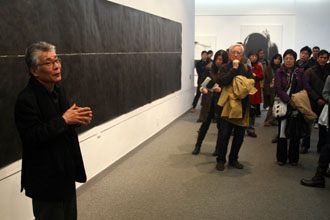
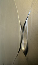
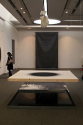
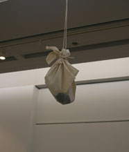
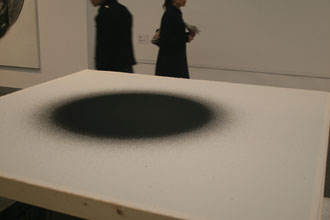
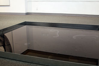
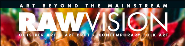
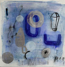
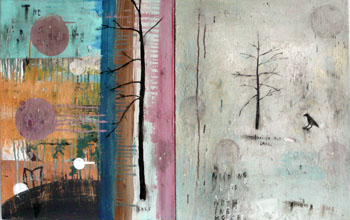
 Control (2008) features a figurine of the late Pope John Paul II, creeping along and holding up a cross as he confronts a crucifix. A serpent’s tail extends from the end of his robe. It is sliced like a sausage to reveal a meaty interior, and the effect of this meticulously painted, strange, paper-and-balsa-wood protrusion is visceral. By contrast, The Wave, the Particle, the Light (2009), a projection onto a wall of a computer-drawn, naked Jesus Christ, which turns slowly on various axes before spinning out of control in an intense, white blaze. It gives visible form to the metaphorical notion of the Christian savior as a source of spirit-cleansing, pure, powerful light.
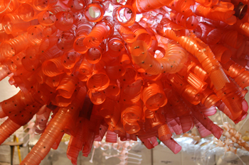
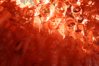
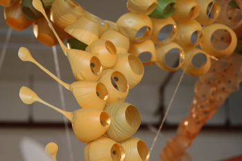
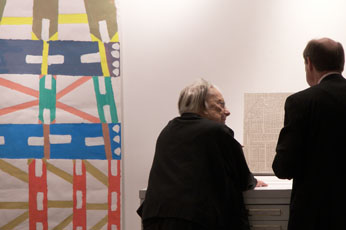
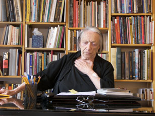
 These artists’ works, many of which Kind showed, were partly surrealist and full of fantasy. Their unabashedly handcrafted qualities were the antithesis of the East Coast’s cool-slick, pop-art style. It was with such trend-bucking art forms in mind that, over the years, Kind routinely pointed out what it was that she was looking for when she looked at art. She said: “I look for a strong, original vocabulary of form and for evidence that artists are making art not because they might want to but instead because they have to.” The British-born sculptor Gillian Jagger, who showed her mixed-media works at Kind’s New York gallery in the early 2000s, says: “Phyllis calls art that meets these criteria ‘the art of necessity,’ meaning art in which it is evident that the people who make it do so because they are absolutely compelled to do so.”
 Zindato, an Italian, self-taught artist who lives in Mexico, met Kind in 2000. She started showing his work that same year. Last week, he stopped in New York en route to Europe, and we met and talked about the legacy of Phyllis Kind and her gallery. Zindato said: “I always appreciated being able to speak with her, because she always offered revealing observations about my work, calling attention to details no one else would have noticed. She would look at a work and pull out a drawing by Wölfli or Carlo and make comparisons, a gesture that showed how thoughtfully she had been looking at art for so many years. If something about a work of art was too obvious, it was meaningless to her. I would say that her relationship with many works of art was and is really very personal.”
 On his own


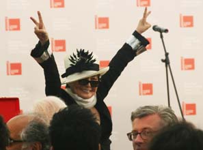
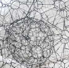
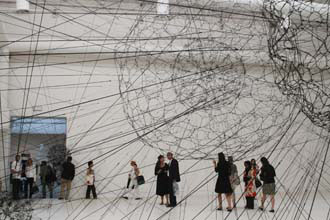
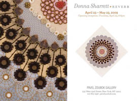
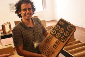

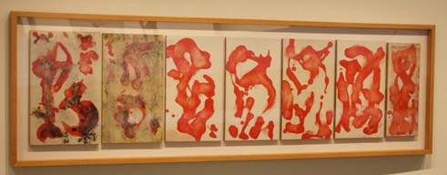
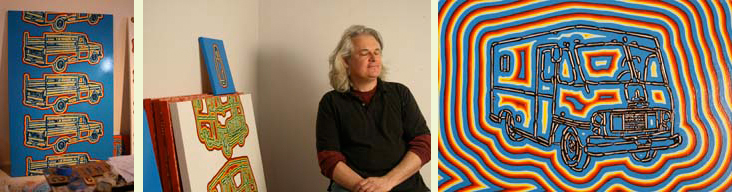
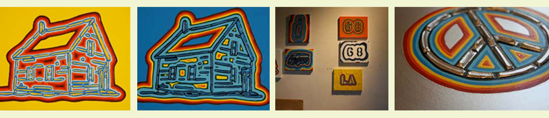
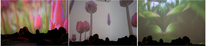
Now available: My essay, "Nostalgia for the Future," about the American painter Stephanie Brody-Lederman, in a limited-edition chapbook published by Ballena Studio. To order a copy, send a check or money order for U.S.A.$6.00 (U.S.A.$7.00 for orders outside the United States) to: Ballena Studio, P.O. Box 7339, J.A.F. Station, New York NY 10116-7339 U.S.A.
|
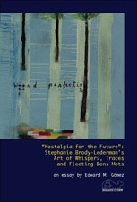
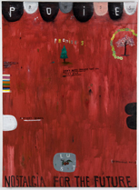
What does any abstract work of art mean? Should abstract works convey any meaning anyway? My essay, “Abstraction’s Ambiguity Is Its Own Reward,” on the ambiguous nature of abstract art, especially abstract painting, appears in the May 2011 issue of the Brooklyn Rail. Click here to read it. Photo above: Karl Klingbiel, Book of Days (2010), oil on paper (woodcut print) mounted on canvas, mounted on board; 41 inches × 41 inches. Photo courtesy of Karl Klingbiel Studio and Elizabeth Moore Fine Art, New York. |
My article about an interesting discussion that is now going on in the field of outsider/self-taught artists' art has been published in the February 2011 issue of Art & Antiques. The debate focuses on this question: Should there even be a distinction of categories between art made by academically trained, "professional" artists and art that is created by self-taught art-makers? Here is the complete Art & Antiques article in PDF form. |
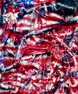
My article about the Japanese modern artist Takesada Matsutani, pegged to his recent museum exhibition in Kamakura, Japan, has been published in the May 2010 issue of Art in America. (See my 7 February 2010 "Journal" item, below, for information about this artist and his recent exhibitions in Japan.) Matsutani, who has been based in Paris since the late 1960s, was a member of the so-called second generation of the post-World War II Gutai group of prototypical performance and abstract-expressionist artists in Japan. Here is the complete Art in America article in PDF form. |
My interview with the artist Aurora Robson was published in the October 2009 issue of Art in America. In it, the Brooklyn-based, Canadian creator of paintings and mixed-media collages, and of sculptures made from cast-off plastic bottles, talks about her philosophy of art-making and the techniques she employs. Of special interest: Robson's environmentalist outlook and how she puts her save-the-planet values into practice as an artist and teacher. Read the article here. It's a large PDF. |