16 March 2021
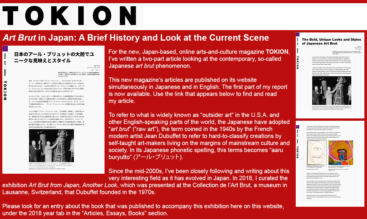
Please click here to see my TOKION article (in English) about Japanese art brut. Click here to see it in the form of a .pdf file.
私のTOKION文化雑誌に掲載された日本のアール・ブリュットについての記事を日本語で読むためにこちらをご覧ください。.pdfファイルです。
8 March 2021
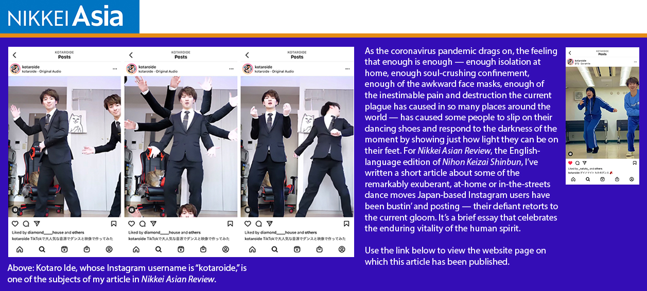
Please click here to see my NIKKEI ASIAN REVIEW article about the Japanese Instagram dancers.
私の日本人のインスタグラムのダンサーについて日経・アジアン・レビューに掲載された記事を読むためにこちらをご覧ください。
1 February 2021
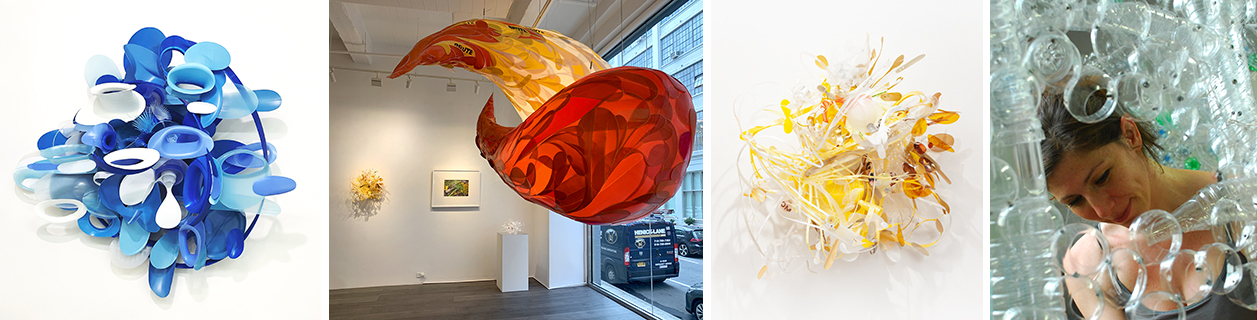
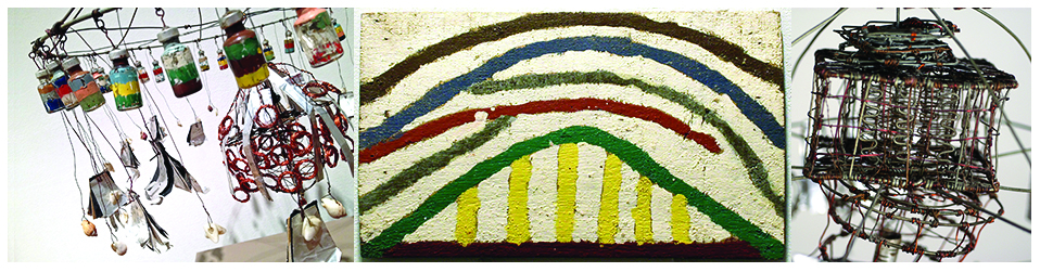
Aurora Robson’s exuberant, otherworldly art reimagines and transforms plastic rescued from the waste stream
More than a decade ago, I first met the Canadian-born artist Aurora Robson and began an ongoing critical dialog with her about her unusual and uniquely expressive work, and writing about it for magazines and exhibition catalogs. At that time, she kept a studio in a high-ceilinged, warehouse-type building in Brooklyn. More recently, she has lived with her family and worked in a rural setting in the mid-Hudson Valley region, north of New York City.
There, over the past several months, she created the new works that are now on view in the exhibition Remnant Romance, Environmental Works: Idelle Weber and Aurora Robson. It is on view through February 27, 2021, at Hollis Taggart Gallery in New York (at 521 West 26th Street, in Manhattan’s Chelsea district). This presentation features a group of Robson’s new sculptures and a selection of paintings by the late American artist Idelle Weber (1932-2020). Weber, who died last year, was associated with the Pop Art and Photorealist movements earlier in her career.
As I write in the essay that appears in the catalog that accompanies this exhibition, in her Photorealist paintings, Weber “documented with precision and grace an otherwise overlooked and, from the mainstream art establishment’s point of view, seemingly unworthy subject — the ubiquitous piles of trash that are to be found every day, in urban settings and just about everywhere. With technical skill and a sympathetic eye, [she] became a portraitist of the used-up and the cast-off — beer bottles, candy wrappers, broken furniture, and even the occasional dead bird [...].”
|
| Sculptures made with repurposed plastic waste by the artist Aurora Robson, now on view at Hollis Taggart Gallery in New York City; from left to right: “Utilize the Portal," 2020, "Ding Dang," 2018, and "Buckle Up, Buttercup," 2020. Right: Aurora Robson at work in her previous studio, in Brooklyn, New York, in the 2010s. (Photos courtesy of the artist.) |
Aurora Robson was born in Toronto in 1972 and spent time in Seattle before moving to New York to study welding and pursue her art-making career. Long ago, she became deeply concerned about pollution, consumer-generated waste, and the harm the human species had inflicted upon the natural environment. Robson developed ways of using plastic bottles and other kinds of plastic trash, which she cleans and manipulates using non-toxic tools and techniques, as the raw material of her art. Her goal has been to produce art without generating any additional waste. As I note in my essay in the current exhibition’s catalog, “All of her sculptures seem to share classic modernism’s fascination with the expressive power of pure form.”
About her works that are now on view at Hollis Taggart, Robson told me, “These newest pieces integrate all the ways of sculpting and working with debris that I’ve experimented with and found effective over the course of my practice as an artist so far. I mix plastic with other packaging, and sewing with welding. I see these combinations as a metaphor for unity — for our need to unify our approaches to solving global problems in a fractured and fragmented time.”
You can see my essay and the published exhibition catalog in its entirety here, in an interactive, on-screen version that allows you to turn the pages electronicllay just as you would turn the pages of a printed book.
26 January 2021
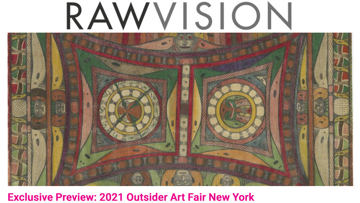
2021 Outsider Art Fair New York to take place online and in several in-person exhibitions
This year, because of the coronavirus pandemic and COVID-19 crisis, which are out of control in the U.S.A., the Outsider Art Fair New York will not take place at its usual location. Instead, it will take place in the form of an online event, along with several exhibitions that will be on view at various venues in New York. Most of the artworks on display in these exhibitions will be for sale. The fair will be open to the general public from Friday, January 29, through Sunday, February 8.
My preview article about the 2021 Outsider Art Fair New York has been published on RAW VISION’s website. You can find it here. Some noteworthy works of art will be avalable for sale at this year's fair, including a superb Adolf Wölfli drawing from the early 1920s, which is being offered by the London-based Gallery of Everything.
1 January 2021
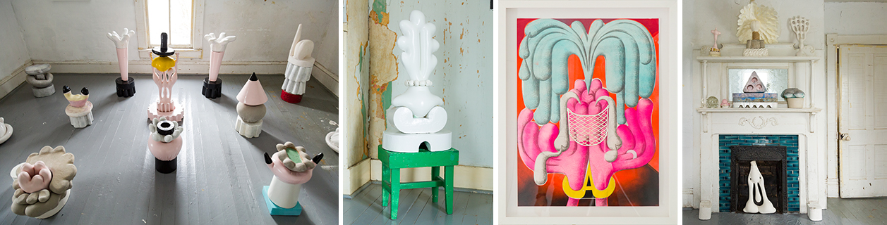
Unusual online exhibition: Mike Goodlett’s sensuous sculptures on display in an old house in rural Kentucky
For the reclusive artist Mike Goodlett, who was born in Lexington, Kentucky, in 1958, the locus of his art-making and daily life is a seven-room old house in the central part of his native state in which his grandparents once resided. Today, he lives there alone. Ever since he moved in, back when he was 30 years old and well after having earned an undergraduate degree at the Art Academy of Cincinnati, it has served as his home, studio, laboratory, and refuge.
|
| Mixed-media sculptures and a work on paper by the artist Mike Goodlett on display in the rooms of his big, old house in rural Kentucky (photos by Alan Rideout, courtesy of March Gallery, New York) |
Now, in a way the very private Goodlett never had anticipated, it is also functioning as a showcase for the online presentation by March Gallery of Chez lui, a solo exhibition of the artist’s recent sculptures and drawings. March is a new, New York-based enterprise established by Phillip March Jones, the founder of Institute 193, an independent arts center in Lexington, Kentucky, whose exhibitions and other programming focus on traditional and contemporary cultural expressions from the southeastern region of the United States.
“My house functions as a big sketchbook in which I’m free to work out ideas in space, without restrictions,” Goodlett told me during a video call. He said, “It’s a whole world here for me. I make and display art in every room and I interact with it.”
Goodlett has become known for abstract sculptures whose sensuous forms evoke flesh and the human body’s protuberances, voluptuous curves, and erotic temptations.
To make his sculptures, Goodlett devised a technique in which he pours a liquid mixture of regular cement and Hydro-Stone, a gypsum cement used to produce dies and castings with very hard surfaces, into fabric forms he creates himself using four-way stretch material (the same kind that is found in athletes’ body-hugging garments).
His sculptures bring to mind dildos; plump, gloved hands; bunny rabbits’ ears; cows’ udders; and the shoulders and smooth curves of fiberglass or plastic display-window mannequins.
In the recent past, Goodlett used ballpoint-pen ink and thread, which he stitched directly into his paper, to create drawings of abstract, biomorphic forms. To make the newer drawings on view in Chez lui, he used spray paint and stencils that he produced himself.
Alluring tensions can be felt in Goodlett’s sculptures between their formal elegance and their air of subversive, brimming-over lustfulness. He says that he finds inspiration in the Chicago Imagists’ paintings, Tom of Finland’s homoerotic pictures, and old underground comics. With unwitting nods to the sensuously biomorphic blobs or abstracted subjects in the work of such modern-art innovators as Constantin Brâncuși, Jean Arp, or Louise Bourgeois, in their own way, Goodlett’s creations are also grounded in modernism’s fascination with the expressive power of pure form. Within them, though, in a match-up between Discipline and Eros, sexiness and sexuality always win. In his art, their expression is unabashedly, wittily gay.
Visit Goodlett’s Chez lui exhibition here.
25 December 2020
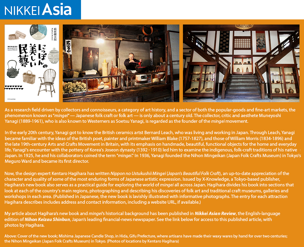
Please click here to see my NIKKEI ASIAN REVIEW article about mingei and Kentaro Hagihara’s new book.
7 November 2020
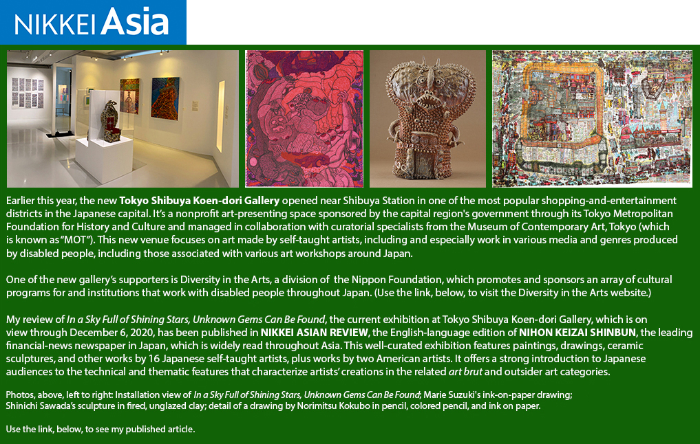
Please click here to see my NIKKEI ASIAN REVIEW article about the exhibition at Tokyo Shibuya Koen-dori Gallery.
私の日経・アジアン・リビューに掲載された東京渋谷公園通りギャラリーについての記事を読むためにこちらをご覧ください。
7 November 2020
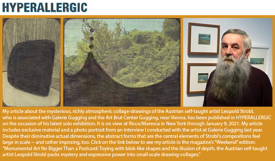
Please click here to see my HYPERALLERGIC article about the Austrian artist Leopold Strobl.
Um meinen Artikel über den österreichischen Künstler Leopold Strobl in der amerikanischen Kulturzeitschrift HYPERALLERGIC zu sehen, bitte klicken Sie hier.
1 November 2020
26 September 2020
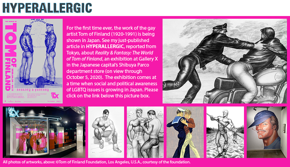
Please click here to see my HYPERALLERGIC article about the Tom of Finland exhibition that is now on view in Tokyo.
私のハイパーアレルギックというアメリカの文化雑誌に掲載されたトム・オブ・フィンランドについての記事を読むためにこちらをご覧ください。
12 September 2020
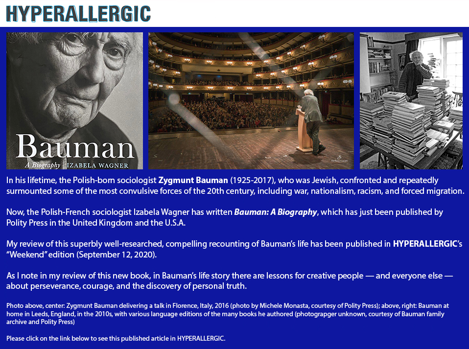
Click here to see my HYPERALLERGIC article about the new biography of Zygmunt Bauman.
29 August 2020
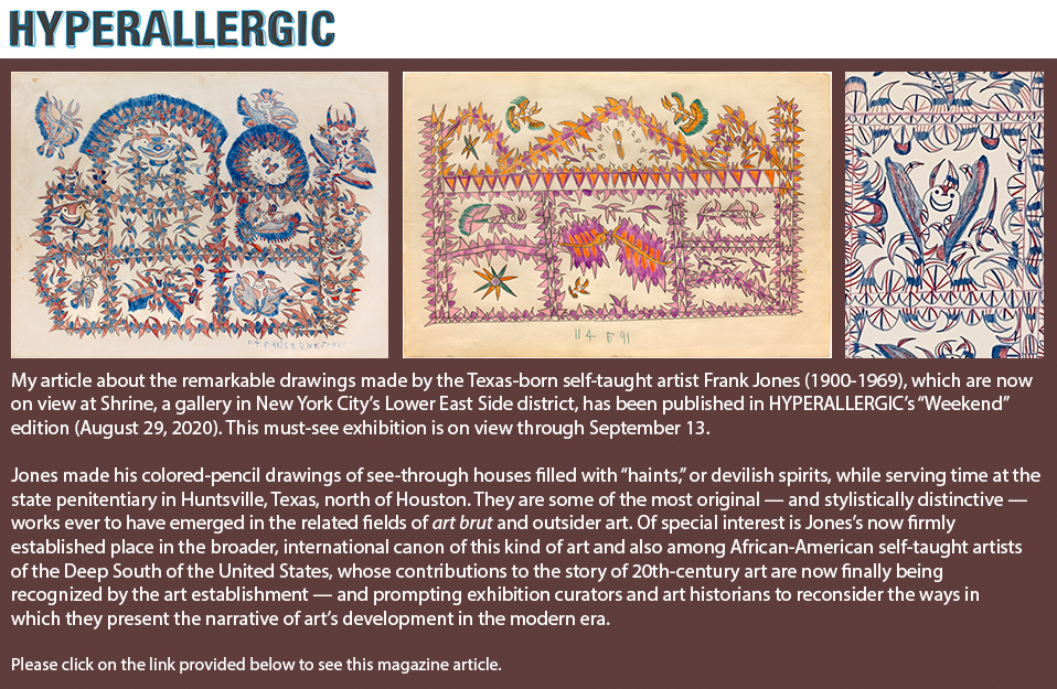
Click here to find my HYPERALLERGIC article about Frank Jones's drawings, now on view at Shrine.
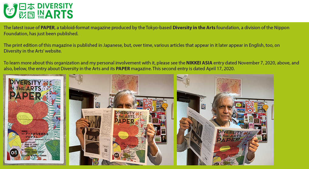
17 April 2020
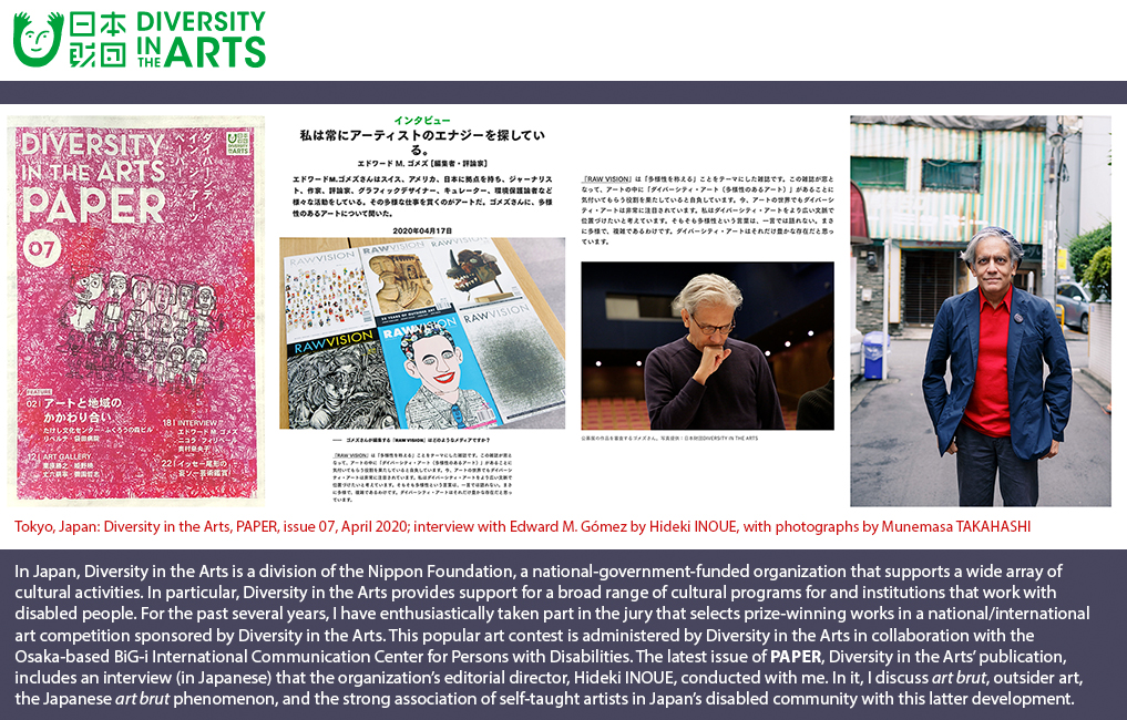
Please click here to see my Diversity in the Arts PAPER interview about art brut, outsider art, and the Japanese art brut phenomenon.
私の日本財団ダイバーシティ・イン・ジ・アーツのPAPERという雑誌に掲載されたインタビューを読むためにこちらをご覧ください。
3 May 2018
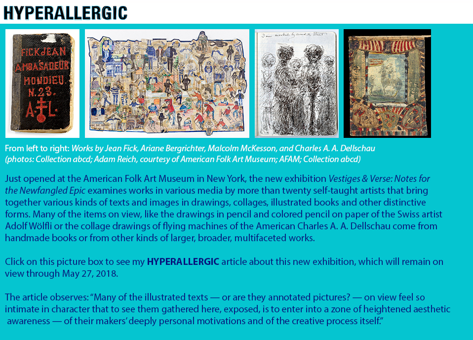
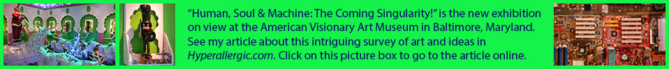
Click on the picture box, above, or click here to see my HYPERALLERGIC article about the Vestiges & Verse exhibition.
13 January 2018
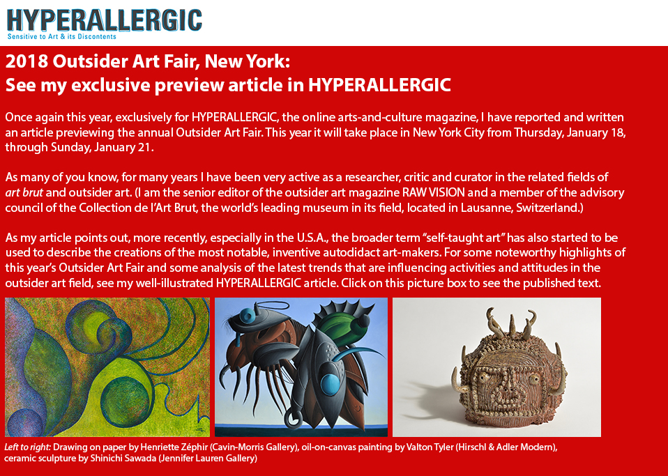
Click on the picture box, above, or click here to see my HYPERALLERGIC article about the 2018 Outsider Art Fair, New York.
12 August 2017
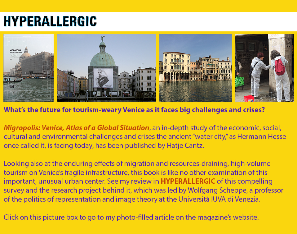
Click on the picture box, above, or click here to see the HYPERALLERGIC article about the new book, Migropolis: Venice.
1 August 2017
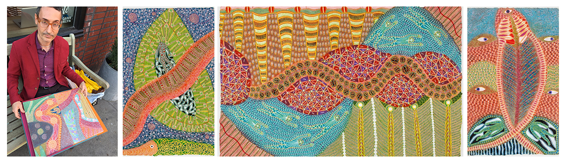
My interview with the artist Domenico Zindato, published in King Kong, Germany
Since the Italian artist Domenico Zindato first appeared on the international scene with a solo exhibition at the now-retired art dealer Phyllis Kind’s gallery in New York, in early 2000, I’ve followed the evolution of his art and ideas with keen interest. I wrote about that first solo show of his in a feature article in the New York Times (Feb. 20, 2000). Since that time, I’ve written numerous articles and exhibition-catalog essays about Zindato’s presentations of his colorful, meticulously rendered pictures in various solo and group exhibitions.
|
| Left to right: The artist Domenico Zindato, in New York, with drawings from the suite 31 (2014-2015); three works from 31: This World is Small as a Grain of Dust, Into the Water's Music and Do Not Ask How It Came About This Creation; all three works dated 2015, ink and pastel on paper; each work measures 16 by 10 inches (photo of the artist by E.M.G.; photos of artworks courtesy of Domenico Zindato and Andrew Edlin Gallery) |
Earlier this year, Zindato, who has long lived and worked in Mexico, showed 31, a new suite of drawings made on handcrafted paper from Oaxaca, at Andrew Edlin Gallery in New York. This is the main gallery that represents the artist today. (See photos of that exhibition’s installation here, and several of the works that were on display here.)
Just prior to that New York presentation, an exhibition of a selection of Zindato’s earlier drawings went in view at COPYRIGHTberlin, an independent art space in Germany’s capital, where the artist had lived and worked in the 1980s, and where he first began making art.
In the lead-up to these two recent exhibitions, I did an interview with Zindato for King Kong, a German magazine that is published in English. Recently I obtained a copy of the published interview in PDF form.
In our interview conversation, the artist referred to what he described as a “spiritual” or “mystical” aspect of his art and art-making process, of which he is very much aware. He told me that he believes that viewers who examine his drawings “activate them with their own energy.” He said, “Through the art, together we share in a kind of blissful communication, a dynamic circulation of energy.”
Read the full
King Kong interview
here. This link will open up a
PDF containing the complete, published article, including photos of Zindato’s artworks from
31.
Posted by E.M.G.
15 July 2017

Click on the picture box, above, or click here to see the HYPERALLERGIC article about Yoko Ono’s record albums.
8 July 2017
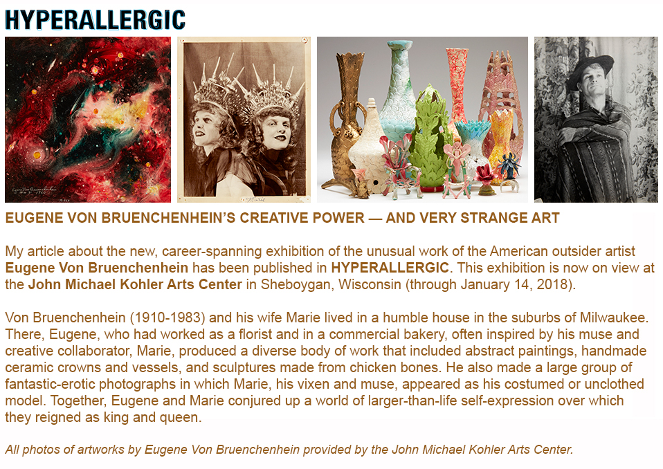
Click on the picture box, above, or click here to see the published HYPERALLERGIC article about the Von Bruenchenhein exhibition.
6 May 2017
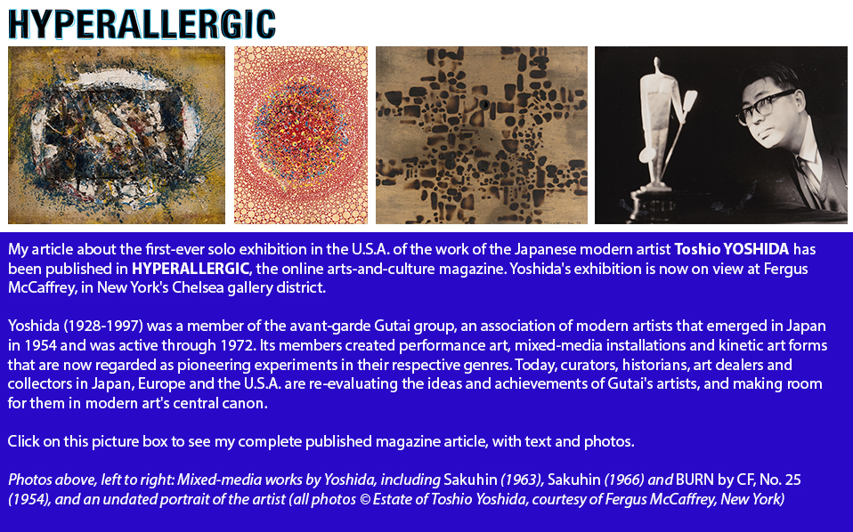
You can also click here to see the published HYPERALLERGIC article about Toshio Yoshida’s exhibition.
8 April 2017
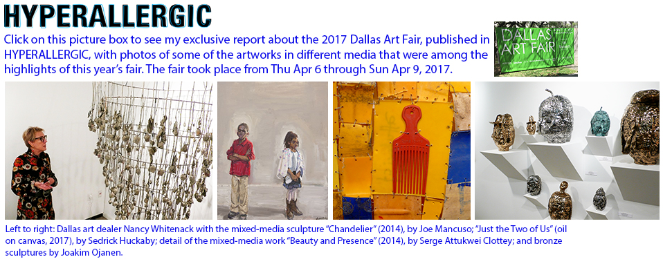
Click here to see the published HYPERALLERGIC article about the 2017 Dallas Art Fair.
1 May 2017
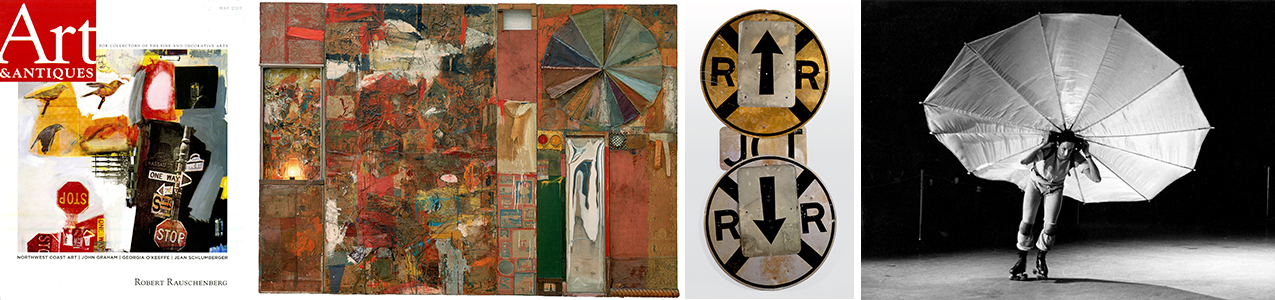
Big Robert Rauschenberg retrospective comes to MoMA, New York: My Art & Antiques magazine preview
NEW YORK ⎯ Get ready: That huge, career-surveying exhibition of the work of the American artist Robert Rauschenberg (Robert Rauschenberg: Among Friends) that was recently on view at Tate Modern in London is coming to the Museum of Modern Art in New York, where it will open to the public on May 21 and run through September 17, 2017.
My preview feature article about this illuminating presentation, which examines in depth Rauschenberg’s varied interests and the wide range of personal experiences and travels that influenced his ideas about art and art-making, has been published in the May 2017 issue of Art & Antiques. It’s the first feature article about this major exhibition to appear in the national media in the U.S.A.
|
| Left to right: Cover of May 2017 issue of Art & Antiques (U.S.A.); Robert Rauschenberg, Charlene, 1954, oil, charcoal, printed reproductions, newspaper, wood, plastic mirror, man's undershirt, umbrella, lace, ribbons and other fabrics, and metal on Homasote, mounted on wood, with electric light, 7 feet 5 inches × 9 feet 4 inches × 3 1/2 inches; Rauschenberg, Polar Glut, 1987, riveted metal street signs, 6 feet 4 1/2 inches × 36 inches × 4 inches; Rauschenberg’s Pelican, 1963, as performed in a former CBS television studio, New York, during the First New York Theater Rally, May 1965 (photos: Art & Antiques; Stedelijk Museum, Amsterdam, © 2017 Robert Rauschenberg Foundation, courtesy of Museum of Modern Art, New York; Museum of Modern Art, New York, promised gift of Marie-Josée and Henry R. Kravi, © 2017 Robert Rauschenberg Foundation, courtesy of Museum of Modern Art, New York; photo by Peter Moore, © Barbara Moore/Licensed by VAGA, New York, New York, courtesy of Paula Cooper Gallery, New York, © 2016 Robert Rauschenberg Foundation, courtesy of Museum of Modern Art, New York) |
From my Art & Antiques article:
“[The] palpable tension between the familiar (all those found and reused car tires, furniture scraps, umbrellas, stuffed chickens, lit light bulbs, printed calendars, Coca-Cola bottles, and other unexpected tchotchkes Rauschenberg liked to appropriate to make his art) and the bracingly new (the genre-busting forms in which he brought them all together in mixed-media ‘paintings,’ sculptures and more) is one of the aspects of this prolific artist’s vast, multifaceted oeuvre that are examined in Robert Rauschenberg: Among Friends.... [...]
At MoMA...the exhibition has become what its organizers call an ‘open monographic’ one, meaning that, at certain points as it recounts the history of the evolution of Rauschenberg’s art and ideas, it branches off and pays special-focus attention to projects he undertook with various collaborators or to the work and thinking of other artists who influenced or inspired him. [...]
[Growing up in] East Texas, the young, dyslexic Robert would have seen examples of homemade ‘yard art’ assemblages of found materials — wood and metal scraps, old tires, wire and more — with which rural African-Americans decorated their porches and properties, a folk tradition that can be traced to the ancestral cultures of the slaves who had been brought from West Africa to the Americas in the colonial era. The roots of Rauschenberg’s collage- and assemblage-oriented art-making lay in such sources, which were familiar to him from an early age.”
The observation in that last paragraph above about one source of Rauschenberg’s well-known found-object assemblage approach to creating works of art — this is a notion and an art-historical detail that interests me very much, especially with relation to the work I’ve done for many years in the related, overlapping fields of art brut, outsider art and the art of visionary self-taught artists. Rauschenberg did not originate the found-object assemblage mode of art-making. Certainly, in modern art, it had been evolving at least since the Cubist era, with Picasso’s Cubist sculptures helping to pave the way for a new kind of sculpture-making, in which sculptural forms were built up or constructed from various materials, rather than being carved or otherwise extracted from a block of stone or some other starting-point raw material.
To read the full article, as it appears in the printed magazine, click here to open and view a small PDF file. To view the article in a higher-resolution, larger PDF, click here. (Size of larger file is 42.7 megabytes.)
Posted by E.M.G.
14 January 2017
Click here to see the published HYPERALLERGIC article, complete with numerous photos of artworks.
30 October 2016
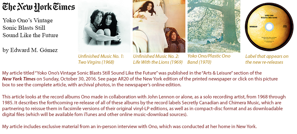
Click here to go to the online version of my New York Times article about Yoko Ono’s record-album re-releases and music-recording career.
8 October 2016
An unusual work of video art in a most unexpected location in the far north of Japan
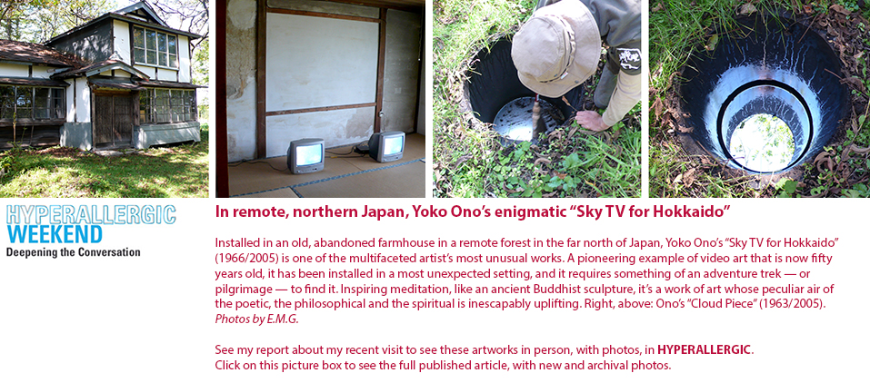
Click here to go to the HYPERALLERGIC article about Yoko Ono’s art installation in the far north of Japan.
Posted by E.M.G.
1 October 2016
In Japan, journeys, adventures and discoveries
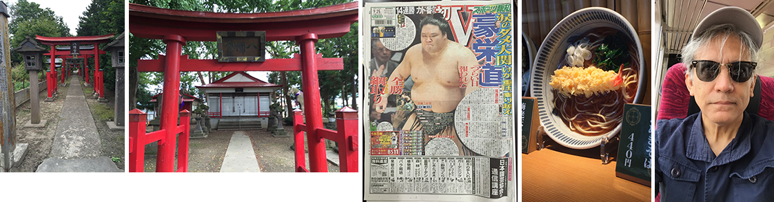
KYOTO, JAPAN ⎯ I have been in Japan for several weeks so far, traveling to different cities and working on various reporting and research projects. Among them, I have been gathering information about contemporary Japanese self-taught artists and scouting for works by such art-makers to include in a big exhibition that I’m organizing in the role of guest curator for a museum in Europe. I have lived and worked in Japan in the past, I speak and work in Japanese, and I visit Japan several times each year. This time, though, my work is taking me deep into artists’ studios and art-therapy workshops run by so-called social welfare organizations, which provide facilities where people with disabilities can go and regularly spend time making art, often with a range of materials made available to them.
A fe days ago, I traveled to the island of Hokkaido in the far north of Japan, where I visited a little-known and rarely seen video-installation work by the artist Yoko Ono, her “Sky TV for Hokkaido” (1996/2005), which was set up in an old, abandoned farmhouse in the Tokachi Millennium Forest in 2005. My article about this unusual artwork and its unexpected setting has been published in HYPERALLERGIC. Click here to see this article, with many photos. (See the picture box at the top of this home page, too.)
This coming Saturday, October 15, 2016, I’ll deliver a talk and take part in a symposium at Doshisha University in Kyoto. The title of the event is “Rethinking the Artistic Expressions of the Disabled.” I’ll be speaking in my role as an art critic and art historian, and as a representative of the London-based magazine Raw Vision, of which I am the senior editor.
|
| Left to right: A Shinto shrine in the small town of Kitanokiwa in Aomori Prefecture in northern Japan; a recent edition of a sports newspaper; a plastic-food menu display in a restaurant's window in Tokyo; myself on the train (again). |
Posted by E.M.G.
10 September 2016
In New Paintings, Elisabeth Condon Pours on Color and Unexpected Forms
NEW YORK ⎯ In Bird and Flower, an exhibition of Elisabeth Condon’s newest works (on view through October 16 at Lesley Heller Workspace in Manhattan’s Lower East Side gallery district), this New York-based artist, with a paint bucket and a stack of floral-patterned wallpaper samples at her side, addresses some of the enduring aesthetic and technical concerns concerning the making of abstract paintings. For many years, pouring watery washes of color onto the surface of a canvas has been one of the principal image-making methods in her art-making kit; she has also worked with Mylar sheets, metallic paints, rhinestones, and other materials.
|
| Left to right: American Pastorale (2016), ink, acrylic, glitter and pumice on linen, 59 x 59 inches; Bluebirds (2016), ink, acrylic, glitter and pumice on linen, 59 x 59 inches; and Elisabeth Condon at work in her New York studio. First and last photos by Phillip Reed, courtesy of Lesley Heller Workspace; middle photo by the artist. |
To produce her latest canvases, Condon has experimented with some new approaches that, in effect, have made the production of her paintings as much the subject of these new works as the birds, flowers and other recognizable, if stylized, images that pop up in them.
The works in Condon’s new “Bird and Flower” series (their collective name comes from that of a 10th-century stylistic school of Chinese painting whose nature subjects were depicted with color-filled outlines) prominently feature birds, voluptuous flowers copied from wallpaper patterns, ferns and leaves, splotches of acidic dark magenta or lemon yellow, and drippy-bright patches of poured color that anchor their backgrounds or push forward like expanding, dissipating mists. The dynamism of Condon’s all-over compositions feels self-propelled, and it’s easy to imagine them stretching far beyond their borders into an endless, gyrating flow of birds, plants and streams of luscious, electric, energized color.
Click here to see my article in HYPERALLERGIC about Condon’s new paintings, which describes her background and ideas.
Posted by E.M.G.
20 August 2016
Roger Ricco, Artist, Has Something to Show You
NEW YORK ⎯ More than thirty-five years ago, along With Frank Maresca, Roger Ricco founded Ricco/Maresca, a gallery specializing in works by both contemporary, trained “professional” artists and those of their most inventive, original, visionary self-taught peers. The gallery is also a showcase for various forms of vernacular art. Together, Ricco and Maresca have authored numerous illustrated books about folk and vernacular art, as well as about the work of important self-taught/outsider artists.
|
| Left to right: Pool with Jungle Night (2015), acrylic on canvas, 32 x 32 inches, and the artist Roger Ricco at his home in Woodstock, New York, in August 2016 (first photo courtesy of Savery Gallery, Philadelphia; photo of artist by E.M.G.) |
As accomplished as Ricco has become as a presenter and promoter of art, less well known is the fact that he started his career as a painter. He earned a degree in fine art at the University of Wisconsin in his hometown of Milwaukee, where, at the end of his undergraduate years, he won the Rome Prize, which allowed him to live and work at the American Academy in Rome for two years. Later he produced psychedelic sound-and-light shows for rock bands in New York in the 1960s, hung out with the Grateful Dead, and became one of the first dealers in the United States to handle such unusual folk art items as scarecrows and wood carvings from fraternal lodges.
In recent years, Ricco has been stepping out publicly to again show his own paintings and photographs. A selection of his most recent works is now on view, through August 28, 2016, at Miyako Yoshinaga Gallery in New York. This exhibition is being presented in collaboration with Savery Gallery of Philadelphia, the artist’s main representative in the U.S. See my HYPERALLERGIC profile of Ricco, which captures him at home and in his studio. This article has just been published on the occasion of his current New York exhibition.
In my article, Ricco says, “As a kid, I visited the zoo. I saw the big cats in their cages. Thinking about them there ⎯ it was almost as though their awareness became my awareness. The paintings I’m making are about the flash of that moment of ‘Aha!’”
Click here to see the complete article, with photographs.
|
| Left to right: Roger Ricco in his studio in Woodstock, New York; Pool with Ladder (2016), acrylic on canvas mounted on board, 33.5 x 32 inches; Cube, Shell and Sphere (2014), archival pigment print photograph, 32.05 x 32.05 inches, edition of ten (first two photos by E.M.G.; last photo courtesy of Savery Gallery, Philadelphia) |
Posted by E.M.G.
13 August 2016
At the Menil Collection in Houston, a trove of self-taught artists’ works finds a museum home
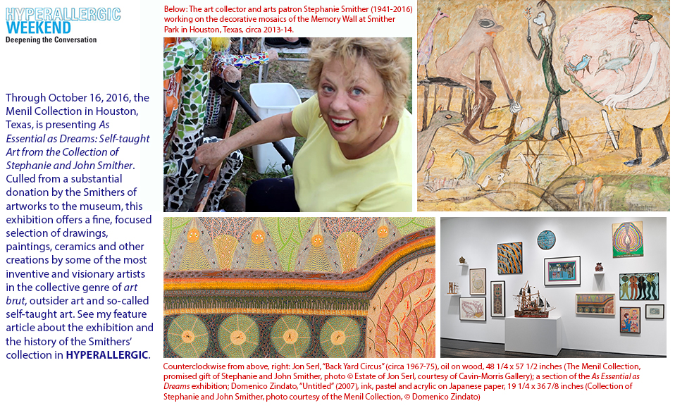
Click here to go to the HYPERALLERGIC article about the exhibition at the Menil Collection in Houston, Texas.
25 June 2016
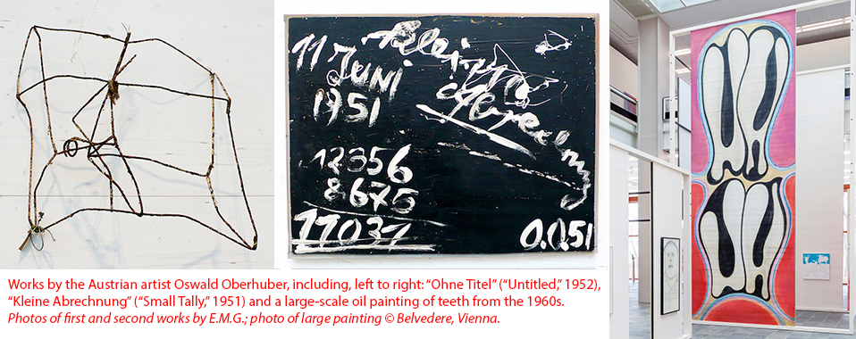
Austrian modern artist Oswald Oberhuber: Prolific practitioner of “permanent change”
VIENNA, AUSTRIA ⎯ Born in 1931, the Austrian artist Oswald Oberhuber has been making drawings, paintings and works in a diverse range of media since he was a very young man. While growing up in Innsbruck, in western Austria, he was influenced by what he learned about the art informel movement in France in the 1940s, in which European artists created various kinds of abstract art. He went on to explore the expressive potential of plaster, wire, assembled found objects and various other modes of art-making during the course of a career that has lasted nearly seven decades. Over the years, Oberhuber was also influential in his work as an exhibition organizer, art teacher and rector of Vienna’s University for Applied Arts.
Oswald Oberhuber, a comprehensive, career-spanning retrospective of Oberhuber’s work, which has always been experimental and through which a cheeky, subversive current has always flowed, is on view at 21er Haus, a venue for modern and contemporary art that is part of the larger Belvedere museum complex. 21er Haus is located on the edge of a park near Vienna’s main train station.
Oberhuber calls the spirit of his forward-charging creative process the “principle of permanent change.” That label reflects his desire as an artist to never stand still. In an interview published in a booklet that accompanies the current exhibition, he says, “You have to keep taking a fresh approach because continuity doesn’t exist.”
My Hyperallergic article about the Oberhuber exhibition has just been published. You can find it here, with a good selecton of photos of Oberhuber’s arworks.
Posted by E.M.G.
4 June 2016
The haunting ⎯ and hauntingly beautiful ⎯ found-object assemblage art of Hannelore Baron
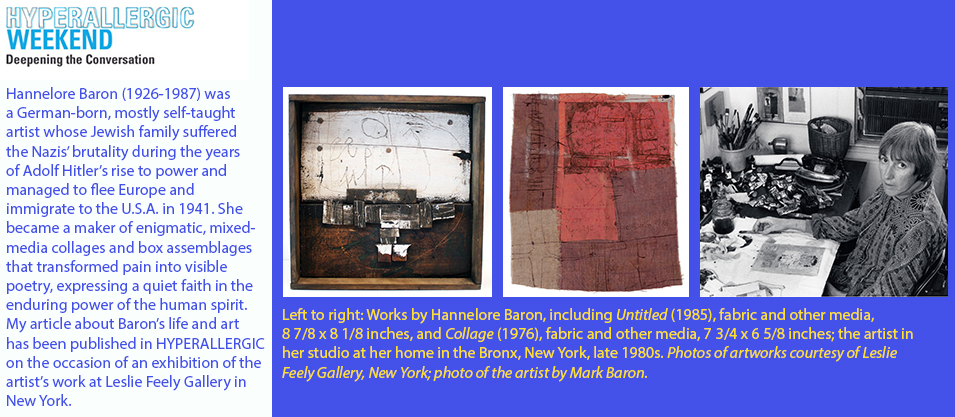
Click here to go to the HYPERALLERGIC article about Hannelore Baron and the new exhibition of her work in New York.
28 May 2016
With eyes focused on Japan in the 1960s, looking more deeply and more broadly at modern art’s history
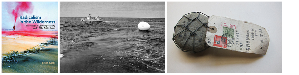
|
| Left to right: Cover of art historian Reiko Tomii's new book; The Play, Voyage: Happening in an Egg (1968), photo of performance-art event in progress (photo © The Play); Michio Horikawa, The Shinano River Plan 11 (Mail Art by Sending Stones) (1969), stone, wire, mail tags (mailed to artist Yutaka Matsuzawa) (collection of Kumiko Matsuzawa, photo by Reiko Tomii). |
NEW YORK ⎯ The Japanese-born art historian Reiko Tomii is one of those researchers who is both passionate about her subjects and recognized among her peers for her meticulous mapping of the cultural-intellectual terrain from which they emerge. An independent scholar who has lived and worked in the United States since the mid-1980s, Tomii has focused her research on the artists and art movements of post-World War II Japan.
In her new book, Radicalism in the Wilderness: International Contemporaneity and 1960s Art in Japan (MIT Press), Tomii expounds upon the notion of “international contemporaneity” with regard to certain avant-garde artists’ activities and ideas in Japan during a decade in which conceptual art was developing with vigor in Europe and North America. As conceptual art evolved in different parts of the world, conventional, physical works of art ⎯ paintings, sculptures, drawings ⎯ became “dematerialized” in the face of a new kind of art whose substance was ideas or actions; this new form of artistic expression often effectively eliminated the materiality of the familiar, artist-made art object. In examining how certain ways of thinking about and producing or presenting art developed in different countries with similar concerns in mind, even if certain conditions, aesthetic values or historical backgrounds varied from place to place, Tomii and like-minded art historians and curators in recent years have demonstrated a keen interest in a broader, deeper view of modern art’s evolution that looks beyond its more well-known centers in Europe and North America.
Tomii’s research has contributed significantly to this new, so-called global view of modern art’s history. In Radicalism in the Wilderness, she describes “international contemporaneity” as “a geohistorical concept, one that liberates us from the inevitable obsession with the present inherent in ‘contemporaneity’ as used in the English construction of ‘contemporary art’ (whose basic meaning is ‘art of present times’) and helps us devise an expansive historical framework” by means of which “a multicentered world art history” may be told. She argues that an understanding of this phenomenon may make room for overlooked or ignored currents in the story of modern art as it developed in 20th-century Japan after World War II. She also puts forth the related notions of what she calls “connections” and “resonances,” the meanings of which become self-evident as her study unfolds.
For more about Tomii's eye-opening research, see my article about her new book in Hyperallergic. Click here to see the complete article, with photos.
Posted by E.M.G.
23 April 2016
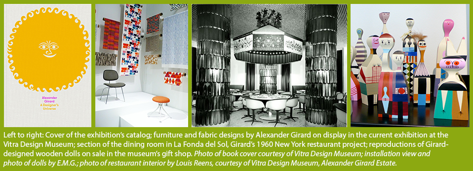
Alexander Girard: An all-around design Wunderkind’s wide-ranging, multifaceted oeuvre
WEIL AM RHEIN, GERMANY ⎯ Was there a field to which the American designer Alexander Girard (1907-1993) did not contribute in the most innovative, imaginative ways? Fabrics; posters; furniture; home, office and restaurant interiors; an airline’s corporate-identity scheme; the color-themed rejuvenation of a Midwestern American town’s entire main street and its historic buildings’ façades ⎯ during his long career, there seemed to be no project too big or complex that Girard would or could not pursue in ways that set high aesthetic standards for his peers in the related worlds of architecture, interior design and graphic design. Brought up and educated in Italy and England, Girard went on to become one of the giants of late-20th-century design, often collaborating with some of the the most original architects of his time. Still, even to many informed design aficionados, his work is not as well known as it deserves to be.
 e.
e.
Recently I saw the big, career-spanning exhibition Alexander Girard: A Designer’s Universe, which is on view through January 29, 2017 at the Vitra Design Museum in Weil am Rhein, Germany, just north of the border with Switzerland, near Basel. It’s an excellent, informative, wide-ranging survey that is well worth making a point of seeing if you find yourself traveling through this part of Europe anytime this year.
I have written a feature article about Girard’s achievements and this noteworthy exhibition, which has been published in Hyperallergic, the arts-and-culture magazine. Click here to see the complete article, with photographs.
From the article:
“The Vitra exhibition examines several of Girard’s large, multi-component projects, every aspect of which he personally oversaw and elaborated. It also presents hundreds of sketches, models and produced designs for fabrics, housewares, posters, and other objects, as well as a large selection from Girard’s folk art collection. [...] Girard really never stopped working, and compelling ideas never ceased to flow from his sketchbooks and material experiments. [...] The Vitra show serves as a reminder that to examine Girard’s patterns, drawings, wooden dolls, and other designs is to discover anew the power of creative thinking and problem-solving ⎯ as well as their prolific creator’s unsinkable sense of unabashed, irresistible joy.”
Posted by E.M.G.
3 April 2016
At Museum Gugging, near Vienna, my lecture about Japanese art brut
MARIA GUGGING, AUSTRIA ⎯ On April 3, 2016, I presented a talk at Museum Gugging in the Art Brut Center Gugging, which is located about 12 miles to the northwest of central Vienna. The subject of my lecture was the still somewhat new but fast-evolving field of so-called Japanese art brut, in which, in Japan, an active, inquisitive, enthusiastic group of cultural organizations, curators and some art dealers in recent years have been paying close attention to the creations in different genres of talented, self-taught art-makers. Many of these autodidacts have been and are participants in art-therapy workshops or programs sponsored by private or government-operated social-welfare organizations, as such institutions for disabled persons are known in Japan.
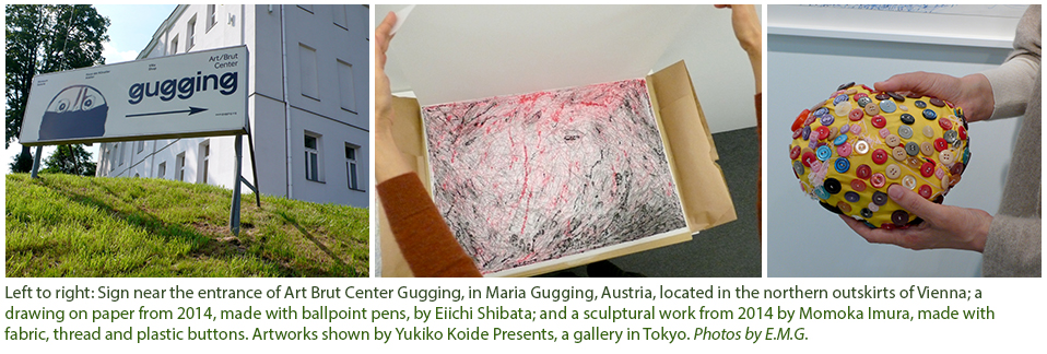
In my talk I pointed out that, although some remarkable bodies of very original work and their creators have been identified in Japan, to date some of the main presenter-promoters of this kind of art in that country have emphasized that art brut is normally or largely produced by disabled persons. As a result, insofar as this kind of art has become known by a broader Japanese public, art aficionados who know anything about it at all (and the mass media, too) tend to assume that all art brut is made by disabled persons. In fact, this kind of art can be and is produced in Japan and around the world by a wide range of self-taught artists, not all of whom are living with various kinds of physical disabilities or mental illnesses.
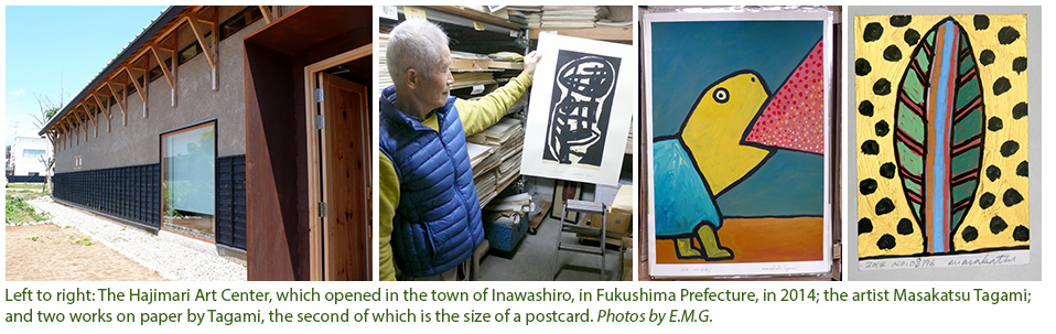
In my presentation, I showed photos of artworks in different media by a wide range of contemporary Japanese self-taught artists. I described the character and purposes of Japanese social-welfare organizations and, in an introductory way, placed the works of self-taught artists from Japan in the broader critical and historical contexts of the related categories of art brut, outsider art and self-taught artists’ art. (Those three labels are sometimes used synonymously but, in fact, each one conveys a slightly different, nuanced meaning.) I mentioned new institutions in Japan, like the Hajimari Art Center in Fukushima Prefecture, that have emerged in recent years as venues that are especially interested in the presentation of self-taught artists’ works.
My talk at Museum Gugging coincided with its presentation of the exhibition Art Brut: Japan - Switzerland, which had originated in 2014 at the Museum in Lagerhaus in St. Gallen, Switzerland.
Posted by E.M.G.
18 March 2016
Emily Eveleth’s eloquent, captivating portraits — of the world’s most luscious doughnuts
NEW YORK — She’s back! Emily Eveleth, one of the most talented painters and original artists anywhere on the contemporary-art scene, is presenting a selection of her most recent paintings in oil on canvas (plus a few very small pictures made on wooden panels) at Danese/Corey Gallery in Manhattan’s Chelsea district. This just-opened, must-see exhibition will run through April 15, 2016.
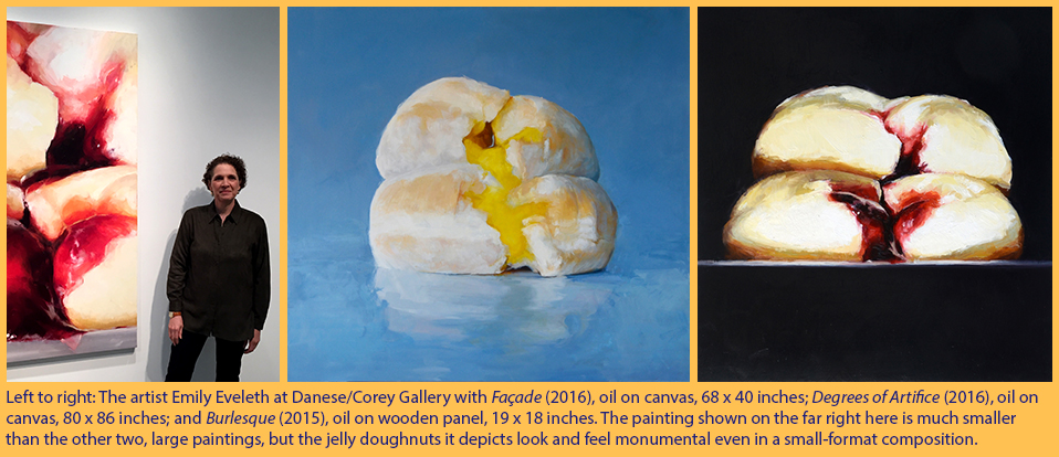
I first saw Eveleth’s unusual and skillfully realized paintings several years ago in New York. Around that time, I also had the pleasure of meeting her at her studio in a town on the outskirts of Boston. My first article about her work was then published in the New York Times (and can be found here).
Steeped in picture-making traditions that evoke the paint handling of European Renaissance masters — to represent light, mass and depth, and to capture and convey something of the essential character of a subject — Eveleth’s images are, in fact, as much portraits as they are still lifes. Or are they some kind of landscape images, in which her inanimate subjects substitute for mountains? Her “sitters” are not human. Instead they are doughnuts — luscious, golden or frosting-covered pastries, which she often depicts split open, spilling their gooey, jewel-colored jelly guts and collapsing in on themselves like droopy specimens of just-captured game, fresh from the hunt, of the kind that sometimes appear in Netherlandish still lifes.
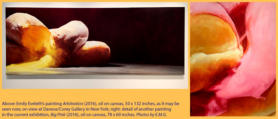
Despite their subject matter, Eveleth’s images are not pop art in style or attitude. Recently, the artist told me, “I enjoy seeing what happens when I approach the painting of a doughnut like that of, say, a classical still life or a heroic landscape.” She adds, “There’s a tension that results when you realize that such an ordinary subject is being given this kind of painterly treatment. It’s not what you would expect. I like the tension that can be felt as the image appears to constantly shift between genres.”
My latest article about Eveleth and her art, which is pegged to this new gallery exhibition, has been published in the April 2016 issue of the American magazine Art & Antiques. Click here to see this article in PDF form.
Posted by E.M.G.
17 March 2016
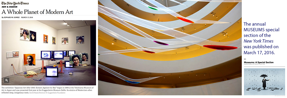
My New York Times report: Museum curators looking more deeply, more broadly, at modern art’s history
|
| Left to right: A photo from my New York Times article offers an installation view of the exhibition Japanese Art After 1945: Scream Against the Sky, which was presented at the now-defunct Guggenheim Museum SoHo, New York, in 1994; the Japanese artist Sadamasa Motonaga's Work (Water) (originally created in 1956), in the exhibition Gutai: Splendid Playground, at the Solomon R. Guggenheim Museum, New York, in 2013; and the logo of the newspaper's special section focusing on museums. Photos taken from the website of the New York Times. |
NEW YORK — Each year, as winter winds down, and spring approaches, the New York Times publishes a special section focusing on the programming and on new trends in the management and offerings of museums around the world.
This year's special “Museums” section was published today. In it appears my report about an interesting new trend, which finds many art historians and curators, and the exhibitions they have been organizing, taking a deeper, broader look at the evolution of modern art. Looking beyond such familiar creative centers as Berlin, London, Paris or New York, which have long figured prominently in the canonical narrative of modern art’s development, the exhibitions these researchers have been assembling and presenting at such institutions as the Solomon R. Guggenheim Museum and the Museum of Modern Art in New York, the Dallas Art Museum in Texas or the Walker Art Center in Minneapolis, Minnesota, among others, have been making room in that well-established history for numerous, less-well-known but attention-deserving artists, art movements, theories or events.
To learn more about this still-evolving curatorial tendency, click here to see my article, “A Whole Planet of Modern Art,” in the “Museums” special section of the New York Times.
Posted by E.M.G.
16 March 2016
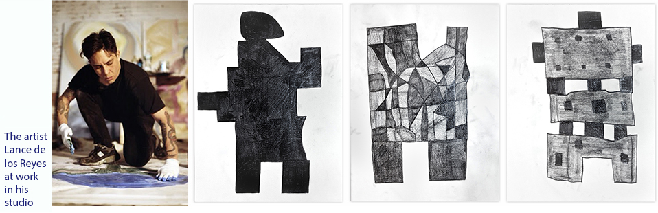
Drawings by Lance de los Reyes: Classic, modernist abstraction from a former graffiti tagger
NEW YORK — Since it opened in mid-January, I’ve been following with interest the programming of Shrine, a new gallery at the southern end of Manhattan’s Lower East Side district, near the eastern edge of Chinatown. It’s located on Henry Street, where several other galleries also have popped up. In recent years, the LES has become a major gallery zone; with its many restaurants, boutiques and ever-stronger hipster vibe, this area is quickly displacing Chelsea as the place for contemporary-art dealers to set up shop.
|
| Left to right: Lance de los Reyes at work, and Builder 1, Builder 6 and Builder 7; all works dated 2016 and made with graphite on paper; each sheet measures 24 x 18 inches. Photo of the artist by Mordechai Rubinstein, courtesy of the artist; photos of artworks courtesy of Shrine. |
Through April 17, Shrine is showing Builder 33, a selection of drawings in graphite on paper and one very large oil-on-canvas painting by the Brooklyn-based artist Lance de los Reyes. A 39-year-old, former graffiti artist who grew up in southern California (where, he told me, he once practiced his renegade métier on the sides of freight cars in a local railway depot), de los Reyes studied at the San Francisco Art Institute before moving to New York several years ago. Inquisitive, down to earth and unabashedly passionate about art and art-making, de Los Reyes quickly made friends among other young artists and found himself working as an assistant to the artist Donald Baechler.
“For me, making art is something I have to do,” de los Reyes told me when I stopped by Shrine to see his exhibition. “It’s about expressing certain truths that you feel or recognize in the world, and it’s about making visible that creative power you feel — I almost feel somewhat defiant about it.”
I asked him: “You mean, you feel defiant in the face of that intuitive creative urge, as though you have to steer it in the direction you want to go instead of the direction in which it might be leading you?”
“No,” the artist replied. “What I mean is, I feel deeply moved and energized by that creative impulse, almost like I have to defend it. Making art expresses and defends that creative energy at the same time.”
|
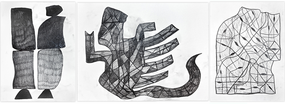
| Lance de los Reyes, Builder 2, Builder 10 and Builder 3; all works dated 2016 and made with graphite on paper; each sheet measures 24 x 18 inches. Photos of artworks courtesy of Shrine. |
I found de los Reyes’s comment about the nature of what he does and his motivation for making his paintings and drawings to be one of the freshest and most heartfelt remarks on the subject I had heard from any artist in quite a long time. His abstract images share strong affinities with those of modern artists of past decades whose works brought a sense of sculptural form into the confines of two-dimensional drawing, especially during that period when many a modernist was looking for ways out of the free-form formlessness of paint-flinging or gestural abstract expressionism.
As seen at Shrine, the abstract imagery of de los Reyes’s drawings on 18-by-24-inch sheets of paper feels at once intimate and monumental, spare and full. Given the side of a freight car to fool around on today, I wonder what he might conjure up on such a vast, imposing surface.
Lance de los Reyes’s Builder 33 exhibition remains on view at Shrine, 191 Henry Street, New York NY 10002, through April 17, 2016.
Posted by E.M.G.
12 March 2016
Architecture of the future, right now: An exhibition of Japanese designs at MoMA, New York
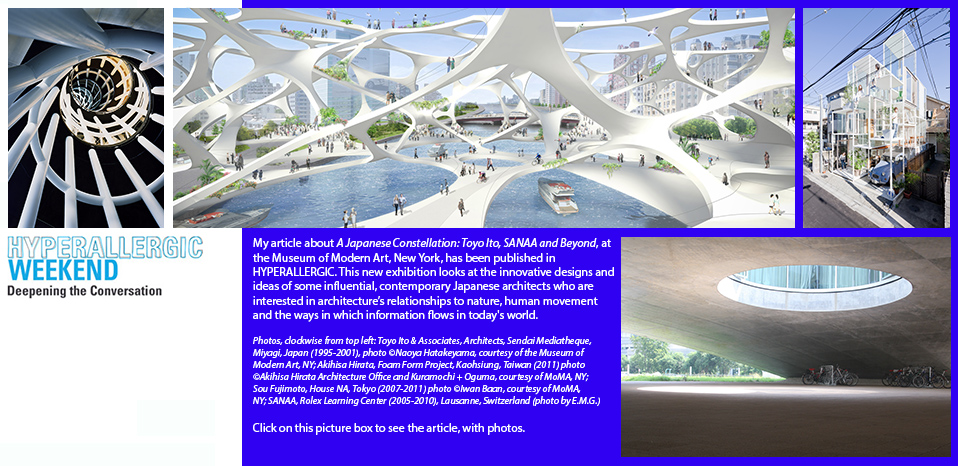
Click here to go to the HYPERALLERGIC article about the new MoMA exhibition showcasing contemporary Japanese architecture.
5 March 2016
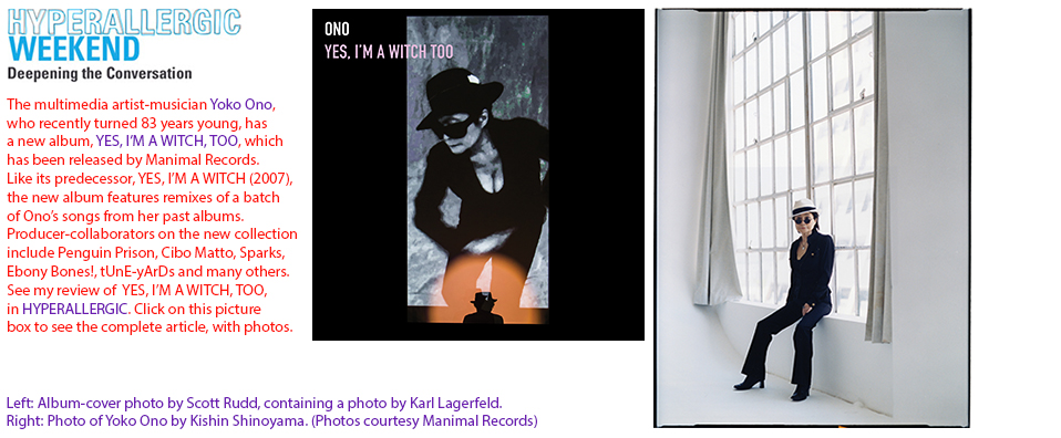
Click here to go to the HYPERALLERGIC article about Yoko Ono’s new record album of remixes.
20 February 2016
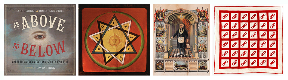
As Above, So Below: A new book recalls the history and examines the mysteries of “secret societies”
|
| Left to right: Cover of the new book by Lynne Adele and Bruce Lee Webb; Masonic Scottish Rite painting (c. 1900), unidentified artist, oil paint on linen, framed in a lightbox and illuminated from behind, 42 x 30 inches; George Washington as a Freemason (1867), chromolithograph produced by Strobridge & Co., Cincinnati, Ohio, 24 x 19 inches; Odd Fellows summer bedspread (c. 1875–1900), maker unknown, cotton, 76 x 76 inches. First photo courtesy of University of Texas Press; second and third photos courtesy of Webb Gallery, Waxahachie, Texas; last photo by José Andrés Ramírez, courtesy of American Folk Art Museum, New York. |
NEW YORK — In their new book, As Above, So Below: Art of the American Fraternal Society, 1850–1930 (University of Texas Press), Lynne Adele and Bruce Lee Webb offer a fascinating and revealing history of so-called secret societies, such as the Freemasons, the Odd Fellows and the Knights of Pythias, among many others. Their study is colorfully illustrated with archival photos of people, places and buildings around the United States during the heyday of such groups’ development, from the period following the American Civil War through the beginning of the Great Depression era of the 1930s.
Tennessee-based Adele is an art historian who has long focused on 20th-century American self-taught artists, especially those from Texas. In 1992, after presenting a talk at Rice University in Houston, she met Bruce Lee Webb and his wife, Julie Webb, collectors and art dealers who operate the Webb Gallery in Waxahachie, a small town south of suburban Dallas, where they also live. Well known regionally and nationally for their interests and activities in the fields of folk art and outsider art, over the years the Webbs have been enthusiastic explorer-promoters of a wide range of vernacular forms that are now known as American “visual culture” and ”material culture,” including, for example, circus sideshow banners, tramp art and self-taught artists’ works.
In their book, Adele and Webb point out that, as fraternal associations grew in the U.S. in the late 1800s, they looked to Etruscan, ancient Greek and Egyptian, Gothic, Moorish and so-called Oriental sources for themes and influences (echoing that era’s popular fascination with the “exotic”), which were reflected in their rituals, costumes and objects, and even in the fantasy architecture of some of their assembly halls (the medieval-Norman-style Masonic Temple in Philadelphia, for example, or, in Indianapolis, the temple of the Murat Shriners of the Ancient Arabic Order of the Mystic Shrine, with its plump, distinctive minaret).
Right now, in New York, the American Folk Art Museum is presenting (through May 8) Mystery and Benevolence: Masonic and Odd Fellows Folk Art from the Kendra and Allan Daniel Collection, a selection of some 200 items donated to the institution by a New Jersey-based couple, who found and gathered them over several decades. This exhibition offers a fine complement to Adele and Webb’s book.
My review of As Above, So Below, which also describes the exhibition at the American Folk Art Museum, has been published in HYPERALLERGIC. Click here to see the complete article , with photos.
Posted by E.M.G.
13 February 2016
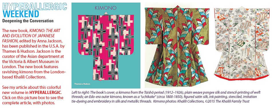
Click here to go to the HYPERALLERGIC article about the new book on the history of kimono.
2 February 2016
Daniel Swanigan Snow’s achingly poetic, found-object sculptures, on view and uninhibited, in Brooklyn
|
| Left to right: The artist Daniel Swanigan Snow, illuminated, at Cathouse FUNeral; Snow’s mixed-media work Deus M/X (2013) and his small work Shadow Dancer (2003). Photos by E.M.G. |
NEW YORK — The use of all sorts of found or cast-off materials to produce mixed-media assemblages — wall-mounted, free-standing, hanging from the ceiling or filling whole rooms — has become a big part of the lingua franca of art-making in these late postmodernist (or early post-postmodernist?), appropriation-happy times. It’s a mode of constructing sculptural, often abstract forms whose variable or ambiguous meanings can emerge from any one of a particular work’s constituent elements or from the perceived sum of its parts.
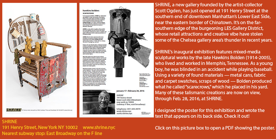
This manner of crafting works of art was on vivid display at the recent 2016 Outsider Art Fair in New York in the creations of such self-taught artists as Joe Minter, Lonnie Holley, the late Hawkins Bolden (see my item about his current Shrine Gallery exhibition immediately below) and Daniel Swanigan Snow.
A trained actor who has performed in Shakespeare plays and B-movies, Snow now has a solo exhibition (Sober Don’t Make Art) of mixed-media assemblage works on view at Cathouse FUNeral, a gallery in Brooklyn. Located at 260 Richardson Street, a short distance from the Graham Avenue stop on the L subway line, this unusual artspace is situated in a section of a large building that formerly housed a funeral parlor. David Dixon, the gallery’s founder-director, cheekily referred to it as “an art speakeasy” when I stopped by Snow’s opening reception last weekend. Cathouse FUNeral’s rooms have character, not only because they can be and are reconfigured from show to show, but also because Dixon makes a point of keeping some of the physical traces of each art presentation he creates intact and visible — incisions in walls, a drawing on a wall buried under layers of previously used Sheetrock — so that his gallery has become a three-dimensional palimpsest.
With its current, dramatic, low-level illumination — the joint’s a speakeasy, remember? — it’s an appropriate setting for Snow’s works, some of which play with shadow and light to conjure up ineffable forms on walls even as they rejuvenate the solid, found and forgotten — a shower head, a duct connector, a circular saw blade, a child-size shopping cart and more.
Over the years, in different places, I’ve seen a lot of mixed-media assemblage works. Generally speaking, they share the aesthetic of and may be seen as three-dimensional expressions of the art of collage. Among the masterworks of the genre: Joseph Cornell’s literary-romantic boxes, with their air of unrequited yearning; Jean Tinguely’s monumental “machines,” one of which its maker famously designed to self-destruct; and Edward Kienholz’s installations, which look wearily, sometimes brutally, at the tawdry, gruesome, morally corrupt aspects of modern life.
An air of tenderness and endearing pathos wafts through some of Snow’s constructions. Their rusty, scrappy, weather-beaten or forlorn elements — did anyone ever love his old, bent-wire toilet-paper holder or his slinky stretch of exhaust-pipe tubing? — land with more kerplunk than choreography into their artistic configurations. Some sport colored lights or feature shaky-shaky, motorized parts that wobble or twitch. Artworks with nervous ticks? They certainly have attitude; it’s subtle, but in such essays in quirky charm as The Whale (2014) or a mysterious ship, Jade Sea (2011), it can grow on you.
“I started making art about ten years ago,” Snow told me at the gallery over potent cups of whiskey and Coca-Cola. “I went into the garage and just started tinkering. I like giving new life to the odds and ends I find. They speak to me. They have something to say.”
Exuding their peculiar vibe or whispering into the gallery’s semi-darkness, Snow’s creations will be on view at Cathouse FUNeral through March 13.
Posted by E.M.G.
26 January 2016
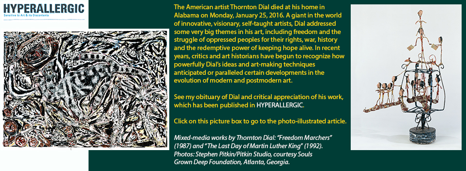
Click on the picture box or click here to see my HYPERALLERGIC obituary of Thornton Dial, with a critical appreciation of his accomplishments.
17 January 2016
In New York, a rare opportunity to see Hawkins Bolden’s “scarecrow” art in depth
16 January 2016
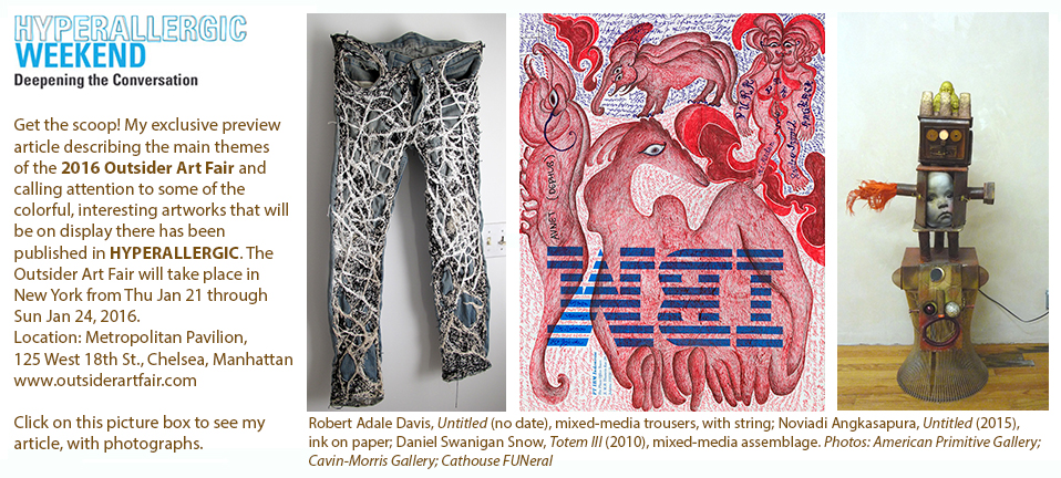
Click here or on the picture box above to see the HYPERALLERGIC article about the 2016 Outsider Art Fair in New York.
1 January 2016
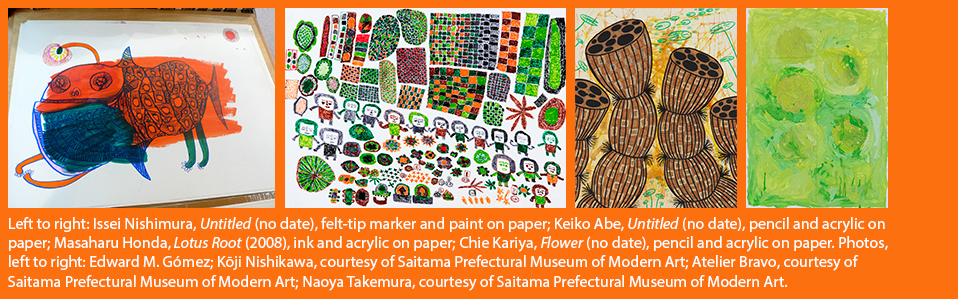
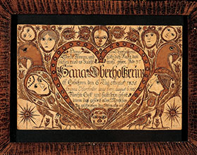
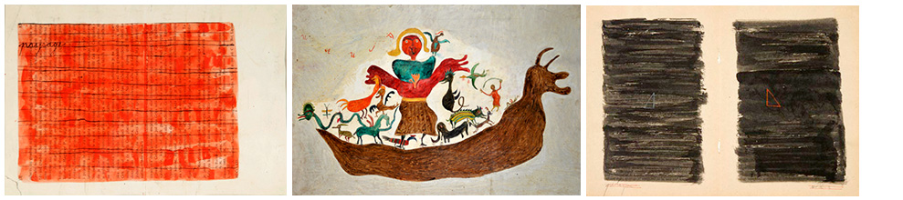
In Japan, the art brut/outsider art field is evolving quickly
|
NEW YORK — For a long time in my work as an art critic and art historian, I’ve taken a special interest and I’ve been very active in two very different fields of research, including the history of Japanese modern art and what is known as art brut and outsider art.
Outsider art, which refers to works made by self-taught art-makers situated geographically or conceptually outside the social-cultural mainstream, producing their creations mainly for themselves, evolved out of art brut. That earlier designation, meaning “raw art,” was coined by the French modern artist Jean Dubuffet in the 1940s and came to refer primarily to the singular, technically innovative visions of talented European autodidacts, works that could not easily be classified according to existing labels. Later, the term “outsider art” became more common in the United Kingdom and the United States. It was applied to an array of visionaries on the margins of mainstream society who were not academically trained, “professional” artists.
In recent years, in Japan, appreciation of the work of such untrained, self-taught artists has increased, and numerous exhibitions of what has become known as “Japanese art brut” have been presented at museums around the country. (However, in Japan, there still is not a well-developed, commercial-gallery infrastructure for the promotion and sale of such art.) I travel to Japan several times each year and each time I return, there is another interesting show or event in this field that catches my attention. I’ve been following and writing about developments in this still-young, still-evolving field in Japan. It’s a field that brings together my interests and expertise both in Japanese modern art and in the artistic creations of talented autodidacts. (I’m the senior editor of the London-based magazine Raw Vision, the world’s leading publication in the art brut/outsider art/self-taught art field; I invite you to check out this informative magazine. Some of my reports have appeared in this publication.)
Now, the American magazine Art & Antiques has published my latest report about developments in the Japanese art brut field in its winter 2015/2016 issue. It’s full of timely information about which self-taught artists are emerging in Japan and which museums and galleries are becoming involved with this kind of art. In my article, I describe two recent exhibitions, which were presented at museums in Saitama Prefecture, just north of Tokyo, and in Shiga Prefecture, near Kyoto. I saw both of these exhibitions several months ago.
Above and below, you will find some photos of the kind of artworks that are described in my Art & Antiques article.
To read this article, click here. A PDF will open. This file was made from scanned pages of the magazine. You’ll see the full article, with photos of artworks, as it appears in the printed, published edition of the magazine. |
12 December 2015
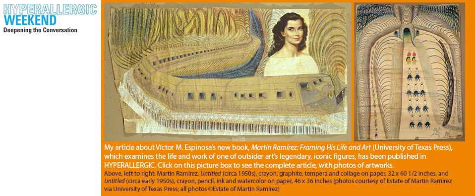
Click on the picture box or click here to see the HYPERALLERGIC article about Víctor M. Espinosa’s new book about Martín Ramírez.
5 December 2015
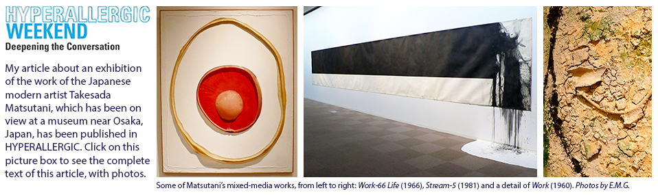
Click on the picture box or click here to see the HYPERALLERGIC article about Takesada Matstuani’s latest museum exhibition in Japan.
24 October 2015
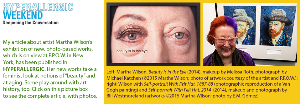
Click on the picture box or click here to see the HYPERALLERGIC article about Martha Wilson and her latest gallery exhibition.
10 October 2015
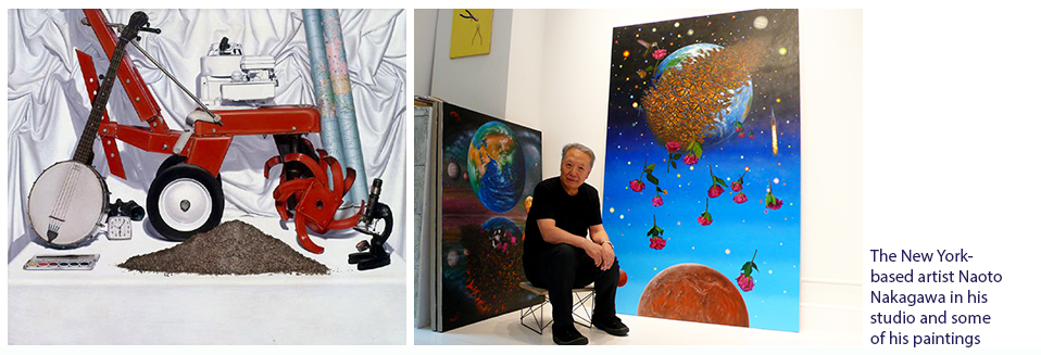
In his new group of paintings, Earth Series, Naoto Nakagawa takes on some urgent, timely themes
|
| Left to right: Paintings by Naoto Nakagawa, including the older Still Life With Earth (1975), acrylic on canvas, 46 x 54 inches (photo courtesy of the artist); and the artist in his New York studio with three paintings, including, on the wall, Still Life in Process (1966), acrylic on canvas, 20 x 15 inches, Earth Series III (2013), acryclic on canvas, 52 x 41.5 inches, and, on the right, Fallen Angels II (2015), acrylic on canvas, 84 x 54 inches (photo by E.M.G.) |
NEW YORK — The Japanese-born, New York-based artist Naoto Nakagawa has long been passionately interested in the art of painting as a tool for seeing, that is, of understanding the perceived “real world,” as well as ideas about it, in profound, insightful ways. Now, as he enters his seventies, Nakagawa is still making images with a sense of wonder about his medium’s expressive power and with the pleasure of a kid who has just discovered how to squeeze its shiny, viscous goo out of a tube.
In his new group of paintings, Earth Series, Nakagawa, who once probed the soul of a lawn mower in a highly detailed still life, has taken on bigger subjects — that is, objects — in his consciousness-raising through paint. He has moved on to depict whole planets and celestial pageants whose fantasy imagery evokes earthly concerns about material existence that are about as real as they can get. Nakagawa recently told me, “I want to pay attention to the Earth, to what we’re doing to it and to the way it’s connected to the rest of the universe. I feel it’s urgent to dive into this issue of our survival and that of nature and the whole planet.”
The Last Supper, one of the artist’s new Earth Series paintings, can be seen in The Value of Food: Sustaining a Green Planet, an exhibition that is now on view at the Cathedral Church of St. John the Divine (1047 Amsterdam Avenue, Morningside Heights, Manhattan), where it will run through April 3, 2016. This group show examines the role of what humans eat to sustain themselves. More broadly, it also looks at the survival of life on Earth. Nakagawa’s The Last Supper shows a multitude of silvery fish emerging into the cosmos from an apparently fiery — and angry? — Earth, from which a lone hawk picks off a specimen and flies away into the void to enjoy a final repast. Have Earth’s animals given up and had enough of human mistreatment? Is there nothing left for them to do but flee?
For more about the history of Nakagawa’s art and ideas, see my recently published article in HYPERALLERGIC. Click here to see the complete article, with photgraphs.
Posted by E.M.G.
9 October 2015
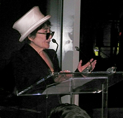
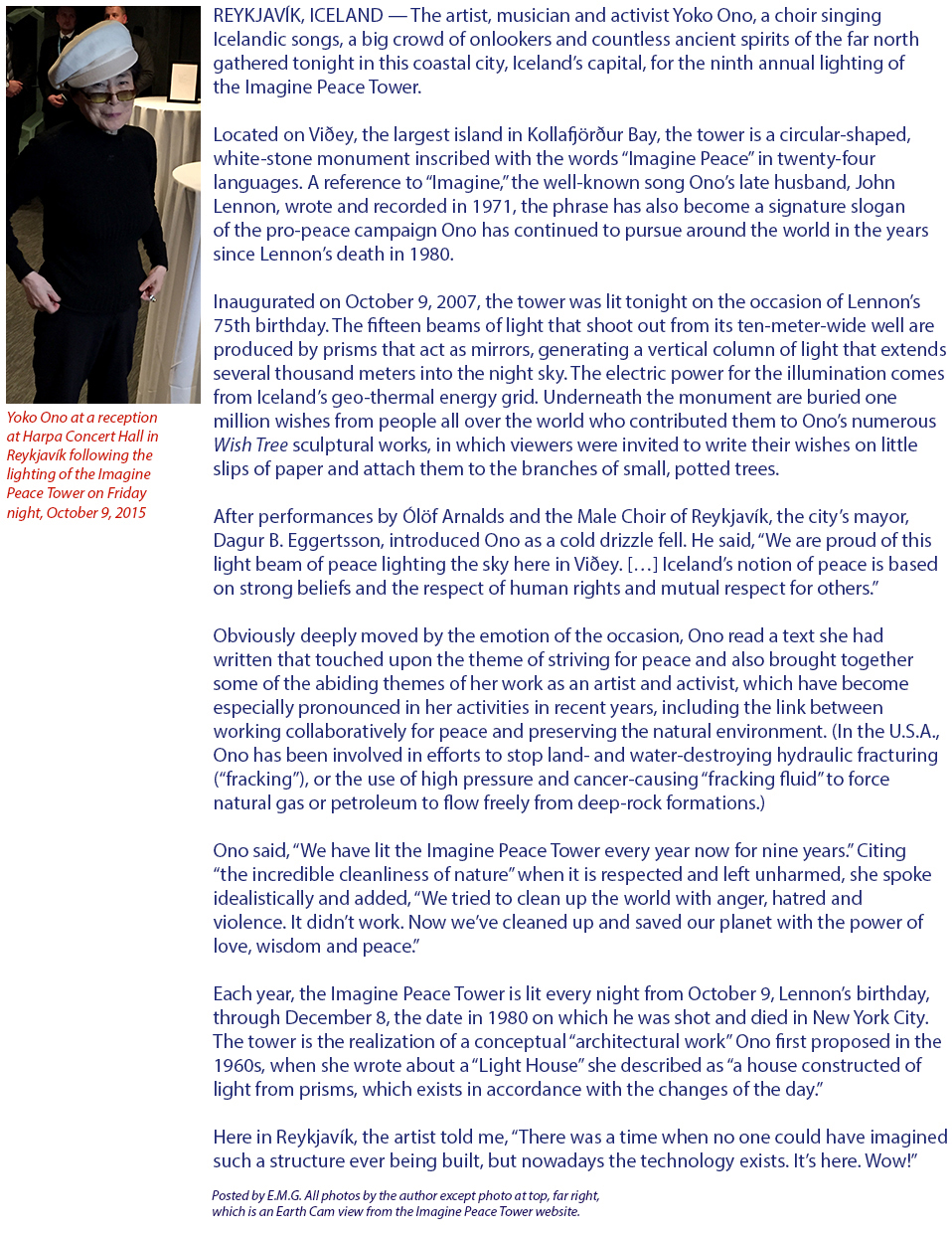
In Iceland, Yoko Ono lights the Imagine Peace Tower on the occasion of John Lennon’s 75th birthday
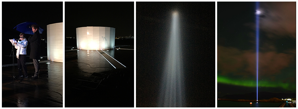
Above, left to right: Artist Yoko Ono and the mayor of Reykjavík, Dagur B. Eggertsson; the Imagine Peace Tower and its light beam
Click here to go to the Imagine Peace Tower’s official website.
26 September 2015
Click on the picture box or click here to see the HYPERALLERGIC article about Daisy Craddock and her art.
19 September 2015
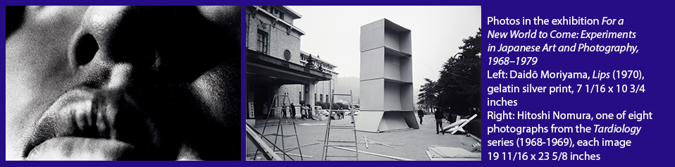
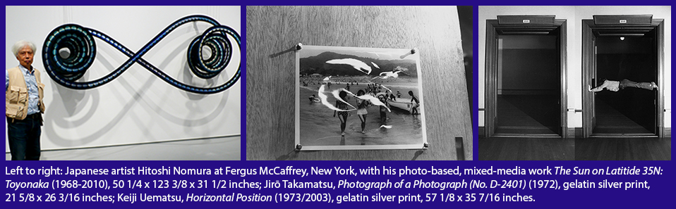
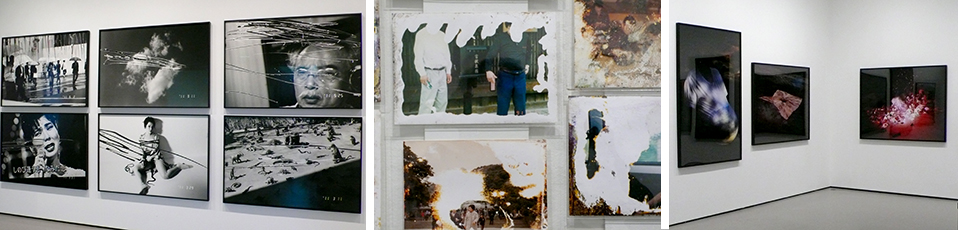
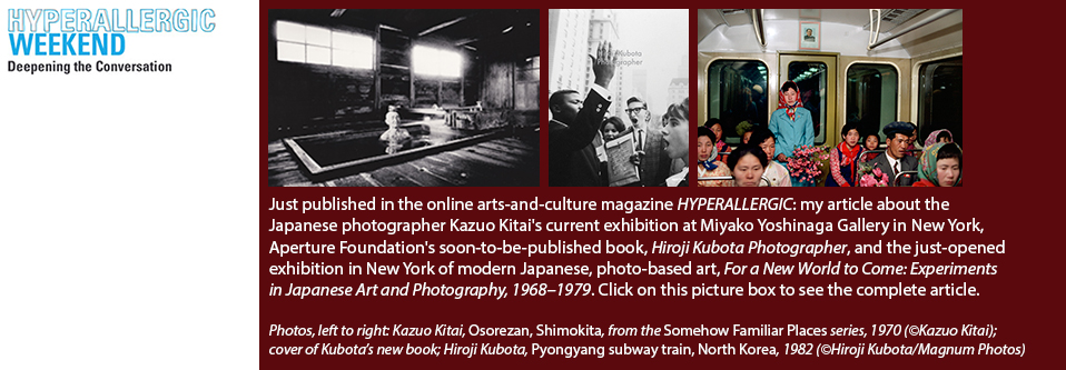
My review: For a New World to Come: Experiments in Japanese Art and Photography, 1968–1979
|
| Photo credits, left to right: Moriyama image ©Daidō Moriyama, photo courtesy of the Museum of Fine Arts, Houston; Nomura image ©Hitoshi Nomura; courtesy of Fergus McCaffrey. |
NEW YORK — For a New World to Come: Experiments in Japanese Art and Photography, 1968–1979 is a two-venue exhibition with photography at its core. The first part of this big presentation, which overall features some 350 works in various media, has opened at New York University’s Grey Art Gallery. Part two will open at Japan Society in Manhattan on October 9.
For a New World to Come was organized by Yasufumi Nakamori, the associate curator of photography at the Museum of Fine Arts, Houston, where this exhibition was first presented earlier this year. It takes as its starting point a period in the late 1960s when Japan was deep in the throes of fast-paced reconstruction effort following World War II, which in time would become known as its postwar “economic miracle.” As left-wing critics and student protesters in the 1960s observed, however, mass production’s material rewards, an emerging consumer culture and what the Japanese artist Takashi Murakami decades later, in the mid-2000s, would refer to as his country’s “infantilizing” relationship with the United States, all came at a price.
For a New World to Come examines how innovative Japanese artists in the 1970s merged art and photography, and through their efforts paved the way for the mixed-media art forms other artists in Japan would develop in later decades.
In a telephone interview, Nakamori told me: “In Japan and elsewhere, as far as art history is concerned, the period of the 1970s has been something of a lacuna. With regard to Japan, people seem to think the late 1970s, in particular, was a period when not a lot was going on. In fact, the 1970s was a period in which, around the world, photography became the lexicon of much contemporary-art practice.”
|
| Photo credits, left to right: Photo of Nomura by Edward M. Gómez; Takamatsu image ©The Estate of Jirō Takamatsu, photo courtesy of the Museum of Fine Arts, Houston, and Yumiko Chiba Associates; Uematsu image ©Keiji Uematsu, photo courtesy of Yumiko Chiba Associates. |
Among the many artists whose works are featured in the exhibition and/or in its accompanying catalog: Takuma Nakahira, Daidō Moriyama, Kōji Taki, Hitoshi Nomura, Jirō Takamatsu, Nobuo Yamanaka, Tsunehisa Kimura and Kunié Sugiura.
Unfortunately, the emphatically postmodernist critical/theoretical framework this exhibition’s organizers and catalog writers have set up and proposed, through which viewers can or should examine and consider the works on display, is one that is based on some very tired, worn-out, pomo critical points of view.
For more information about this exhibition’s content and a discussion of the curatorial approach it takes to the material on display, see my just-published review in HYPERALLERGIC. Click here to see this article on the magazine’s website.
Posted by E.M.G.
12 September 2015
Click on the picture box above to go to the article on HYPERALLERGIC’s website or click here.
2 September 2015
New paintings by Ken Grimes: Somewhere out there, they’re listening. Let’s listen right back!
|
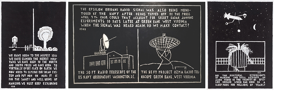
| Above, left to right: Paintings by Ken Grimes, including Untitled (The Deepest Seas)(2013), acrylic on canvas, 36 x 49 inches; Untitled (The Epsilon Eridani Radio Signal)(2003), acrylic on board, 71.5 x 48 inches; and Untitled (The Electrical Experiments of Marconi)(2013), acrylic on canvas, 36 x 49 inches. Photos of artworks courtesy of Ricco/Maresca Gallery. |
NEW YORK — Ken Grimes is a self-taught American painter, who is based in Connectict and who for many years has been fascinated — even obsessed — with such related subjects as outer space, UFOs and the possibility that alien life forms might be watching Earth’s inhabitants — or even that some of their representatives might already be living here among us.
Grimes has carried out in-depth studies in the field known as the Search for Extraterrestrial Intelligence, in which researchers look for signs of life elsewhere in the universe by searching for evidence of otherworldly technology. Grimes makes simple, black-and-white pictures in acrylic on canvas or board that depict interplanetary spacecraft, crop circles and aliens. Another one of his favorite topics: the conflicting interpretations of and typographical errors that have been found in reports of a radio transmission that supposedly occurred in 1960 and originated in the vicinity of Epsilon Eridani, the third-closest star to Earth that is visible to the naked eye.
Aliens notwithstanding, there’s something about Grimes’s art that feels very urgent in this era of round-the-clock surveillance by anonymous government bureaucracies of our e-mail exchanges, telephone calls, credit-card purchases and, thanks to ubiquitous security cameras, even our physical movements. Big Brother resides in the very heart of Big Business, too, what with the endless big-data mining all those nosy, soulless corporations are always doing, employing whatever personal information Internet users might deposit online.
A group of Grimes’s newest paintings is on view through Saturday, September 5, at Ricco/Maresca Gallery in New York’s Chelsea district. In this late-summer heat, go see them (and read them, too; they’re full of the artist’s research findings and provocative questions), think about meeting an alien and dream of being abducted.
Ricco/Maresca Gallery, 529 West 20th Street, Floor 3; telephone: 212-627-4819.
Posted by E.M.G.
1 August 2015
Click on the picture box above to go to the article on HYPERALLERGIC’s website or click here.
18 July 2015
Click on the picture box above to go to the article on HYPERALLERGIC’s website or click here.
4 July 2015
Click on the pictre box above to go to the article on HYPERALLERGIC’s website or click here.
8 June 2015
Melvin Way’s fantasy formulas meet Andrew Castrucci’s diagrams of dysfunction
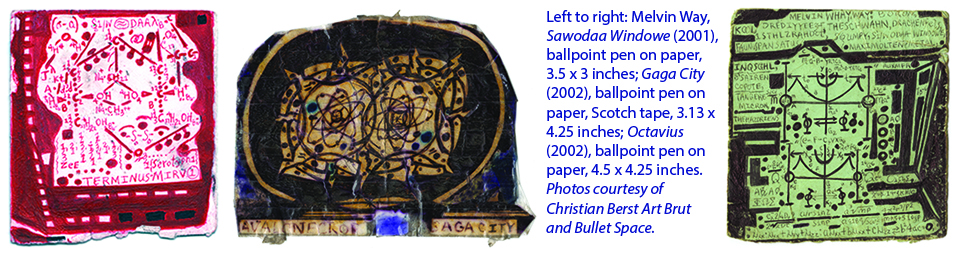
NEW YORK — Last night I dreamed that I was traveling on some kind of very swift, almost invisible public-transportation system in a futuristic city, whose streets were laid out on a neat grid. Even as I was being carried along inside the carriage of a high-speed train, I also seemed to have an aerial view of this transportation network and the cityscape around it. I could see the heat-generated color trails of moving vehicles clearly indicating where they were zipping along through the weave of an ephemeral urban fabric. The place or space in which I found myself was more psychic than physical. Was I journeying through the unmapped territories of the subconscious and the soul?
Perhaps, in the mysterious manner of the dream world, such imagery had been inspired by the ambiguous and the inexplicable in what I had just seen in Gaga City, a new exhibition of drawings on paper made by Melvin Way. It opened yesterday at Christian Berst Art Brut, at 95 Rivington Street in Manhattan’s Lower East Side gallery district. Could it be that something in the subconscious was helping me to make sense of Way’s beautifully complex drawings, whose dense, small-format compositions — many are more diminutive than playing cards — are filled with numerals and symbols, and resemble a theoretical mathematician’s elaborate equations?
Way’s written formulas are as real or as imaginary as you want them to be. Born in 1954, Way is a black, American, self-taught artist who for many years has traveled back and forth between South Carolina and New York. In the past he attended technical school, played in a band and experimented with drugs; in New York, over the years he has found support and refuge in city-sponsored shelters and social-service programs.
Like the Jamaican outsider artist Ras Dizzy (1932-2008), when it comes to recalling his own life’s story, Way is a teller of tall tales. Phillip March Jones, Christian Berst Art Brut’s director, notes that Way has claimed to have invented the Dell computer; to have written songs for the Supremes; and to have graduated from high school more than a dozen times. Way makes his drawings in ballpoint pen on little scraps of paper that he covers with strips of Scotch tape and carries around in his coat pockets for long periods of time before he is ready to display them.
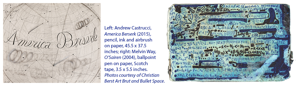
In its Workshop space, Christian Berst Art Brut is also presenting a selection of works by Way’s friend and sometime collaborator, the New York-based artist and art teacher Andrew Castrucci. A veteran of the East Village art-scene explosion of the early 1980s, Castrucci has developed a body of work that proposes a worldview in which the real and symbolic meanings of darkness and light (his show’s title is “Seeing in the Dark”) are central themes. Castrucci offers images of light bulbs, pills, graffiti-covered city walls and a big, black, fuzzy circle or dot, which just might represent a locus of all sorts of ominous energies, or a void, or a target, or maybe, recalling the subject of an old Temptations song, an inescapable “ball of confusion.”
In fact, the full title of that funky tune from the 1970s was “Ball of Confusion (That’s What the World is Today).” With that theme in mind, Castrucci’s art strives to capture the spirit of all the mischief-making (that’s a euphemism for trouble-making, including war) and mishegas, corruption and corporate chicanery, and deal-making and dystopia that characterize Uncle Sam’s bungling empire at the beginning of the 21st century. Castrucci is big on diagrammatic drawings, too; in his panoramas of social-political-economic dysfunction, look for his references to “perpetual war,” “environmental racism,” “heavy metal with [the] volume off” and the “Halliburton loophole,” and then try to connect the thematic dots.
Both Way’s and Castrucci’s works are intriguing. To me, they bring to mind the title of the medieval, Sephardic-Jewish philosopher Maimonides’s influential treatise, The Guide for the Perplexed. Way’s unusual drawings, in particlar, are steeped in uncertainty, and that’s okay. Ambiguity is the very essence of poetry, after all, and if ever any clues to any work of art’s meaning might be wished for or needed, there is always understanding to be found in the peculiar “clarity” of a dream.
Melvin Way’s and Andrew Carlucci’s exhibitions are on view at Christian Berst Art Brut through July 19, 2015 (95 Rivington Street, Manhattan; subway: F line, Second Avenue station; telephone: 917-525-5939).
Posted by E.M.G.
16 May 2015
Click on the pictre box above to go to the article on HYPERALLERGIC’s website or click here.
10 May 2015
Japan: Revisiting the disasters zone in photos, four years after the earthquake, tsunami and nuclear accident
|
| Above, left to right: Black-and-white images by the Japanese photographer Nobuyoshi Araki, who is well-known internationally for his urban scenes of Japan; damaged photos from family albums, which were found among the rubble and debris in the Tōhoku region after the flood waters had receded and were rescued by the Japan-based Lost and Found Project, a volunteer organization; and photos by Lieko Shiga, which offer a hallucinatory take on the appearace of the disasters-affected region today. Photos of exhibition installation by E.M.G.. |
BOSTON — At the Museum of Fine Arts, Boston, I’ve just seen one of the most interesting photography exhibitions to have come along in quite a while; certainly the subject matter of this presentation makes it as compelling as the unusual images, produced by 17 photographers, that it features.
On view, through July 12, In the Wake: Japanese Photographers Respond to 3/11 is a survey of photographic images of the Tōhoku region in northeastern Japan, which, on March 11, 2011, was struck by what has become known as the “Great East Japan Earthquake.” That massive temblor, which measured 9.0 on the Richter scale, was followed by a tsunami that in some places reached a height of 130 feet and rolled inland some six miles from the sea. Those natural disasters damaged a coastal, nuclear-power plant in Fukushima, leading to a deadly release of radioactivity that effectively made a vast swath of territory uninhabitable.
The photos on view here in Boston document the physical effects of the triple-whammy of natural and human-made disasters that devastated Tōhoku. Some, like Kōzō Miyoshi’s black-and-white shot of a boat resting atop piles of rubble after the floodwaters receded, offer straightforward visual records of how wiped-out towns appeared after the catastrophic events of March 2011. Some show how once-lively cities and villages look today, either abandoned or in various stages of determined rebuilding.
Other images on view, like Lieko Shiga’s picture of a shoreline covered by a blood-red sky or Masato Seto’s reverse-printed, black-and-white trees, offer more interpretative takes on the region’s sometimes eerie-looking landscape, which has been reshaped by destruction. A photo by Yasusuke Ōta shows a lone ostrich walking along the main street of an abandoned town, while Tomoko Yoneda’s images capture the beauty of plants in the disasters-stricken region, some of which, inevitably, have been affected by the radioactive fallout from the damaged Fukushima power plant.
See the museum’s website for a video clip with a brief interview with this exhibition’s curators.
Posted by E.M.G.
5 May 2015
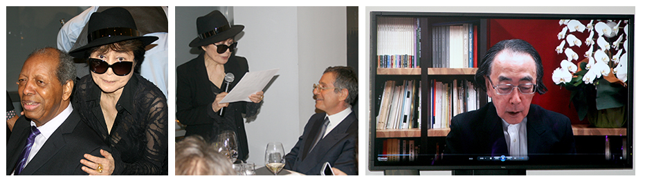
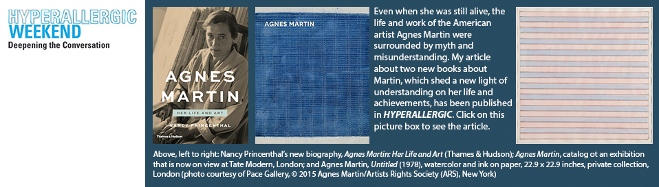
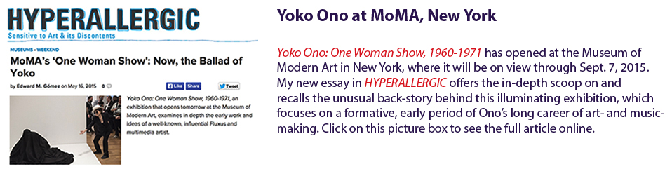
At New York’s Museum of Modern Art, Yoko Ono’s once-conceptual solo show becomes very real
|
| Above, left to right: Opening spread of article in May 2015 issue of Art & Antiques; artist Yoko Ono performing “Cut Piece” (1964) at Carnegie Recital Hall, New York, March 21, 1965; and Ono with the Gaston Lachaise sculpture “Standing Woman” (1932), in the garden of the Museum of Modern Art, NY, circa 1960-61. Both archival photographs by Minoru Niizuma, © Minoru Niizuma, courtesy Lenono Photo Archive, NY, and the Museum of Modern Art, NY. |
NEW YORK — On May 17, 2015, the exhibition Yoko Ono: One Woman Show, 1960-1971 will open at the Museum of Modern Art in New York. (It will run through September 7, 2015.) One could say that it’s a presentation that has been some 45 years in the making. But in looking back at Ono’s career trajectory and the evolution of her art and ideas, it focuses specifically on one especially formative, earlier period in the development of her work.
What makes this exhibition unusually noteworthy is that there was a time decades ago when Ono imagined presenting a solo exhibition of her work at MoMA but the closest she was able to come to realizing it was to mount a conceptual show on the sidewalk in front of and, in the imagination, inside MoMA’s building. Here’s the back story, which I summarize in an article, “Plastic Ono Show,” in the just-published May 2015 issue of the American magazine Art & Antiques. My article also offers a preview of the themes and content of MoMA’s forthcoming exhibition.
In late 1971, Ono placed advertisements in the New York Times and the Village Voice announcing her conceptual Museum of Modern (F)art show at MoMA, complete with a printed catalog, which she sold by postal mail. Her ads featured a black-and-white photo showing the entrance of the museum, with its name spelled out in letters mounted above its awning. The photo was manipulated to create an empty space between the last two words of MoMA’s name. In the picture, Ono could be seen strolling by, carrying a shopping bag on which had been printed or perhaps onto which had fallen from above a big letter F, spelling out the word... Well, you know.
For two weeks, without the museum’s involvement, a man whom Ono had hired walked back and forth in front of MoMA’s entrance wearing a signboard. It bore a text explaining that a swarm of flies had been placed in a big bottle containing the same perfume Ono wore, and that the bottle had been placed inside the museum. It stated that the flies had been released into the air, and that a photographer had been dispatched to search for and shoot pictures of the scattered insects. Ono’s catalog of this imaginary exhibition contained photos of various New York locations in which, reputedly (that is, conceptually), the flies had landed.
In a recent interview with me at her home in New York, Ono acknowledged that, decades ago, when conceptual art was still emerging and dominated by male artists who often took themselves or their pronouncements rather seriously, when it came to daring to express some humor through such art, as she often did, “They didn't like it.” However she noted, referring to the art world as a rather limited target audience, “I was not creating just to communicate on that level. I was doing it for myself, too.”
For more about the staging of Ono’s “Museum of Modern (F)art” project many years ago and her new MoMA exhibition, see my
Art & Antiques article. Click
here to open a
PDF containing this new article. (Give it some time to download. It’s a 14 MB file.)
Posted by E.M.G.
10 May 2015
1 May 2015
28 April 2015
Vienna’s great Kunsthistorisches Museum, deep behind the scenes
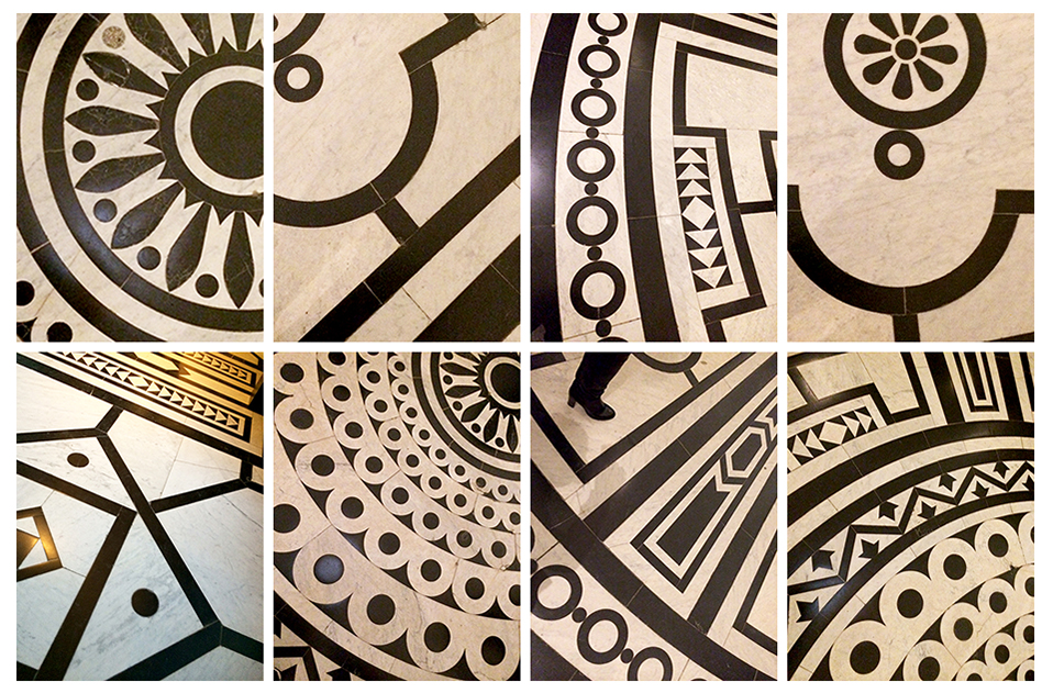
NEW YORK — At IFC Center, the multi-screen movie theater in downtown Manhattan, I just had the pleasure of seeing Johannes Holzhausen’s superb, new docu-film, Das Grosse Museum (The Great Museum), a cinema verité look at the inner workings of one of Vienna’s most venerable cultural institutions, the Kunsthistorisches Museum. A repository of paintings, sculptures, arms and armor, garments, decorative objects, books and documents, and antiquities, the museum’s collections are encyclopedic in scope. In particular, Holzhausen’s film documents the preparations the museum’s collaborating teams of designers, curators, managers and general staff members undertook to renovate and reinstall the KM’s emblematic Kunstkammer Wien, a core collection of treasures whose creation and acquisition in past centuries benefited from the patronage of old Austria’s former rulers in the House of Hapsburg. (The Kunstkammer Wien reopened to the public in March 2013.) Some of the most compelling scenes in the film are also its most unassuming; these are the moments in which Holzhausen’s camera slips quietly into the museum’s storerooms and also into the workrooms and laboratories of its art conservators, and watches them at work. Their highly specialized technical skills are indispensable to the long-term survival of both the famous masterpieces and the smaller, odd objets the state-funded institution is charged with preserving and protecting.
I most recently visited the Kunsthistorisches Museum in February of this year, at which time, using an Apple iPhone 6, I snapped the photos of the black-and-white patterns on its main-lobby floor that appear above.
Posted by E.M.G.
21 March 2015
1 March 2015
In Japan, one of the world’s legendary collectors of classic Asian art tells me his story
NEW YORK — Several months ago, in Japan, I had the pleasure of meeting Yasuyoshi Morimoto, a Kyoto-based collector of ancient works of art from China, Japan, the Korean peninsula, Thailand, India and other parts of Asia. Morimoto is something of a legend among collectors in this field. Over a period of many decades, along with his late partner, the American writer David Kidd (1926-1996), Morimoto built up one of the most wide-ranging private collections of classic Asian art to be found anywhere in the world.
Kidd was born in Kentucky and grew up in Detroit. In 1946, he headed to China’s capital, then known in the West as Peking, as a college exchange student. There, he taught English and watched China’s tired, fractured ruling system collapse as Mao Zedong’s revolutionary communist forces defeated the Nationalists and in 1949 established the People’s Republic of China. Kidd married the daughter of a former high-ranking judge, which made him the odd, foreign member of an aristocratic family and provided him with a unique vantage point from which to observe the pain and pathos, for China’s privileged elite, of the demise of their way of life. Kidd’s stories about these experiences were published in the United States in The New Yorker and in a book, All the Emperor’s Horses (1960; later reissued as Peking Story: The Last Days of Old China). After the Communists’ vistory, Kidd returned to the U.S. but he longed to return to China. A few years later, divorced and hoping to make his way back to China, he went to Japan, where he remained until his death. A self-taught, erudite connoisseur of classical Chinese and other East Asian art forms, Kidd became an indefatigable collector.
In Japan, Kidd and Morimoto became friends and life partners, sharing a home and a passion for Asian art. “What little money we had, we poured into collecting,” Morimoto told me. In the world of Asian art collecting, Kidd and Morimoto became the go-to experts for a range of inquisitive, discerning clients.
My article about Kidd and Morimoto’s collection, based on my interview with the seventy-something Morimoto at his home in Kyoto, has been published in the March 2015 issue of the American magazine Art & Antiques. This article’s text and main photos can be found online, here.
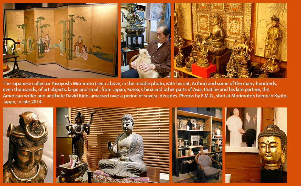
Posted by E.M.G.
23 February 2015
In New York, Yoko Ono Lennon presents the 2015 Courage Awards for the Arts
|
| Above, left to right, images from the dinner event in New York on Sunday evening, February 22, 2015, at which the artist Yoko Ono Lennon presented her 2015 Courage Awards for the Arts: The jazz saxophonist, composer and band leader Ornette Coleman and Ono; the artist with the art dealer and former museum director Jeffrey Deitch; and the Japanese avant-garde composer Toshi Ichiyanagi, who sent his acceptance speech via pre-recorded video clip from Tokyo. Coleman, Deitch, Ichiyanagi andJonas Mekas, the avant-garde filmmaker and co-founder of Anthology FIlm Archives in New York, were all recipients of this year's Courage Awards. Photos by E.M.G. |
NEW YORK — There was another awards ceremony in the United States last night…
At a private dinner at The Modern, a restaurant in the Museum of Modern Art’s main building in Manhattan, the artist Yoko Ono Lennon presented the 2015 Courage Awards for the Arts. First awarded in 2009, Ono’s prize is among the less familiar expressions of philanthropy and cultural activism for which this internationally recognized multimedia artist, performer and peace activist is known.
Still, as Ono has said, it is an awards program whose mission and character resonate deeply with the artist herself. That’s because, as she has observed, over the decades of a long, multifaceted career she has learned firsthand about struggling, perseverance and striving to remain true to one’s creative vision, often in the face of harsh criticism, misunderstanding or rejection. With such themes in mind, over the years Ono’s Courage Awards have acknowledged the achievements and the stick-to-itiveness of art-makers, music-makers, creative visionaries and champions of free expression.
This year’s Courage Award recipients included Ornette Coleman, the pioneering jazz saxophonist and composer; Jeffrey Deitch, the New York art dealer and former director of the Museum of Contemporary Art, Los Angeles; Toshi Ichiyanagi, the Japanese composer (who was Ono’s first husband); and Jonas Mekas, the avant-garde filmmaker and a co-founder of New York’s Anthology Film Archives.
To read more about this year’s Courage Awards for the Arts, click here to open a PDF containing a report about last night’s awards ceremny.
Posted by E.M.G.
1 February 2015
In SCULPTURE magazine, my article about Gillian Jagger’s evocations of the life force and passing time
|
| Above, left to right: The British-born sculptor GIllian Jagger in one of the barns on her property in the mid-Hudson Vallery, north of New York City, which serves as a studio. An artist who has worked in a wide range of media, Jagger created one of her most recent sculptures by using plastic-coated electrical wire. She based its form on that of a bucking bull, which she depicted in a mural-size drawing on paper after seeing in person and feeling deeply moved by prehistoric paintings on cave walls in southern France. Photos by E.M.G. |
NEW YORK — The British-born sculptor Gillian Jagger’s work defies familiar art-category labels. Her art is self-consciosuly postmodern-ironic, nor does Jagger send her designs out to nameless fabricators to be manufactured for her — bigger, shinier, more expensive! — to sell to trophy-seeking Russian oligarchs or oil-rich Qataris. Certainly many of her mixed-media works are large — and complex and unusual, too, for they may incorporate the dried bodies of dead animals or rusty sections of old farm implements or trunks of fallen trees. Still, despite or because of their strangeness, her sculptures do not traffic in one-trick sensations; instead, they tend to conjure up resonant, ambiguous emotions and atmospheres that feel at once primordial and timeless, charged with some kind of unnameable, soulful-psychic energy.
Jagger, who is now in her early eighties and has lived for several decades in the rural Hudson Valley region, northwest of Manhattan, says: “As human beings, we’re interconnected with each other and with nature. We are or we should be, that is, and I want my works to reflect that idea.” Jagger is a professor emerita of Pratt Institute, the art, design, architecture and engineering school in Brooklyn, where she taught for 40 years. She also continues to teach, in the role of visiting critic, at the Pennsylvania Academy of the Fine Arts in Philadelphia.
See my feature article about this engaged and empathetic artist’s work and career history in the January-February 2015 issue of Sculpture. Click here to open a PDF showing the complete article just as it appears in the print edition of this magazine. The file’s size is approximately six megabytes.
Posted by E.M.G.
24 January 2015
For the Metropolitan Museum of Art in New York, a donation that could change art history’s tale
17 January 2015
She didn’t just play the cello: A new bio of avant-garde performer and impresario Charlotte Moorman
Click here to see my review of the new book about Charlotte Moorman in Hyperallergic, the arts-and-culture magazine.
Posted by E.M.G.
15 January 2015
In Tokyo, artist Jack McLean presents his vision of a goofy-banal world, in which he is a leading anti-hero
|
| Above: Details of large-scale drawings made with ink on canvas by the Tokyo-based, Scottish artist Jack McLean and the artist himself, standing next to one of his works. Photos by E.M.G. |
TOKYO — The Tokyo-based, Scottish artist Jack McLean is a master of a certain kind of super-dry satire, whose mischievousness is on view at The Container, a small, alternative-space gallery in the capital’s Nakameguro district. In just a few years, this replica of a metal shipping container, installed inside a hip haircutting salon, has become a much-watched venue for conceptual and other forms of contemporary art. McLean’s exhibition, It’s a Long Story, in Full Colour, Without a Happy Ending, includes a large drawing in oil-ink pen and watercolor on canvas, which fills the gallery’s far wall, and two long, horizontal drawings made with the same materials, which radiate out from it on either side like cartoon friezes. Also on view is a large, papier-mâché airplane, a prop from one of McLean’s performance art events.
Read my article about McLean’s unusual drawings and sculptures — he also presents performance art works, in which he appears himself as a kind of reluctantly active agent-object — in the Japan Times, the leading, independent, English-language, national/international newspaper that is published in Japan. Click here to see this article.
Posted by E.M.G.
13 January 2015
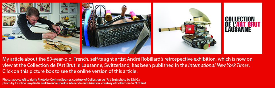
10 January 2015
Guitar strings, neckties, dried flowers and artificial hair: Donna Sharret’s art mixes media and meanings
|
| Above, left to right: Michelle, 2013, 6 x 6 inches, made with old neckties, jewelry, guitar strings, guitar-string ball ends, buttons and thread; a detail of Dancing Barefoot, 2014, 48 x 48 inches, made with men’s shirts, women’s dresses, wedding dress hem, jewelry, blue jeans, neckties, guitar strings, needlework, damask tablecloth, negligee edging, interfacing, buttons, bone beads, pins, synthetic hair and thread; the artist Donna Sharrett at the opening of her exhibition in New York on January 8, 2015; and some of the artist's preparatory sketches, with which she develops ideas for her compositions. Photos: Courtesy of Pavel Zoubok Gallery; Margaret Fox; E.M.G. and E.M.G. |
NEW YORK — I’ve been following the development of the American artist Donna Sharrett’s work with great interest since I first encounetred and wrote about it in the New York Times in October 2000. At that time, still early in her still-young career, her unusual, mixed-media creations were being featured in a solo exhibition at the Everson Museum of Art in Syracuse, New York. Made with dried rose petals, which she joined together in intricate patterns using hand-stitched, artificial hair, the works Sharrett presented there in her Mementos series explored the theme of memorializing deceased family members and other loved ones. Each of the works in that series was set against a black-velvet background and constructed using a needlelace stitch.
Now Sharrett’s skilled needlework and other kinds of meticulous craftsmanship are evident again in her newest series of mixed-media compositions, Love Songs, which is on view in an exhibition of the same name, through February 7, 2015, at Pavel Zoubok Gallery in New York.
In a recent interview, Sharrett told me that, over time, the main theme of her work has become memory, “and, more specifically, the idea of remembrance,” or as she puts it, “people and their belongings,” as well as the “events, places, times and things that we remember and what triggers our memories to flow.” Something about the way she creates her art seems to echo the sense of reverie it evokes. She told me, “The slowness of this kind of work, the long time it takes to produce it, are some of its essential characteristics. My work is slowly built up. It’s not linear. It’s not like following a pattern to make a quilt. I’m constantly taking apart and reassembling.”
My article about this artist’s current exhibition, “Donna Sharrett’s Art of History, Remembrance and Time,” which describes the development of Sharrett’s art-making methods and ideas, and the themes of this new body of work, has been published in Hyperallergic, along with a good selection of photographs of these hard-to-classify creations. Click here to see the article on this arts-and-culture magazine’s website.
Posted by E.M.G.
3 January 2015

18 August 2014
Magiciens de la Terre: 25 years later, a pioneering exhibition is reconsidered — in a new exhibition
|
| Views of the current "'Magiciens de la Terre': Return to a Legendary Exhibition" exhibition at the Pompidou Center in Paris, in which big photos of the works that were presented in the original 1989 show cover the walls, and vitrines are filled with documents and background materials indicating how that innovative show's organizers carried out their research and decided which artists' works to include in it; cover of the original exhibition's catalog; and the Australian Stuart McArthur's Universal Corrective Map (1979), which reverses the usual cartographic positions of the Earth's northern and southern hemispheres. McArthur's map is on display in a vitrine in the current exhibition. It provided a major point of reference for the organizers of "Magiciens de la Terre," who sought to look at the world and its cultures in new, non-Eurocentric ways. Photos by E.M.G. |
|
|
PARIS — In Paris, through September 15, the Pompidou Center is presenting Magiciens de la Terre: Return to a Legendary Exhibition, an exhibition that looks back at this museum’s historic 1989 show Magiciens de la Terre (Magicians of the Earth). That original exhibition was one of the first major presentations in Europe or America to display works by non-Western, self-taught art-makers living and working outside the commercial mainstream alongside works by academically trained, mainstream contemporary artists. Often those featured self-taught artists were deeply rooted in indigenous cultural traditions or influenced by post-colonial conditions in their homelands.
Magiciens de la Terre attempted to view all of its participating artists’ creations in an even-handed manner without regarding works from the non-Western, developing world as “primitive” or aesthetically inferior. This new exhibition about an exhibition presents research materials that show how the original show’s curators decided which themes to explore and which artworks to include in their headline-making survey 25 years ago. Some of the ideas and contentious issues that informed the original exhibition find echoes in today’s bringing together in numerous exhibitions of works by mainstream contemporary artists and less well-known, self-taught art-makers.
Posted by E.M.G.
26 July 2014
In the farm shed of a rural-Nebraska recluse, an astonishing “healing machine”
Emery Blagdon (1907-1986) was a reclusive, former farmhand, saw mill worker and gold prospector who settled on a farm in his native, rural Nebraska, not far from the city of North Platte. He lived alone and, over time, in an 800-foot-square shed on his property, used wire, metallic foil, scraps of wood, colored lights and assorted found objects to create unusual, talisman-like sculptural objects and abstract paintings. Densely packed together inside the shed, these
|
| Above, left to right: Various components from Emery Blagdon's larger, all hand-crafted "healing machine" creation, including a mixed-media, chandelier-shaped sculpture, an abstract painting on board and a box-like wire sculpture. First photo by Kelly Rush; photos in center and at right courtesy of Cavin-Morris Gallery, New York. |
|
|
“pretties,” as Blagdon called them, collectively constituted his “healing machine.” Blagdon believed his creations, individually and together, possessed a curative power that could positively affect people who found themslves in their presence. Just to be near them, he believed, was to absorb a soothing electromagnetic energy, which supposedly emanated from them. The artist was prompted to make his “machine” after having been deeply moved by the deaths from cancer of many of his family members. That disease would also lead to his own demise.
Now, Kelly Rush, a longtime promo-spot producer for Nebraska’s statewide public-television network, has made a short film about Blagdon’s life and accomplishments. Click here to see my just-published article in HYPERALLERGIC about the film, Emery Blagdon & His Healing Machine. Click here to go to NET Nebraska’s website, where the film may be viewed in its entirety. That website also offers a special section filled with archival photos and other material related to Blagdon’s life and remarkable artistic creation.
Posted by E.M.G.
8 July 2014
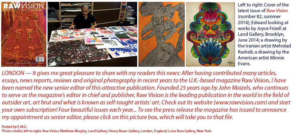
10 July 2014
More about the Japanese modern artist Akira Shimizu’s intriguing art — collages and sculptures
LONDON — I’m in sunny and hot, summertime London right now, but back in the U.S.A., Art & Antiques magazine has published a second article of mine about the work and career of the Japanese modern artist Akira Shimizu. It appears in the summer 2014 issue (the July-August double issue) of this publication. Recently, in New York, Shimizu presented his first-ever solo exhibition in the U.S. at Pavel Zoubok Gallery. I wrote about that show in Hyperallergic. See the orange-colored picture box above, at the top of this home page, to go to that article, or simply click here.
|
| Above, left to right: One of the works from Akira Shimizu's Guidebook series of mixed-media collages, made with printed topographic maps of Japan, 1962-1972; Mesien, a mixed-media collage, 1999; Shunkou, a collage, 2011; and another work from Guidebook. Photos courtesy of the artist and Pavel Zoubok Gallery, New York. |
|
|
My Art & Antiques article echoes that earlier text but it also offers a different selection of photos of Shimizu’s works in various media, especially his sumptuous collages. Shimizu is an unusual figure in the annals and within the specific context of Japanese modern-art history in that, unlike many other Japanese modernists, he has always worked alone, not as a member of any artists’ association or artistic school or movement. Also, he has always been a collage-maker. Collage has been a big part of his oeuvre. However, among Japanese modern artists, collage-makers have been relatively rare.
Click here to see a PDF showing my complete, published Art & Antiques article as it appears in the print edition of this magazine.
Posted by E.M.G.
3 July 2014
Art in the streets: It’s where you find it
NEW YORK — As I emerged from a long meeting, which had taken place in a building filled with offices and art galleries in Manhattan’s Chelsea district, the early-evening, summer light illuminated the street like a stage set. My mind was on the business matters I had just discussed with a friend and colleague, but as my eyes surveyed the urban landscape, an extraordinary object caught my attention. It was a large, clear-plastic bag filled with shredded paper — garbage, that is, from one of the nearby office buildings.
|
| Above, left to right: Clear-plastic trash bags, each one filled with shredded papers from offices, lying in a dumpster on West 20th Street in Manhattan in early July. Photos by E.M.G.. |
|
|
The fluffy ball glowed in the warm, yellowish light of the artificially long, late afternoon. (Thanks, Daylight Saving Time. Look up the history of this human-concocted, time-controlling practice here.)
Simply put, what I saw was one of the most evocative sculptural objects I had encountered in quite a while; it was plain, unassuming, even charming in its teasing play of visual textures and shadows and light. I wanted to touch it but I did not do so. Maybe it was sleeping or at least lounging lazily in that delicious, enticing, mood-changing light.
Of course, what I spotted there in the street was not a work of art at all. Still, it had more of a sense of presence (or what some aesthetes like to call an “aura”) than many works of contemporary art I’ve seen in recent years. Certainly it had more going for it aesthetically and, dare I say it, emotionally, than anything in the bloated, vain, soulless Jeff Koons extravaganza that is now on view at the Whitney Museum in New York. Make a discovery like this, and the joke is on whom, exactly? Attention, conceptual artists: Back to your drawing boards!
Posted by E.M.G.
28 June 2014
At the leading folk art museum in the United States, an insightful re-examination of a diverse field
NEW YORK — Self-Taught Genius: Treasures from the American Folk Art Museumis a new, wide-ranging exhibition now on view, through August 17, at the American Folk Art Museum, the leading institution in its field in the United States. Featuring roughly 100 creations in a variety of genres and materials — textiles, furniture, functional-decorative objects, paintings, sculptures and more — it is a rich, diverse survey of folk art that examines what the term “self-taught” can, does and perhaps should mean when used to describe artists and artisans from many different backgrounds who produced highly original works from the mid-1700s to more recent times. This exhibition also looks at the notion of “genius” — at what it means, what its sources might be, and where, across a broad landscape of artistic creativity, it has been found.
|
| Above, left to right: Logo of the current exhibition at the American Folk Art Museum in New York; David Cordier, Birth Record for Hana Oberholtzer, 1816, watercolor and ink on paper, 7 3/4 x 12 1/2 inches; uknown artist, Flag Gate, circa 1876, paint on wood, with iron and brass, 39 1/2 x 57 x 3 3/4 inches . Photos courtesy of American Folk Art Museum. |
|
|
My article about this exhibition has been published in HYPERALLERGIC. Click here to read it online.
Stacy C. Hollander is the American Folk Art Museum’s deputy director for curatorial affairs, chief curator and director of exhibitions. In her essay in the catalog that accompanies Self-Taught Genius, she notes that “the concept of ‘self-taught genius’ [...] has changed dramatically over time” from the 1700s to today. She writes, “The idea of ‘self-taught’ in America is entrenched in a culture of self-actualization that was fundamental to the revolutionary temperament and critical to the growth and success of a new nation.”
Hollander also points out that Enlightenment-era thinkers in Europe debated whether or not genius was something innate or God-given, a state of being or a psychological phenomenon. Whatever it was or wherever it originated, it certainly got swept up in the heady vapors of Romanticism. Hollander writes that, in “liberating genius from God and classical precedent, [and] by placing it within the life spark of man,” Romantic and Enlightenment ideas “opened [up] the possibility for freedom” of the self and the individual.
In other words, however much certain objects tagged as “folk art” might have been shaped by particular cultures or communities, or however much their forms might perpetuate or emulate certain well-established models (think of traditional baskets, ceramics, furnishings or painting genres, for instance), often there is a lot of self-expression packed into them, too — and it’s just waiting to be recognized and appreciated.
Check out this new article of mine to find out about some of the highlights of this intriguing exhibition, which, after its New York showing, will travel to six other venues in the U.S. through early 2017.
Posted by E.M.G.
12 June 2014
Kazumi Kamae packs mystery and emotion into her unusual expressions in fired clay
TOKYO — The Japanese self-taught artist Kazumi Kamae, who was born in 1966, lives in Shiga Prefecture, near Kyoto, where she produces her unglazed, fired-clay sculptures at Atelier Yamanami, an art-therapy workshop in the city of Koka. Her creations are among the most unusual to have appeared anywhere in recent years in the self-taught art field.
The central theme of Kamae’s work is her affection for Masato, a male staff member at the workshop. Kamae lives in a country whose popular culture is loaded with expressions of cuteness and sometimes mawkish sentimentality — smiling bunnies, puppies or fish routinely turn up in company logos, and Hello Kitty’s mouthless mug is ubiquitous. By contrast, despite the fact that Kamae’s subject matter is so personal, in her art she manages to abstract it in a manner that yields objects of mystery, intriguing ambiguity and considerable charm.
|
| Above: Unglazed, fired-clay sculptures made by the self-taught Japanese artist Kazumi Kamae, on view at Yukiko Koike Presents, in Tokyo. Photos courtesy of the gallery. |
|
|
An excellent selection of Kamae’s works is now on view, through June 20, 2014, at Yukiko Koide Presents, a gallery in Tokyo that specializes in works made by self-taught artists. The exhibition, Kazumi Kamae: Masato, My Love, offers a good overview of the expressive range of Kamae’s art. Some of the sculptures on view are semi-abstract, totem-like forms with stubby arms and multiple eyes and mouths. Others seem to slouch like strange animals in repose. Kamae meticulously covers her sculptures with short, thick daubs of clay that resemble three-dimensional brushstrokes. From a distance, her works appear to be covered in fluffy pelts, belying the hard, crusty character of their surfaces. The artist’s remarkably skillful transformation of her humble material and the unusual aura of her creations contribute in a big way to her work’s allure.
Posted by E.M.G.
24 May 2014
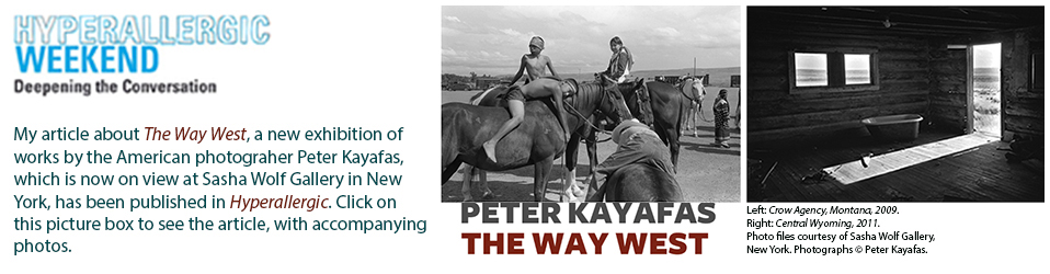
17 May 2014
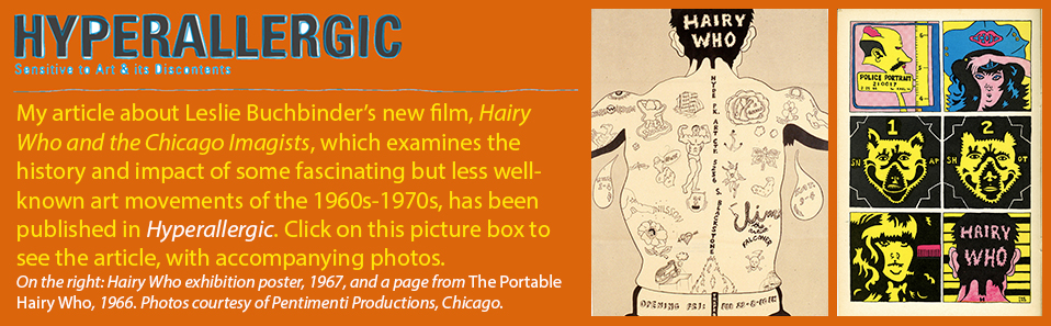
13 May 2014
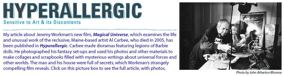
12 May 2014
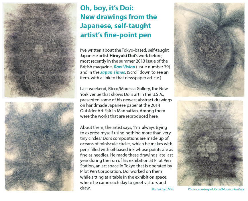
4 May 2014
A dialog in art: The folk art of Ilija (Bosilj) Bašičević and the heady conceptualism of “Mangelos”
|
| Above, left to right: Dimitrije Bašičević (known as "Mangelos"), Paysage, 1951-1956, watercolor and ink over printed text on cream paper, 7.5 x 10.625 inches; Ilija (Bosilj) Bašičević, Noah's Ark, 1967, oil on wood, signed "Ilija," upper left, 31.875 x 48.25 inches; Mangelos, Pithagoras, 1951-1956, tempera on the centerfold from a book (ivory wove paper), inscribed "pilogora," lower left and "ser. d-5," lower right, 7.75 x 11.25 inches. Photos courtesy of Galerie St. Etienne. |
|
|
NEW YORK — Taking family ties and the notion of different categories of art (what is folk art or outsider art; what is “academic” art; in the former Soviet bloc countries, wasn’t avant-garde art “outsider,” too?) as starting points, Galerie St. Etienne, at 24 West 57th Street, in midtown Manhattan, is now presenting Ilija/Mangelos: Father & Son, Inside and Out. On view through July 3, this exhibition looks back at the distinctive oeuvres of two art-makers who lived and worked in what used to be Yugoslavia.
It pairs the paintings of Ilija (Bosilj) Bašičević (1895-1972), a Serbian peasant who in his lifetime received only four years of primary-school education and made pictures with allusions to the Bible, folk poetry and myth, and the conceptualist works of his highly intellectual, well-educated, critic-curator son Dimitrije Bašičević (1921-1987), whose nom d’artiste was “Mangelos.”
The aesthetic dialog between their two bodies of work is highly charged; Ilija’s pictures are full of color, fantasy and whimsy, while his son’s works are printed texts or images that he blacked out or obscured with gouache and, apparently, a minimalist aesthete’s determination — or glee. Literally or symbolically, what was Mangelos obliterating? At the time in his country, how provocative was such an artistic act? The frisson of tension that emanates from these two, side-by-side bodies of work is unusually compelling.
Painting at right: Ilija (Bosilj) Bašičević, Blue Lady,1967, oil on cardboard, signed "Ilija," center right, and titled, center left, 27.5 x 20.5 inches. Photo courtesy of Galerie St. Etienne.
Posted by E.M.G. |
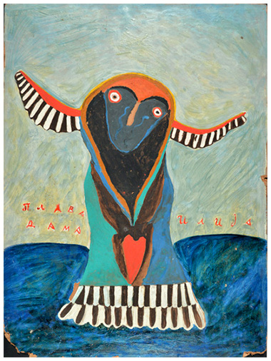
|
3 May 2014
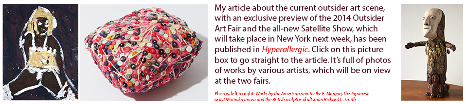
27 April 2014
Now tracking: Michael Newman’s long journey to the heart of gestural abstract art-making
|
Above: Nuances (2014), pencil on Magnani paper; two sheets, each sheet 21.125 inches high x 23.75 inches wide. Click on the ART PROJECTS button on the menu in the upper, left-hand corner of this home page or click here to read my description, with photos, of artist Michael Newman's paintings and drawings in various media, which I'm looking at and thinking about now, and about which I'm working on an in-depth critical essay. Posted by E.M.G. |
|
|
25 April 2014
Sculptor John Crawford: The subtle monumentalist
|
| Above, left to right: The sculptor John Crawford at the opening of his current exhibition at Lori Bookstein Fine Art on April 24, 2014; Bifurcation—Arches (2013), forged steel; detail of Bifurcation—Arches; detail of a tall, free-standing work, Tower 1 (2006), forged steel, showing the triangularly shaped elements of which it is composed. Below: Interlock 3 (2014), forged steel. Photos by E.M.G. |
|
|
 |
NEW YORK — As some art historians have noted, something happened to public sculpture after World War II. When it came to creating and displaying sculptural works whose purposes were to commemorate historic events, heroic individuals or groups, or such lofty concepts as world peace, abstraction as the language for evoking or expressing such themes was inherently not literal. Sometimes it lacked the oomph of more traditional, figurative forms. Also, assemblage and minimalist sculptures changed viewers’ perception of the space they and such works actually occupied and in which they engaged each other’s energies. Non-public or studio sculpture felt the effects of such tendencies. In any case, modernist abstract sculptures do not have to be as huge, imposing and bombastic as Richard Serra’s COR-TEN steel leviathans to make an impact. The American sculptor John Crawford proves this point convincingly in his new exhibition at Lori Bookstein Fine Art (138 Tenth Avenue, Chelsea, through May 24). Muscular, full of allusions to organic shapes and confidently clever (these works don’t have to show off), Crawford’s creations, like fine woodwork, seem to celebrate the craftsmanship that gave them form in texture-rich forged copper or forged steel. |
Posted by E.M.G.
19 April 2014
Strange — and strangely compelling — images from the Iranian-born painter Marzie Nejad
 |
NEW YORK — The self-taught, Iranian-born, New Jersey-based painter Marzie Nejad has come up with some of the strangest images I’ve seen in a long time. How about a picture of Frida Kahlo, that unibrowed, cult-worshipped patron saint of Mexican modernism, appearing to enjoy a pleasant nap as she tumbles down a rushing waterfall in a Chinese-style canoe? (See “Frida” [2012], here on the left.) In the background: a high ridge topped by the ruins of an ancient Roman aqueduct. Or how about “Memory” (2014) with its row of vine-filled flower boxes rolling out into the far distance of the pictorial space against a curtain of foggy color that is joyously multi-striped, like a rainbow. Where do such images come from?
In a recent interview, Nejad, who gladly retired from medicine (kidneys were her specialty) to devote her time to painting, told me, “My pictures come more from visions than from my dreams.” More evidence of Nejad’s audacious image-making will be on view in “Conversation,” her solo exhibition at Luise Ross Gallery in New York’s Chelsea district, which will open on April 24 and run through May 31. See my article about the work in this show in HYPERALLERGIC. In it, I consider whether or not looking at this kind of art from a typically ironic (and, implicitly, somewhat condescending) postmodenist point of view is the most appropriate way to examine it or not. |
12 April 2014
Primoridial, mark-making gestures and texture-rich surfaces in Gene Mann’s New York debut
 |
NEW YORK — The Swiss-French artist Gene Mann is presenting her first-ever solo exhibition in New York at Andrew Edlin Gallery (through April 26). On view: Richly textured works, which blend gestural painting, figurative drawing and collage on everything from small pieces of cardboard to big boards. Often an air of something primordial and elemental wafts through Mann’s art. Her images of semi-abstract human figures and freewheeling abstractions celebrate the basic act of making lasting, even yearning personal marks. They’re gestures that emphatically say, “I am alive. I am here.” For more about Mann’s life and work, see my article about this exhibition in the online arts-and-culture magazine HYPERALLERGIC. |
10 April 2014
Make it big, really big: Artist Jack McLean’s strange, funny, crowded, sprawling drawings
 |
NEW YORK — A few months ago, in Tokyo, I met the Scottish-born artist Jack McLean, who has lived and worked in Japan for two decades and who sometimes likes to dress up as a tree. In my just-published article about McLean’s art and ideas in the April issue of the American art magazine Art & Antiques, you can read about his unusual drawings in ink on paper or canvas, and about how packed they are with overlapping, weird-funny scenes and goofy characters. You might even recognize some of the neurotic urban types and 21st-century zombies McLean depicts in his visual offerings of the human comedy in all of its self-absorbed, head-turning, gadget-obsessed, curse- and laughter-inducing splendor. See a PDF containing the published pages of this magazine article here. McLean is represented by The Container, a gallery in Tokyo. |
23 March 2014
Carve it! Near Chicago, the works of self-taught artist William Dawson in career survey
 |
MUNSTER, INDIANA — In this town some 30 miles southeast of downtown Chicago, the South Shore Arts Center is presenting “William Dawson” (through April 20), a retrospective of the work of the well-known American self-taught artist who was born in Alabama in 1901, spent most of his life in Chicago and died in 1990. The exhibition was organized by the Montgomery Museum of Fine Arts in Montgomery, Alabama. Known for his wooden totems featuring stacks of heads with nearly generic facial expressions, Dawson also made paintings on paper of animals and the occasional abstract creation. Highlights of this survey include carvings of birds, several stand-alone figures (including a forlorn-looking Uncle Sam) and a charming but somewhat ghoulish depiction of the cheery 1970s pop-music act, Tony Orlando and Dawn (left). Remember “Tie A Yellow Ribbon Round the Ole Oak Tree,” the group’s big hit from 1973? Probably better not to... I love the idea that Dawson compressed his depiction of this chart-topping trio’s two female back-up singers into a single figure. That’s them/her on the right in this photo, with real human hair, too. |
21 March 2014
Strange images from a sometimes spontaneous, sometimes masterfully controlled flow of ink
|
| Untitled works on paper (2012), made with ink and/or acrylic paint, and sometimes with salt or iron oxide, by Marcos Bontempo. Photos: Carl Hammer Gallery, Chicago. |
|
|
CHICAGO — Here in the Loop’s gallery district, Carl Hammer Gallery is presenting Spiritual Meanderings (through March 29), an exhibition of 52 small-format drawings by the Argentine-born artist Marcos Bontempo. Bontempo, who has lived in Spain since his childhood, sometimes suffers from schizophrenic episodes. To make his art, he uses ink or acrylic paint, occasionally mixing salt or iron oxide into these materials (which can give his black ink a molten, blood-red appearance) to make images the surrealists of the 1920s probably would have found captivating.
Using a technique that seems to be as controlled as it is spontaneous, Bontempo masks out certain parts of his larger, animated forms, such as their hands and feet, while allowing broader brushstrokes to shape the main trunks of their bodies. From a distance, some of the artist’s primordial-feeling, half-human, half-animal figures — a man with a bird’s head, a giraffe with a man’s head — appear to be ornately decorated with line work as fine as that of old engravings. On closer inspection, however, it turns out that it is the free flow of his ink or paint that naturally generates such richly, randomly patterned passages.
Bontempo’s strange figures, with their gargoyles’ wings, curling tails or spiky plumage jerk, twitch, bend and stretch in silhouette, like bizarre characters in shadow-puppet plays. Compelling and mysterious, his haunting pictures leave after-images that are hard to shake.
Carl Hammer will bring a selection of Bontempo’s works to the 2014 Outsider Art Fair in early May (May 8-May 11).
Posted by E.M.G.
25 February 2014
In New York, artist Yoko Ono presents the 2014 Courage Awards for the Arts
NEW YORK - First presented in 2009, Yoko Ono’s Courage Awards for the Arts are among the less well-known expressions of philanthropy and cultural activism for which the internationally famous multimedia artist, performer and peace activist has been recognized. Still, as Ono has said, it is an awards program whose mission and character resonate deeply with the artist herself. That’s because, Ono has observed, over the decades she has learned a thing or two about perseverance, struggle and striving to remain true to one’s creative vision, often in the face of harsh criticism, misunderstanding or rejection.
|
| Above, left to right: Artist Yoko Ono presiding at the podium at the presentation of the 2014 Courage Awards for the Arts in New York this past Sunday, Feb. 24, 2014; Ono’s white top hat; performance artist Laurie Anderson, one of this year’s laureates, at the awards ceremony.. Photos by E.M.G. |
|
|
With such themes in mind, Ono’s Courage Awards acknowledge the achievements and the stick-to-itiveness of art-makers, music-makers, creative visionaries and determined champions of free expression, that indispensable, basic human right that allows creativity to flow. Past recipients of the awards have included, among others, WikiLeaks founder Julian Assange; the feminist artist, writer and activist, Kate Millett; composer-performer Meredith Monk; the Guerrilla Girls; composer-performers La Monte Young and Marian Zazeela; and the 19th-century writer Émile Zola. (In fact, PEN American Center, the organization that supports writers and freedom of expression, picked up Zola’s 2010 award for him in that long-deceased author’s name.) Each award consists of a framed certificate and a check in the amount of $25,000.00.
Speaking to a gathering of guests that included Patti Smith, composer and WNYC-FM radio-program host David Garland (“Spinning on Air”), artist and Franklin Furnace Archive founder Martha Wilson (a 2012 Courage Award laureate), museum curators and other art-world figures, Ono presented the 2014 Courage Awards for the Arts to performance artist-musician Laurie Anderson; the Vienna-based, Austrian artist Valie Export; the British singer-actress Marianne Faithfull; and the London-based artist Gustav Metzger, who is most often associated with “auto-destructive” art.
More... (Click here to open a PDF containing full news report.)
Posted by E.M.G.
14 January 2014
In this article, the American Visionary Art Museum’s founder-director, Rebecca A. Hoffberger, who organized the exhibition, notes that it “proposes that we can either use technology to empower or to diminish what it means to be human. The choice, as the art and information on display suggest, is ours to make — and it’s one we have a responsibility to make wisely.”
Below: Some of my articles and essays published in late 2013 and early 2014
Click on each box to go directly to a PDF or website, where you can read the text in its entirety, as it appeared in its original publication.
11 December 2013
In Japan, a Scottish artist creates fantasy worlds (on some very large sheets of paper)
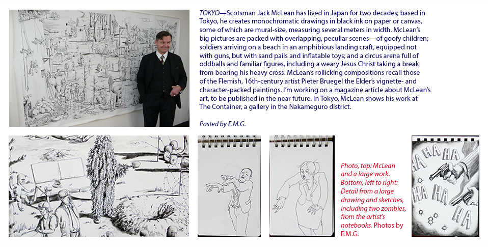
Click here for the website of The Container, the Tokyo gallery that represents artist Jack McLean.
1 December 2013
Ati Maier’s complex compositions explore outer (and inner) space
|
| Above, left to right: Paintings by the artist Ati Miaier, including Giant Dipper (2010) and Savvy (2010). Dimensions of both works: 53 inches x 94.5 inches. Materials used to make both paintings: Airbrush and ink on paper. Photos courtesy of Pierogi. |
|
|
NEW YORK — Pierogi, the well-known gallery in the Williamsburg section of Brooklyn, the very epicenter of world hipsterdom, recently presented “The Map Is Not the Territory” (September 6-October 6, 2013), an exhibition of paintings by the German-born, New York-based artist Ati Maier. At its nearby sister space, The Boiler, it offered a mixed-media installation and thematically related video works Maier had created.
The exuberant, complex compositions of Maier’s paintings (which she makes with ink, wood stain and acrylic on paper, often using an airbrush) especially caught my eye. They were dazzling. I wrote a brief article about this artist’s work for the American magazine Art & Antiques, which has been published in its winter 2013 issue (its December 2013/January 2014 double issue).
“I’ve long been very interested in outer space,” Maier old me. She added, “I see my recent work as a reflection of my exploration of inner space, too.” Packed with overlapping, web-like thickets of pulsating lines, roller coaster ribbons of color and spinning wheels of vibrant hues, Maier’s abstractions bring to mind various points of reference. Among them, she notes, are “constellations of stars, the palettes of the expressionist Blue Rider group — artists like Wassily Kandinsky and Franz Marc — and outer-space phenomena like black holes and comets.”
Click here to see a PDF containing my article. Please note: It’s a large file (9.6 megabytes). Give it a few seconds to download.
Posted by E.M.G.
OLDER POSTS